
Achieving a good corporate image is no easy task. For any brand, building or rebuilding a corporate image to convey emotions, feelings, and a specific visual identity is a necessary and complex action.
But what is a company’s corporate image? Well, the corporate image of a brand is the impression that its corporate identity generates in the receiver or not.
Corporate identity is the set of actions and reflections that a brand carries out to create a certain impression on the public. It is the values, feelings, and rules that ensure your business’s message is received by the recipient (suppliers, collaborators, or customers) as you intend to communicate it. And this corporate identity must be present in all the channels where your company transmits any message or creates a conversation.
Furthermore, to ensure that your brand has the corporate image you desire, you must keep updating and adapting to your target audience and the social moment, so that every message you want to convey is interpreted by your consumer as you wish and reaches further.
To better understand what we mean when we talk about a successful corporate image, we present 5 examples of brands that have done, and continue to do, an excellent job, resulting in a unique and different corporate image from the rest.
Tiffany & Co. is one of the world’s most important luxury jewellery brands. It was founded in New York in the 19th century and has since maintained one of the most famous brand identities on the planet.
Its distinctive sea-green colour and sophisticated lettering have made it one of the most recognised brands in the world. Its corporate identity follows the rules of elegance and minimalism, paying utmost attention to every detail and moment.
Even with a really solid graphic image, they teamed up with Pentagram, one of the best graphic design agencies in the world, to make their image even better.
Pentagram made imperceptible changes to the customer’s eye but created harmony between the elements that were not there before; they modified the size and some design details of the logo, the product packaging…
Ikea is a brand that offers its customers furniture and home accessories at a very economical price, with very attractive and practical designs. This company has managed to position itself globally, democratising the decoration of our homes, making it one of the most recognised brands worldwide in its sector.
Its logo features an original combination of colours, referencing the flag of the brand’s home country, Sweden, with simple and easy-to-remember typography.
Its innovative and original advertising campaigns have forged a very solid and distinctive corporate image, characterised by being very different from the rest and by its closeness to the everyday life of the consumer. Ikea has a unique way of communicating, which makes it stand out from the competition.

Coca-Cola can, image by Scott Spedding on Pexels
Coca-Cola is one of the most consumed sugary drinks. Studies show that 94% of the world’s population recognises the brand when they see it. Its red colour and typography are patented and highly recognisable.
The brand, through its numerous actions, seeks to convey optimism, freshness, happiness, and family values. This helps combat bad press and negative opinions about its product, which is often criticised for being unhealthy.
Coca-Cola is also a great example of how to make changes to adapt to customers while respecting the characteristics, philosophy, and image that define them.
Nintendo is one of the world’s most popular video game companies, a brand that everyone remembers, and since its creation, its popularity has only increased. It was in the mid-sixties when it began to focus its strategy on a youthful audience, and this focus has continued to the present day.
The brand has always tried to convey values such as fun, healthy entertainment, and friendship. Nintendo aims to be part of the society’s adolescence, so much so that for many adults, this brand is synonymous with nostalgia and better times.
The most notable feature of its corporate image is its typography. Simple, but very effective and recognisable. Additionally, it has a logo that shares the same characteristics; it is simple, effective, and youthful.
Furthermore, its most famous video game characters are also part of the brand’s corporate identity, and this is why they have succeeded in many countries around the world.


Nintendo Super Mario Bros sign

Nike poster #FindGreatness
Nike is another brand that has been with us for years. It is a classic brand that, by constantly renewing itself, never ceases to be current and modern. Nike pioneered the idea that the logo is more important than the product.
This brand has always been clear that it wanted to convey the idea of sporting activity that is not tied to competition, but to self-improvement. Nike invites and motivates us to bring out the best in ourselves, as exemplified by its famous slogan “Just do it”. And its messages are so clear that its simple visual image and minimalist typography reinforce this concept to reach the consumer without filters.
The brand’s main colours are white and black, but depending on the product design, they also use other colour palettes, always maintaining the simplicity and clarity that characterise them.
Its corporate identity is present in all its actions: photos, catalogues, shops, product design, digital content… And it is all this that makes Nike one of the most valued brands worldwide.
It is incredible how a brand, through its actions, can make its customers feel part of it and integrate it into their lives. These brands, with a good strategy and a successful corporate image, have achieved this.
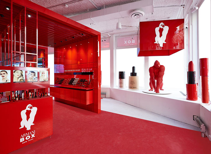
As we have seen, it is essential that your brand has a recognisable and established corporate image. However, you must not forget that this identity must also be reflected in your physical point of sale. The signage on the façade, the shop window display, the corporate colours inside, a careful arrangement of furniture, and decor that conveys the message you want to tell your target audience… all these elements must be in harmony with your brand image.
It is not just about the slogan displayed, or the image accompanying it, or the audiovisual file on the displays. At the point of sale, actions must have a solid foundation. Vision, mission, philosophy, and corporate culture become strategic references. Your point of sale has to tell the story of your business.
The simple combination of colours, the placement of advertising material, the way we decide to convey the message, all communicate a specific style, a way of being of our company.

North Sails store interior by Instore

Hermes window display by Instore
In short, a brand is much more than just a logo. The brand encompasses a wide range of values, consumption experiences, commercial and marketing strategies… with the aim of generating feelings and emotions in its target audience. Thus, all companies that focus on what the public feels and desires have a much higher guarantee of success than any other.
You may also be interested


open
08:00 AM-18:00 PM Monday – Friday
08:00 AM-18:00 PM Monday – Friday


