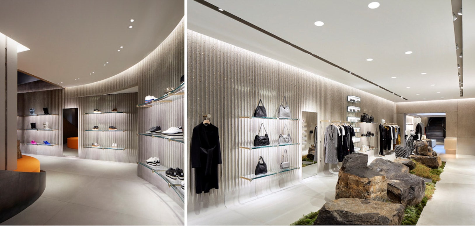
This is why commercial furniture not only has a decorative function but also serves as a facilitator. There is a wide variety of furniture with different utilities and aesthetics, providing you with diverse options when decorating your commercial space. It’s not just about choosing random furniture; it’s about making your product placement a strategy. Choosing shop fittings that are perfectly integrated with your brand concept allows you to make the most of this tool.
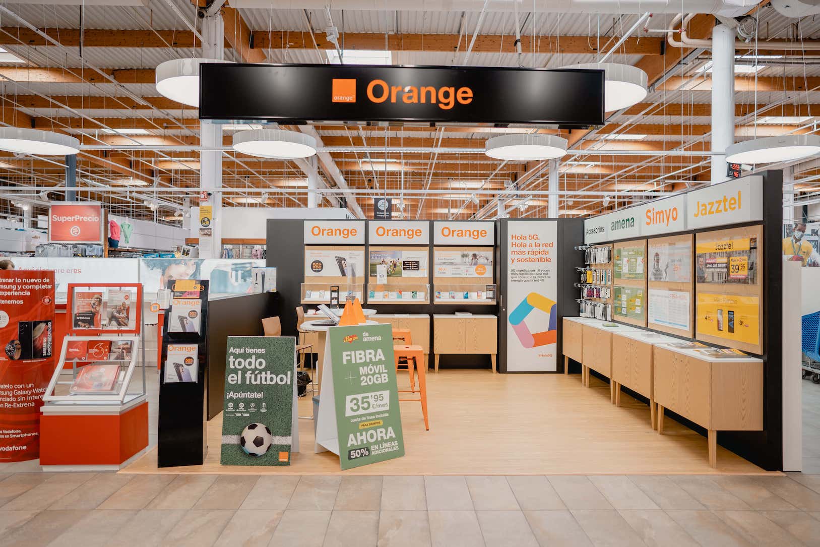
Being aware of the available space is crucial when choosing the dimensions of your furniture. You shouldn’t choose furniture that’s too large for your shop, as it can overwhelm the customer and detract from the importance of the products on display.
Therefore, it is very important to know the measurements of your space and use techniques that help create the right visual sensations. A common scenario is having a limited space, such as a corridor or a specific area. For this, there are different types of furniture that can help create a sense of spaciousness: mirrors, light colours, furniture with low visual weight, light wood tones, etc.
Another tool that will help you determine what furniture you need for your shop is the layout and map. By studying how you want the customer to navigate the shop, using furniture to create this, you can ensure they follow the path you’ve set, making sure they see all your products. The shop map helps you determine where to place your products to make them more visible and gives you greater control over the shop’s flow. Here you can appreciate different shop layouts.
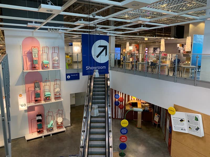
When you think of shop layouts, stores like Ikea or Flying Tiger Copenhagen might quickly come to mind. These shops opt for a very defined shop layout for the customer, ensuring that they see all the products on display. But don’t think that other shops don’t have a studied layout; most do, but many opt for a less defined layout so that the customer doesn’t realise they are following an arrow.
Ikea, one of the stores with the best tours and maps for customer experience.
Typically, the more subtle layouts are created with the furniture display that decorates the space rather than using specific furniture to separate areas. This way, we create different spaces in a less obvious way without using elements that indicate the path (such as the typical vinyl arrows placed on the floor). Obviously, the shop’s layout will be more free-flowing, but if well created, it will be equally effective.
The shop map will help you see your layout more clearly and select the best areas to display your products. One very effective strategy is to manage your shop’s hotspots. You can experiment with product placement and observe which products sell more, where customers pause, or in which areas they spend more time. Conversely, it will show you the cold spots or products that do not attract attention, allowing you to find solutions to encourage customers to spend more time in those areas and boost sales of those items. Thanks to this, your product placement strategy and furniture choice will be more positive.
As I mentioned earlier, it’s not just about knowing how to choose and combine decorative elements; you must pay attention to their placement. You need to be very careful because if your products are not well placed, are inaccessible, or overwhelm the customer with too many choices, this can lead to problems.
If you use product placement assertively, you can increase your sales. There are many product placement strategies: placing less sellable products near successful ones, low-cost products near the checkout, highlighting seasonal products, etc.
Something that can greatly help you is categorising your products. This is very useful when choosing how to place your items, as categorising allows you to see more clearly which products are more or less expensive, which sell more, which are more difficult to sell, and which are seasonal. You can identify that products in trend will be more successful and identify them.
All these strategies work and are reflected in sales. However, you must constantly know the results of your strategies, knowing what you sell, how it is placed and displayed… In short, find the problems to find solutions. Create harmony throughout your space. As for furniture placement, you can follow different arrangements such as:
Perimetral: furniture placed around the perimeter of the space, near the walls.
Central: furniture placed in the centre of the space.
Mixed: furniture placed around the perimeter of the space and in the central area.
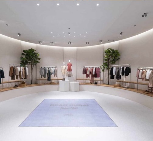
Perimental placement in Zara store interior.
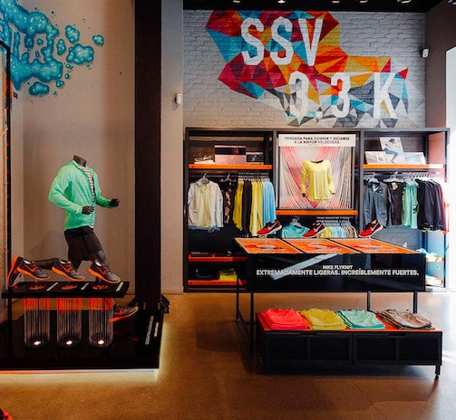
Central placement in Nike store interior.
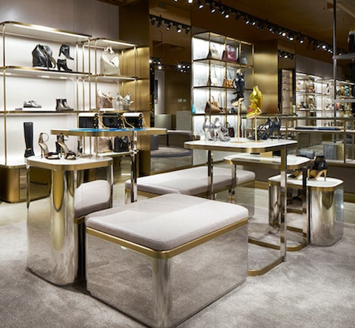
Mixed placement in Jimmy Choo store interior.
Your choice will depend on the space you have (size and shape), the number of products you want in your furniture display, and other factors.
Once all of the above is clear, you should choose the style, materials, colours, and functionality of your furniture. It is advisable that everything is integrated with the lighting of the commercial space, thus making the most of these tools.
Speaking of furniture style, I’ll tell you that this will depend on the brand’s style and image. Many styles convey different sensations to the customer: vintage, industrial, nautical, minimalist, Scandinavian… On the other hand, the materials that make up your furniture are very important, as each material offers benefits, and this should align with the message you want to convey: wood, glass, metal, plastic, acrylic… The chosen colour palette is usually influenced by the style and materials used.
Don’t forget your intentions when transforming the space; use colours that bring you closer to your objectives. For example, in many establishments, we can see a lot of light-coloured furniture with white walls… This colour choice intends to create a sense of spaciousness in the space; conversely, the area will look smaller if you use darker tones.
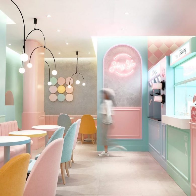
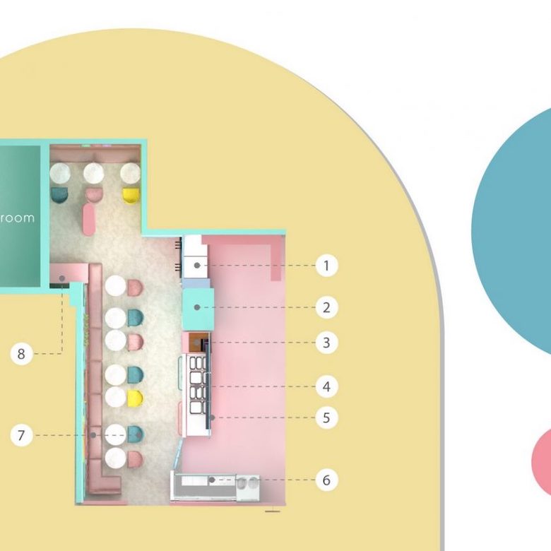
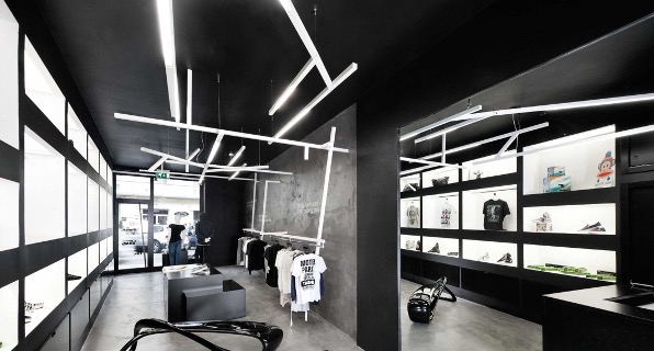
You have a lot of work ahead of you, but by using all these tools and elements correctly, you will choose the furniture that best suits your shop, do a good job, and achieve incredible results reflected in your sales.
You may also be interested
open
08:00 AM-18:00 PM Monday – Friday
08:00 AM-18:00 PM Monday – Friday