The challenge
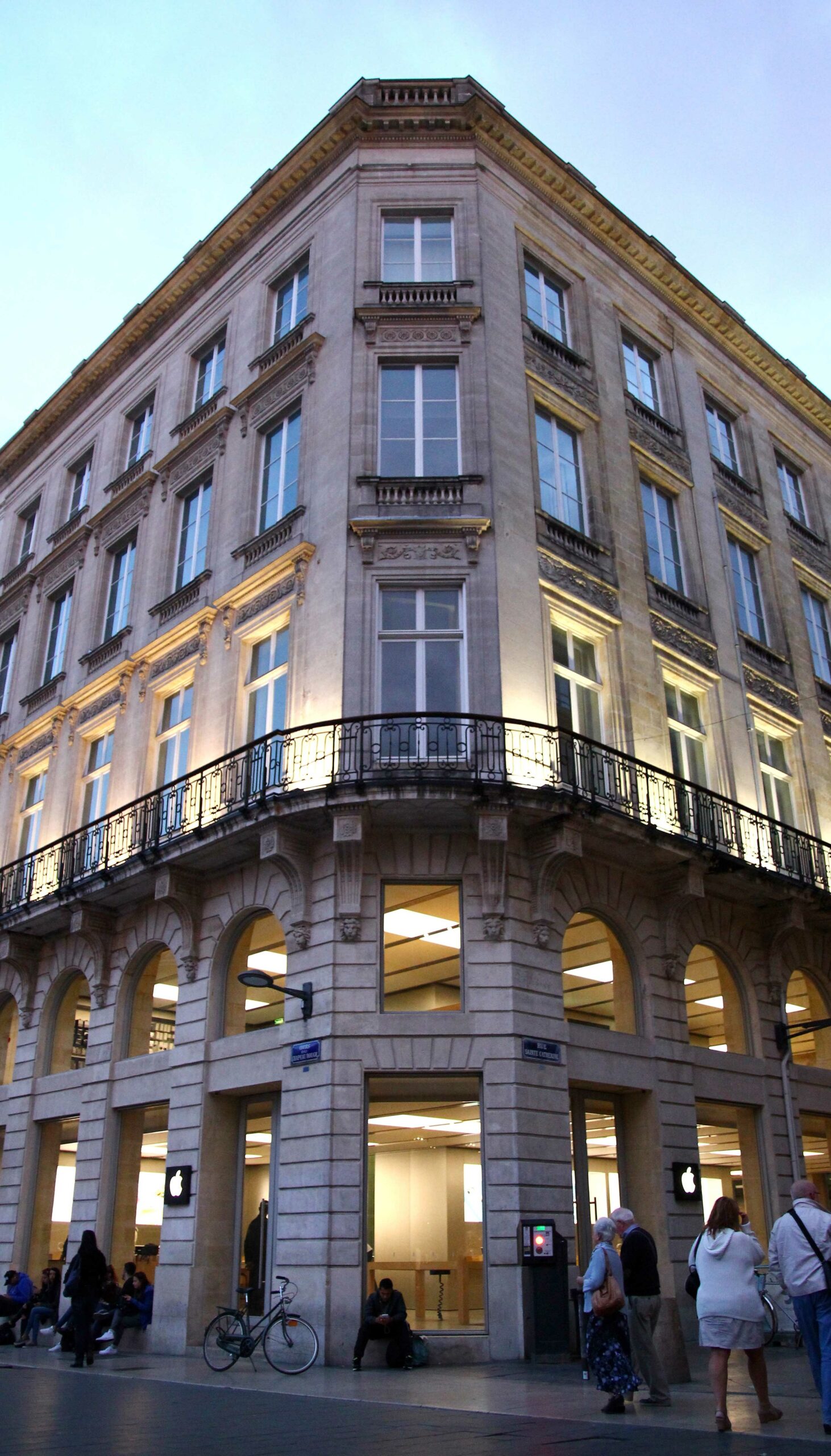
The challenge that the Apple team proposed to us was the redistribution and categorization of the product as well as the improvement of the furniture for an increase in security. The project was carried out in all Apple Stores in France.
The result
We managed to modify part of the furniture and restructure the accessories section more efficiently and clearly. It was possible to improve the exposure of the product and solve a health and safety problem for the client.
Introduction
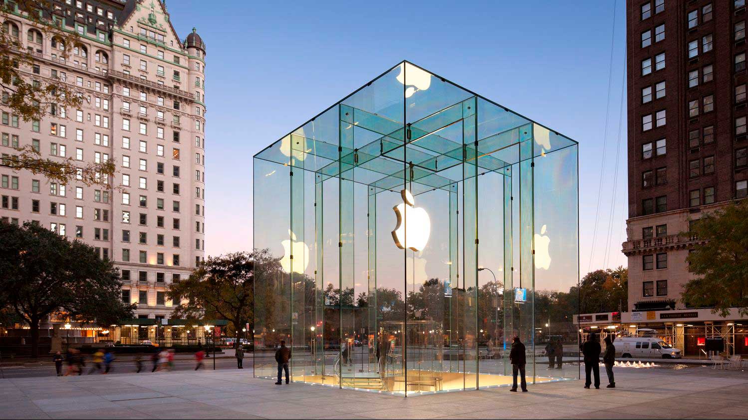
The Apple Store experience is one of the most outstanding in the world of technology. Since they opened in 2001, these stores have been the perfect place to find a specific model, good advice or just have a fun time testing the different products.
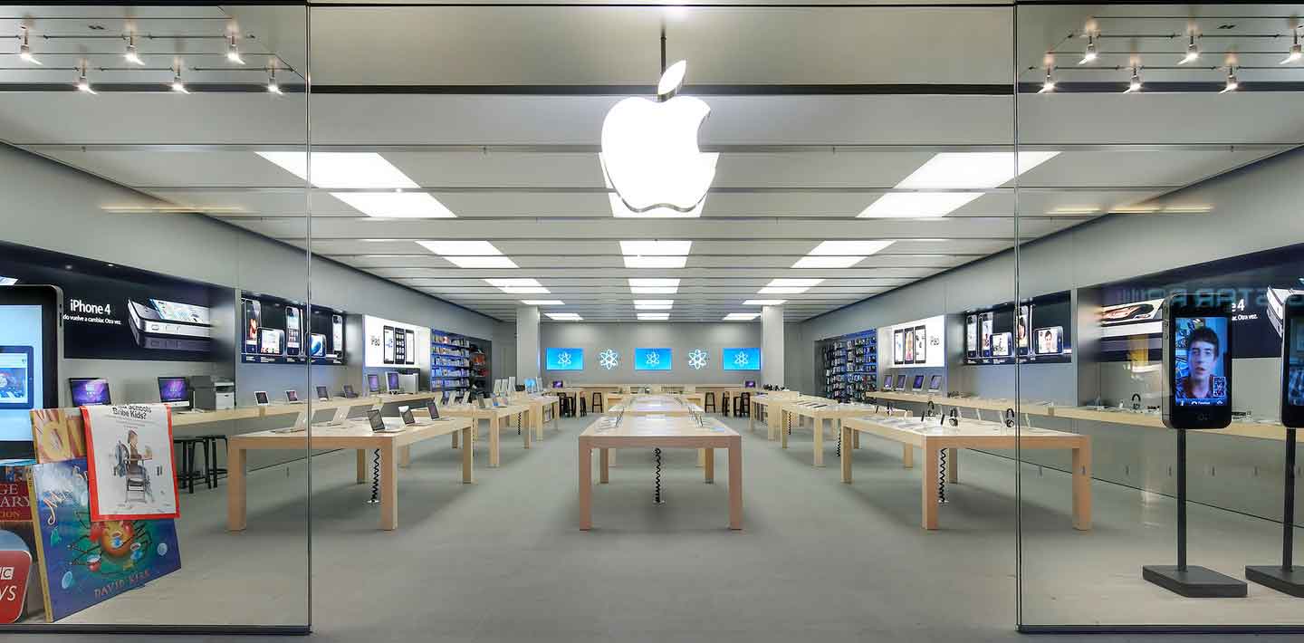
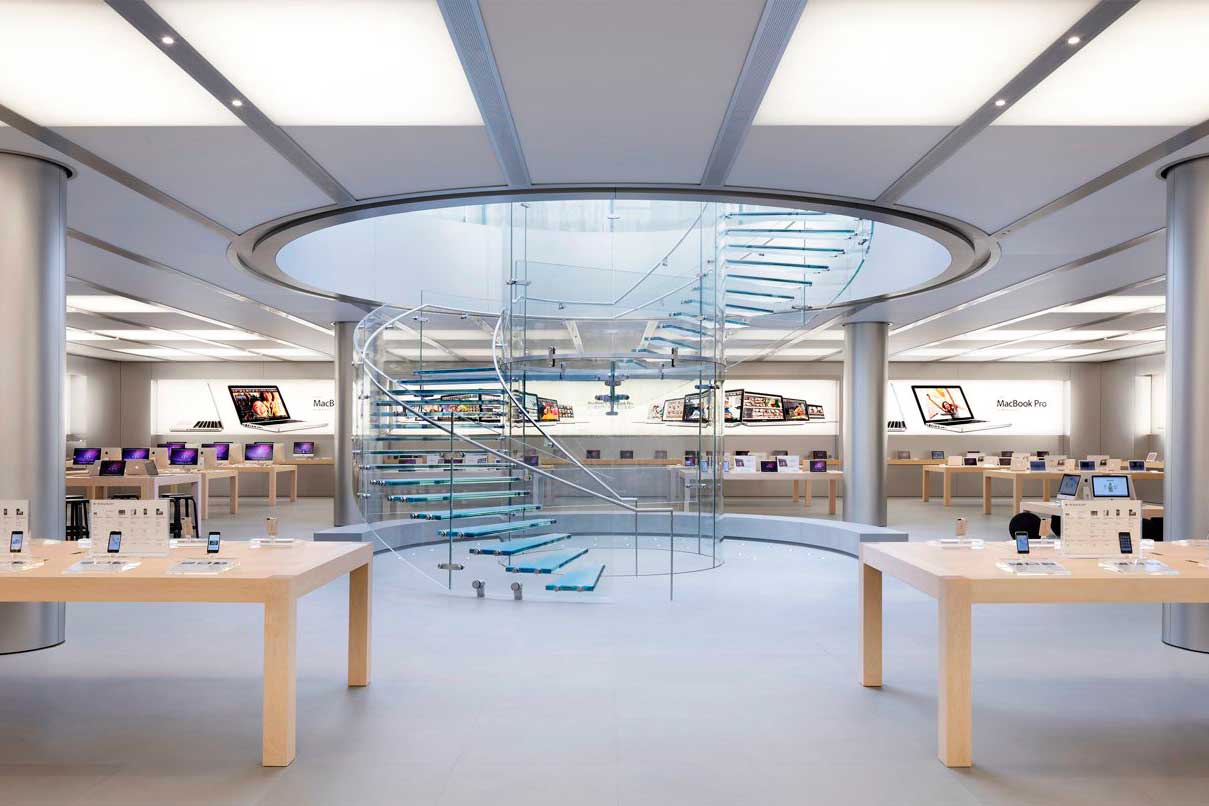
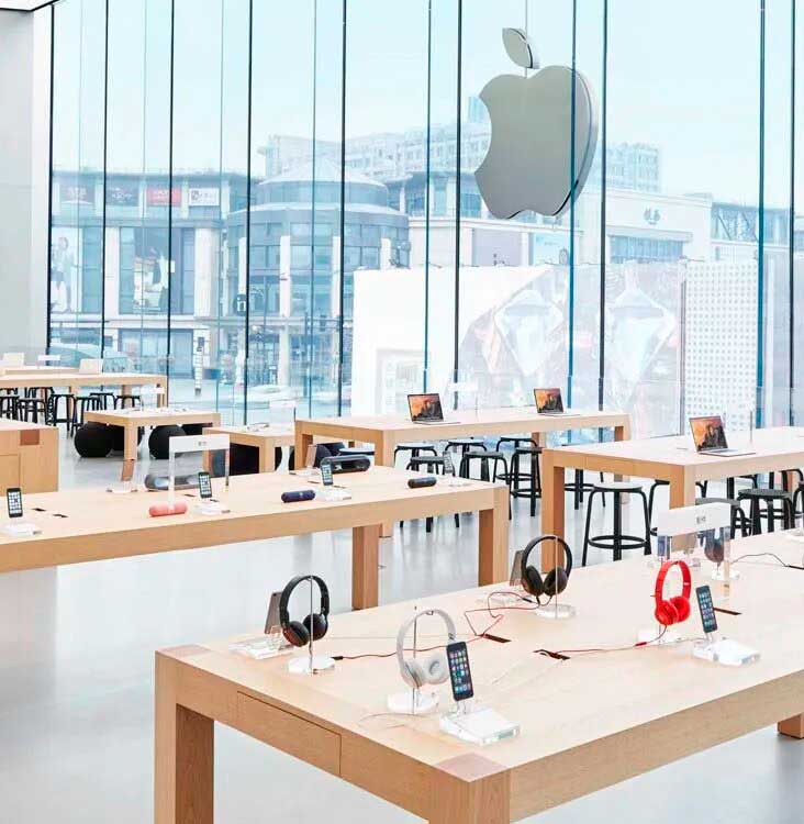
Apple Store is more than a store. The architect Peter Bohlin together with Steve Job himself, came to do something extraordinary, “channel the essence of a brand-product from the design of the store to generate a sense of community, playful shopping, positive social immersion”. People use them to learn about the latest technological trends, to socialize, or even to express their feelings. Undoubtedly, the user experience is prioritized as well as their own interaction. This experience goes hand in hand with its design and aesthetics. Its decoration is minimalist and modern, with simple lines and light colors that create a relaxed and pleasant atmosphere. In addition, the stores are often filled with natural light thanks to their large windows, which makes them even more attractive.
The development
One of the main attractions of the Apple Store is the accessories section, where you can find a multitude of accessories for devices. However, these corners had too many different types of components, poorly organized and not very visual.
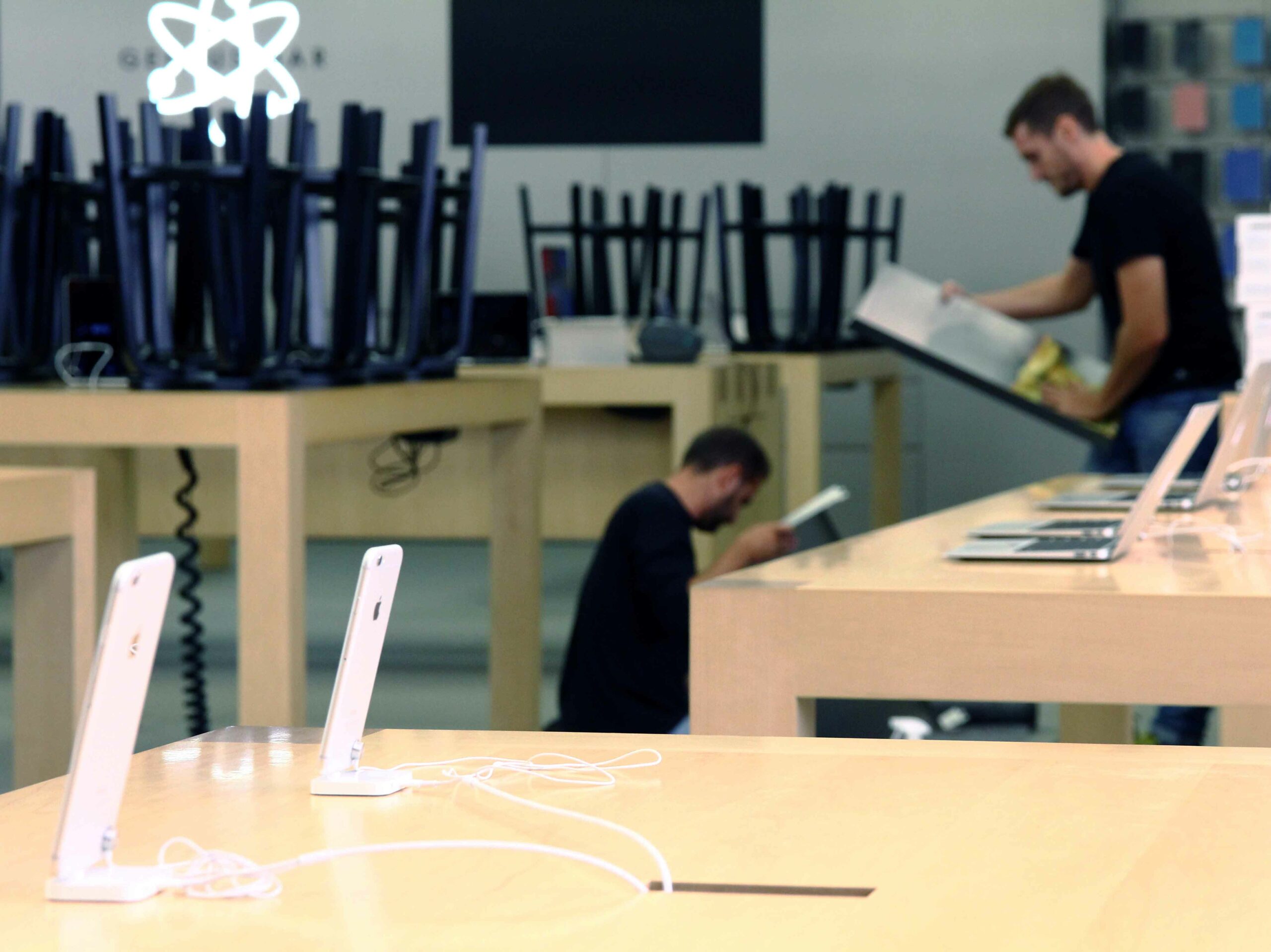
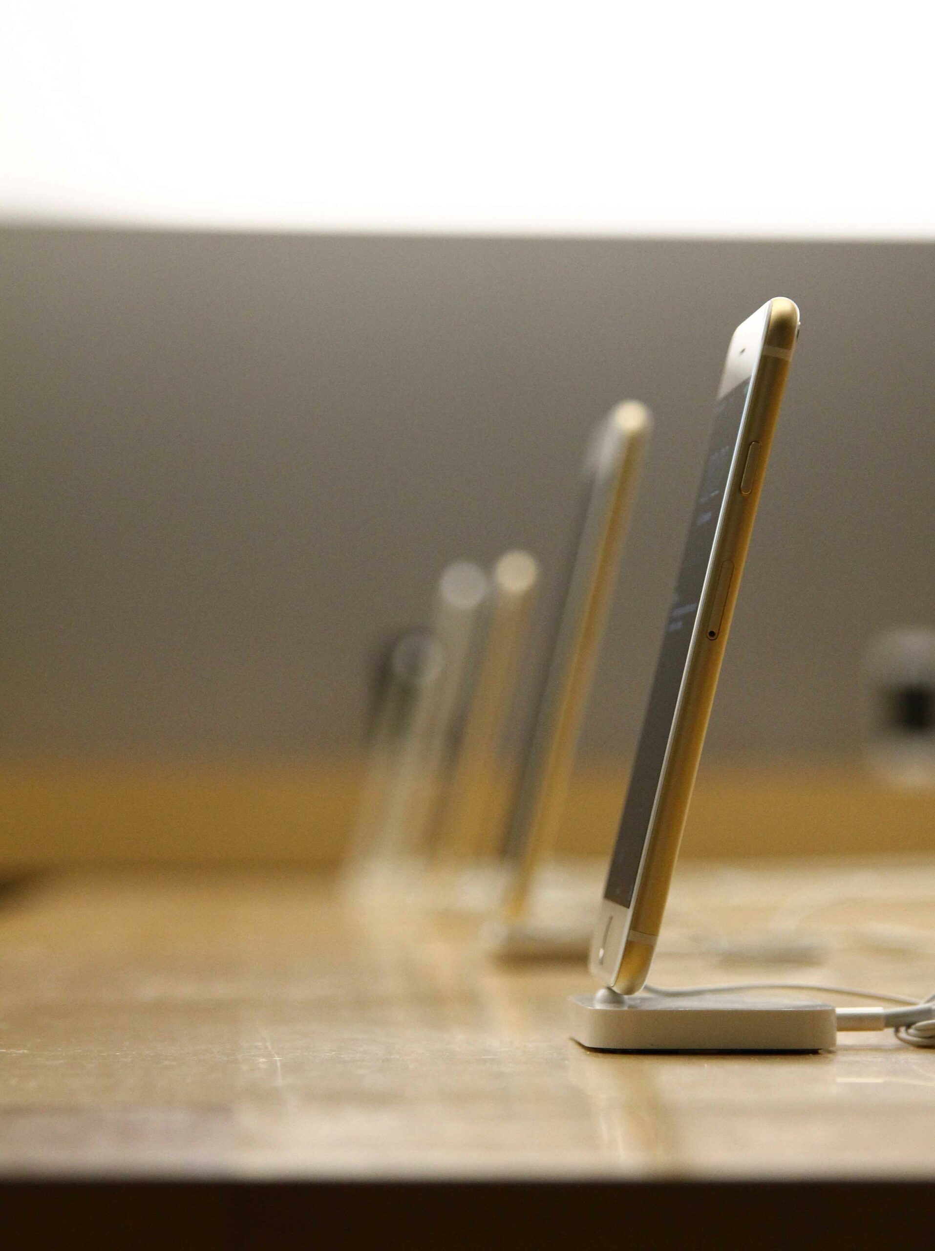
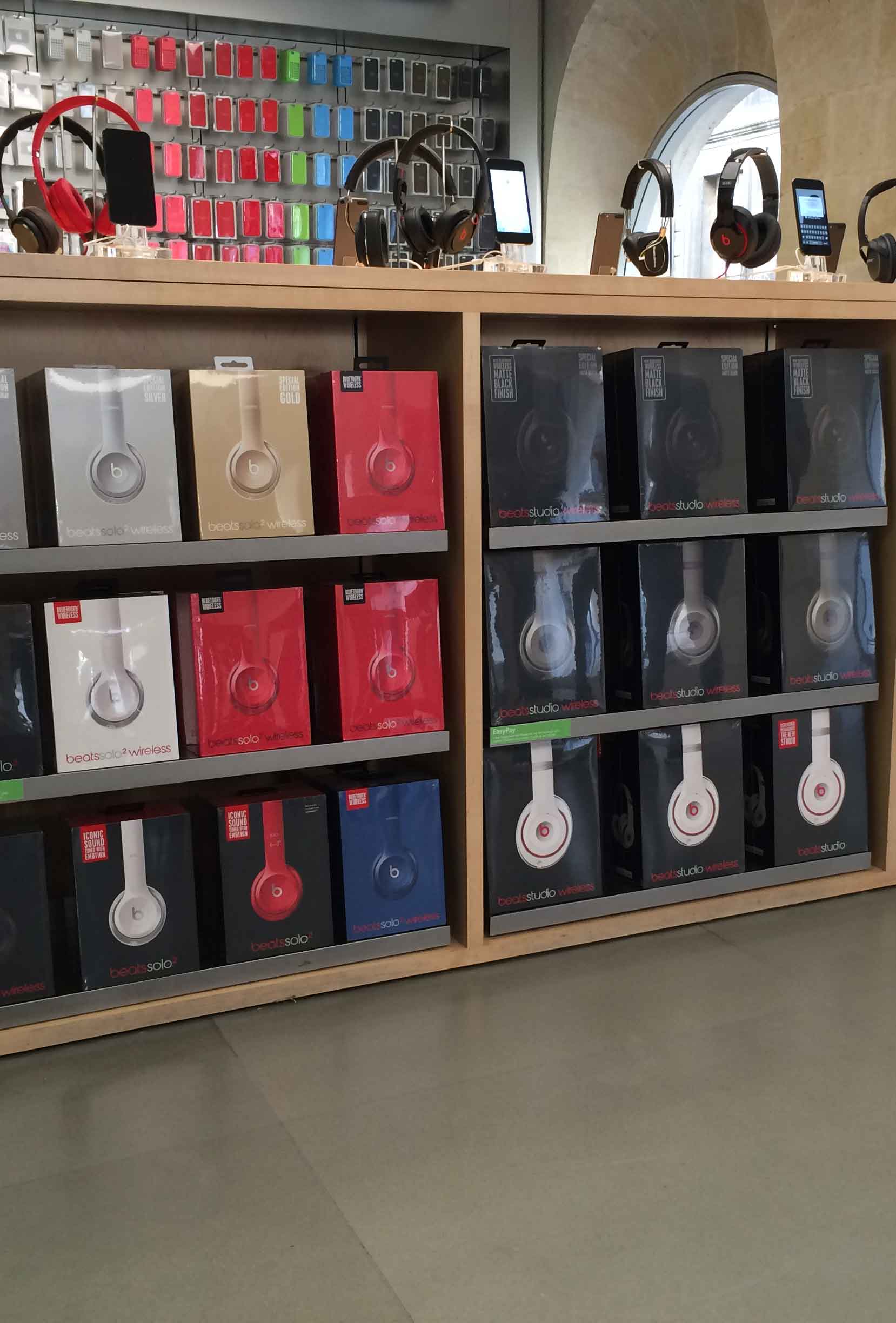
Our team, together with the guides set by Apple, reorganized the section, classifying the product by families and creating a more visual and striking display. To do this, we distribute the shelves strategically, focusing on the customer experience.
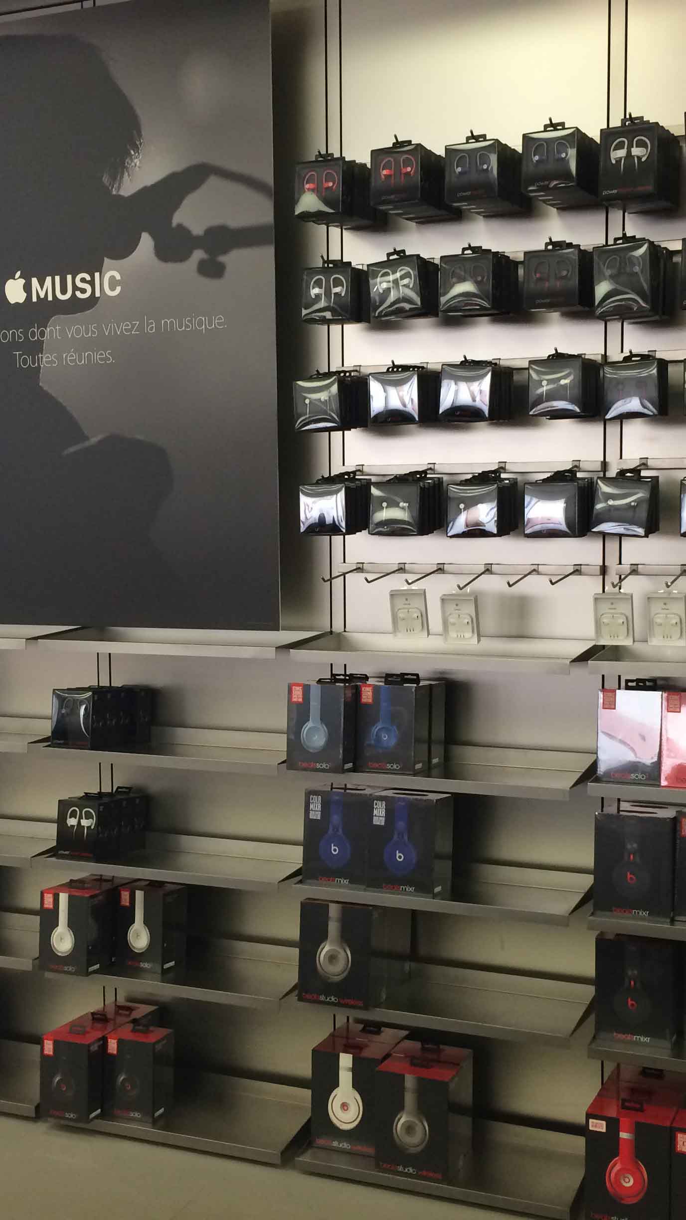

To solve this problem, the INSTORE locksmith and metal department went to each Apple store to sand each piece of furniture. With the marked specifications of the radii, the shelves were rounded 3 millimeters. The material was matt stainless steel with a brushed effect, to modulate this material it is necessary to carry out a meticulous work by layers: first the devastation is done with a file and then it is refined with different sandpapers and radials to polish the edge and make it perfect
01
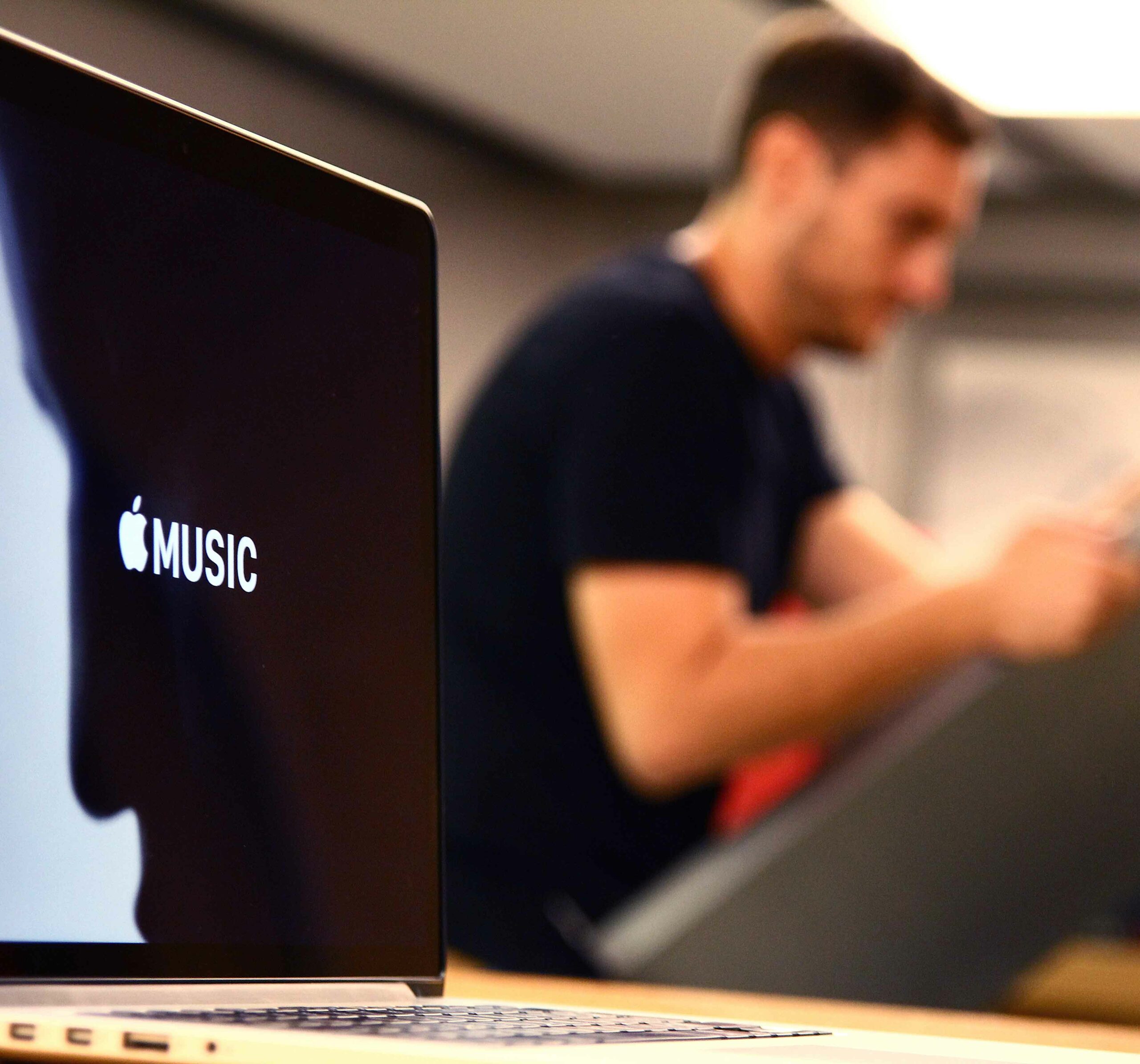
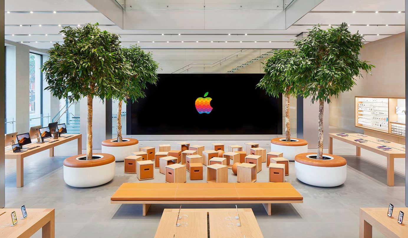
Getting the client to circulate through the maximum possible surface unconsciously is the objective, which is why Apple distributes its furniture by creating open spaces strategically.
02
Something essential in the sales strategy, if the product is well categorized and ordered, a greater visual order is achieved, making it easier for the customer to find the product.
03
Priority so that the consumer feels comfortable walking the aisles. The aim is to provoke in the client the sensation of “nothing bad is going to happen in this space”.
04
The products are at hand height, the space between them is enough to interact without stress… everything is calculated in detail so that the customer spends hours in the store.
05
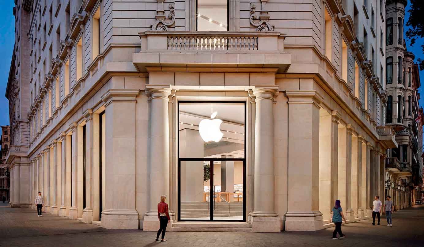
Simple shops with lots of light. Everything is symmetrical, visual noise is not added, the minimization of elements makes it easy to quickly understand the space.
06
Design, experience and service come together to make the best of fusions. The brand manages to create a feeling of belonging and bonding with its customers, it not only sells but also evangelizes.
Outcome
The furniture redistribution and improvement project was a complete success. With these modifications, the brand’s priorities were highlighted: orderly, symmetrical, simplicity and natural lighting that lead the customer to a state of relaxation, increasing their desire to interact and obtain the product.
Apple stores are perfect from a sensory marketing point of view: experience, merchandising, aesthetics and design come together in perfect balance.
open
08:00 AM-18:00 PM Monday – Friday
08:00 AM-18:00 PM Monday – Friday