
Photo by Patrik Michalicka on Unsplash
If your brand doesn’t exist in people’s minds, you don’t exist either. But believe me, non-existence is worse than contempt, as even bad publicity gives you a voice.
The set of beliefs and attitudes the public holds about your business is what we know as corporate image. It’s an external projection of your brand, subject to society’s subjective perception, exposed to prejudices and influenced by consumer experience. On the other hand, corporate identity is part of what you are as a company, a set of purposes, values, and motivations.
Creating a successful brand identity requires careful consideration of the company’s objectives, the market it is in, and its target audience, along with actions consistent with the corporate image you wish to project.
For example, a business that prides itself on sustainability but refuses to replace its plastic bags with kraft paper ones creates inconsistency regarding the values it promotes, generating consumer distrust. When corporate identity doesn’t align with our company’s actions, we lose potential customers and damage our reputation.
Avoiding this is in your hands. You must learn to control the impression your brand’s corporate identity generates in consumers, providing consistency and cohesion to your brand. Ultimately, a good corporate image should be distinctive enough to be recognisable without losing its harmony and coherence.
To ensure our corporate identity (what we are) matches our corporate image (what they think of us), we must establish good communication between our brand and our potential customer.
Words have never been the strongest element in human interaction. It’s well known that the first known source of expression was gesticulation; its easy interpretation and our ability to retain visual messages paved the way for language development. Written communications soon followed, and they came in the form of images. Hence, today, 90% of the information we transmit to our brain is visual.
Don’t believe it? I’ll prove it.
Look at these bottles. I bet you can identify the brand of each one without any label indicating it.

Detail of unlabeled bottles of the Fanta, Coca-Cola and Sprite brands.
Indeed, the brands of our favourite soft drinks have thought of everything, even how to stand out from the competition. Their colour, the shape of the bottle, and even the grip are differentiating elements that leave no doubt: you’re drinking a Coca-Cola. However, this wasn’t always the case. In the early 20th century, the vast variety of drinks with similar names, born in the wake of this brand’s success, forced the search for a differentiating element.
“The challenge was to create a bottle that could be distinguished by touch in the dark and even when shattered on the ground.”
Known as the first patented packaging, the Contour was registered in November 1915 by the Root Glass Company of Terre Haute, Indiana. Since the main ingredients of the soda were coca leaves and kola nuts, the bottle design was inspired by the shapes of a cocoa pod, oval and with very distinctive ridges.
The bottle entered production, becoming an absolute success for Coca-Cola: they had managed to outsmart their imitators while being memorable and recognisable to consumers. The curves, the tactile logo, and the distinctive grooves in the glass became Coca-Cola’s corporate image.
The communication methods available to corporate identity go beyond the product and industrial design. Architecture and commercial interior design are constantly faced with new design challenges, achieving large-scale associations.
A clear example of Retail Branding is shop windows and corporate buildings; the latter are known as flagships. Often considered architectural masterpieces, these stores aim to faithfully reflect the brand’s corporate identity.
Apple’s new store opens up a space with distinctive architecture, featuring a tree-shaped overhanging roof that blends into the symbolic Ratchaprasong intersection, creating a natural and organic atmosphere.
The iconic bitten apple reinforces its corporate identity, highlighting its growth as a company through this splendid apple tree in Bangkok, Thailand.
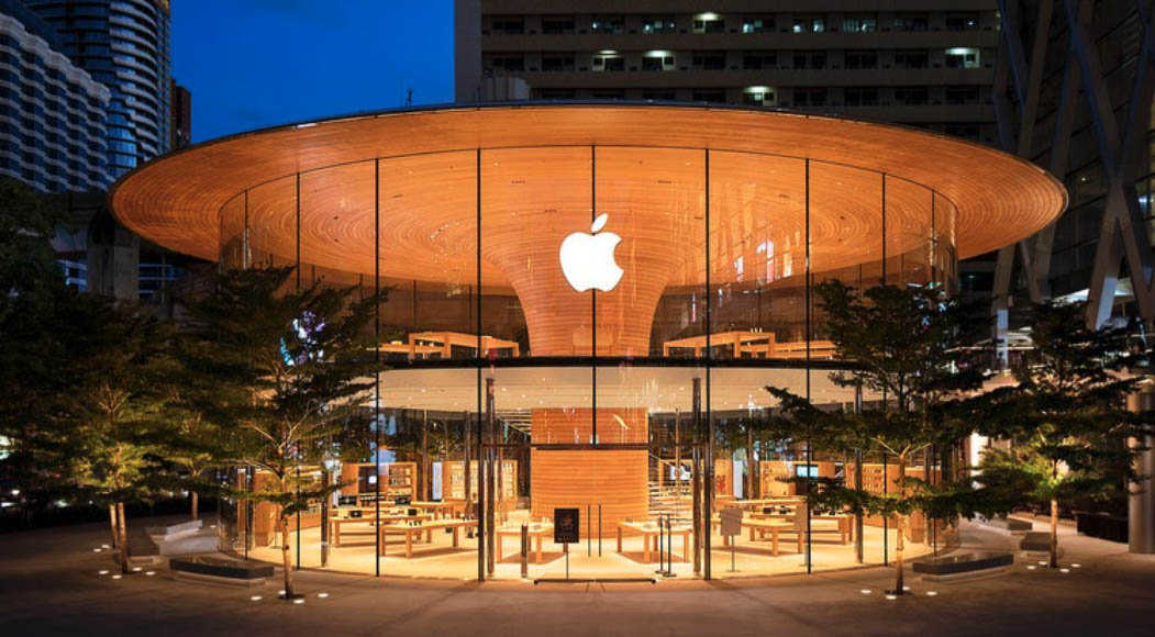
Martin Lindstrom, a neuromarketing expert, warned us in his book Brand Sense:
“The definition of brands through the five senses will be one of the communication keys for the future of businesses. By appealing to the five senses, brands can connect with consumers’ memory and emotions. Sensory stimuli help distinguish one product from another, are recorded in our long-term memory, and have become part of our purchasing process.”
We have seen how the senses play a crucial role in establishing our brand image. We capture stimuli through sight, hear the promises of brands, recognise the taste of Coca-Cola, and the distinctive feel of its bottle. But can we identify a brand by its smell?
The most undervalued of the senses has broken through to explain the importance of smell for the corporate image. Scents reinforce the brand’s perception and create a complete identity. Used as an economical and spontaneous sales strategy tool, as well as in work environments to increase employee productivity and performance, scent marketing has surpassed the boundaries that confined it to perfumeries and restaurants.
Despite not being the precursor in scenting boutiques, we all recognise when we are in front of a Stradivarius. I’d swear that the internet still doesn’t allow aromas to be transmitted through images, so how is it possible that I can smell it?
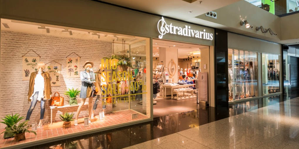
Branding, or brand creation, refers to the visual representation and consumer perception of your company. Creating a solid corporate image requires defining yourself and creating an appropriate visual identity; otherwise, your concept and value proposition will be confusing in the minds of your potential customers. It’s not something physical and tangible but rather a set of symbols, actions, values, and personality of your business.
The brand is composed of various elements, all aligned under the same criteria to give the concept uniformity. Unity, cohesion, and coherence are required. In this post, we will see the most notable ones concerning retail branding. I encourage you to stay and see what they are:
1. Determine your corporate identity
The physical and visual representation of the brand is what we know as design: the logo, typography, symbols, packaging, photographic style, and graphic resources, among others, form part of the brand’s visual universe. Around these elements revolves the entire aesthetic of our point of sale, defining the appearance of shop windows and the store interior.
2. Define your colour identity
Colours are chosen based on what the brand wants to convey. They are usually associated with specific concepts, and there is a consensus regarding their meaning. However, the sensations we perceive differ depending on our experiences and personal associations. Not only that, the connotations of a colour vary tremendously depending on the culture and society we target. For example, in Europe, we prefer less saturated colours, whereas in Asian countries, people are more accustomed to bright colours.

Retail Branding applied to the consumer experience at the point of sale. Picture by Liza Summer in Pexels.
3. Present yourself through the shop window
As the first visual impact we perceive, its importance in retail branding is indisputable. Its objective is to reflect the corporate image of our brand while seducing passers-by. Just like Apple, your point of sale should reflect the corporate identity you want to project. Respecting your brand’s values and aesthetics in your shop windows will help the buyer form a coherent and cohesive image of your business.
4. Enhance loyalty to your business
Brand loyalty is the degree of commitment people develop towards a particular company. Creating a positive brand association in the minds of consumers gives it added value over its competitors. The customer establishes an emotional bond with the product or service we offer based on previous experiences: a pleasant sales assistant, correct visual merchandising, and a comfortable experience at the point of sale guarantee the customer’s return to your establishment. Therefore, we must not forget the face of your brand: the employees. Sharing the company’s values and responding to characteristics such as proactivity and problem-solving will enable your staff to convey your brand’s ideals and establish a good corporate image.
5. Take care of visual merchandising
Visual merchandising helps create a better spatial arrangement of products and furniture elements. The correct display of products at the point of sale and planning the customer’s journey will maintain consumer attention and significantly increase your sales.
Be careful not to confuse branding with design. The brand is independent of its visual identity: it can make profound changes to its logo without altering its corporate image; we call this restyling. Conversely, there are changes in a brand’s concept that don’t require redesign, known as rebranding.
The ever-changing society sometimes forces us to redirect the firm’s focus. Therefore, your brand must be flexible, able to adapt and modernise when necessary. These two major competing companies will explain the difference between both concepts:
A more ecological and healthier McDonald’s
Initially, McDonald’s branding focused on providing speed and efficiency to consumers. Due to growing concern about the impact of fast food on childhood obesity, the golden arches brand decided to soften its traditional image, whose bright red was too aggressive. Colours help create the brand’s image on an ethical level:
“It’s not magical thinking, nor is it an unfounded reality: the meanings of colours are based on cultural criteria and subconscious elements that make one feel or perceive a specific reality when seeing a particular colour.” – Integrago
The change in corporate identity is what we know as rebranding, and its effectiveness depends on influencing the corporate image. McDonald’s objective changed, the company moved away from negative associations in favour of a greener, more ecological, and healthier corporate image. The brand has updated in most European countries while remaining unchanged in the rest of the world. Why is this?
Rebranding is a high-risk and costly service, so its market introduction must be gradual. If the strategy to change the corporate image fails, the brand will have the opportunity to recover more easily.
The choice of where to start with the image change is a conscious and planned decision. Europeans are more aware of health and environmental concerns, both concepts related to the colour green, than the rest of the world. This explains why the brand began rebranding in countries affected by the eco and health trend, while maintaining its existing corporate image (which already worked) in other countries.
The fact that McDonald’s in China still uses red indicates that it is more important and beneficial for sales to preserve the colour’s association with immediacy and speed than to update to the dark green associated with health and nature.
Culturally and socially, China and Japan are countries with long working hours, where residential districts are far from offices and workplaces. As a result, they rely heavily on street food stalls and fast-food restaurants like McDonald’s.
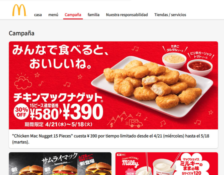
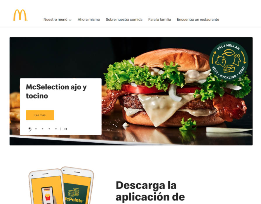
Comparing the Japanese McDonald’s website with the Swedish one, we can see that the colours in the former have remained (red and yellow), while in the latter, they have changed to yellow and dark green. The same is true for the websites of China, the United States, Turkey, Australia, and South Africa, among others.
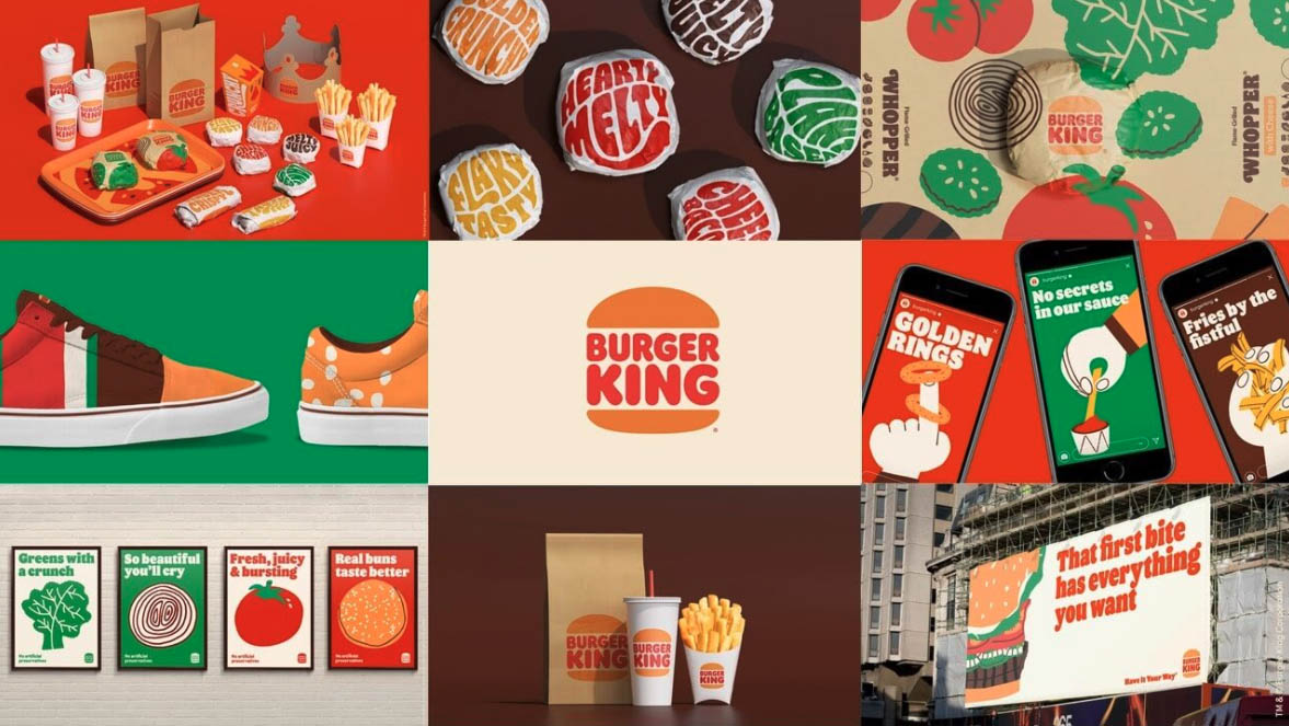
Recently, Burger King decided to completely redesign its visual identity. The difference from its main competitor’s previous action is that Burger King changed the brand’s aesthetics without altering its objectives and values. This is what we call restyling.
Currently, the company has 18,000 burger joints in over 100 countries and US territories. Although rebranding is more expensive, changing all the brand’s touchpoints still requires significant capital investment.
According to Jones Knowles Ritchie, the New York agency responsible for the redesign, the purpose of this brand change was to make Burger King feel less synthetic and artificial and more appetising and tasty.
How did they manage to convey this concept? Do you think they succeeded?
Using close-up shots of the food to highlight the ingredients, grill marks, and fresh vegetables immerses the consumer in a tasty experience. The new typography, colour palette, and illustrations by Cachetejack give the brand a more organic, dynamic, casual, and natural style.
As you can see, controlling public opinion about your company, defining a corporate identity, and creating memorable retail branding ensures enhancing your brand’s visibility and positioning.
If you want to learn more about how to do this, I invite you to start creating your marketing strategy by reading: Marketing for Businesses.
You may also be interested
open
08:00 AM-18:00 PM Monday – Friday
08:00 AM-18:00 PM Monday – Friday