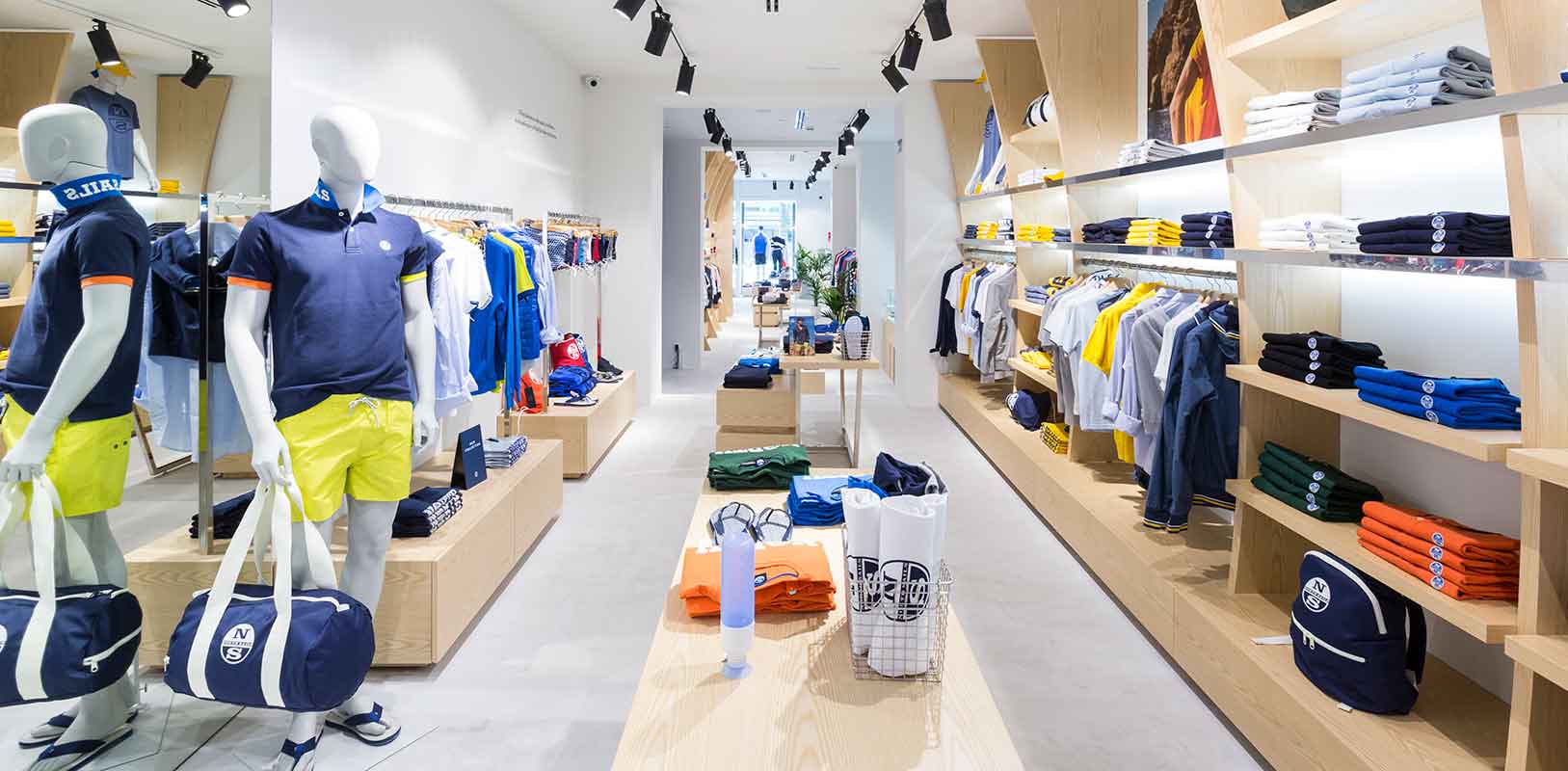
Gone are the days when businesses barely had to worry about competition. It was easy to attract potential customers and retain them. Today, your competitors are everywhere, either on the same street or just a click away online. So, what can you do to make customers prefer you?
There are two powerful tools that can become the key to your business: brand image and shopping experience. Retail furniture is directly linked to these two concepts.
Opening or refurbishing a store is like a blank page for a writer. The furniture are the words that give meaning to that page, the essence and soul of the message you want to convey.
The fierce competition nowadays has forced businesses to differentiate themselves to attract consumers’ attention. Personalising your store with a unique image through furniture is the ace up your sleeve to stand out.
Every brand is tied to values that must be communicated in your store. When a customer enters, they should instantly perceive this message. The furniture in your store are not passive objects; they become active elements responsible for conveying these crucial values.
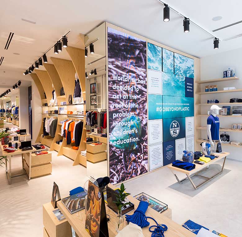
Manufacturing and installation for North Sails store in Madrid by INSTORE
“The furniture in your store are the true protagonists. They bring value, essence, and soul to your business”
Branding is defined as the comprehensive management of all tangible and intangible elements surrounding the brand, aiming to convey a promise essential for creating a coherent and recognisable brand image. The design and choice of furniture must align with this brand strategy, making it an essential point for impeccable branding efforts.
Besides aesthetics, furniture must also fulfil functionality and viability. Beautiful but impractical furniture serves no purpose. Retail furniture should be designed with the customer in mind. It should display products attractively yet accessibly, allowing customers to find and grab items easily. The material should be durable, practical, and easy to clean.
Moreover, furniture helps create spaces within your store. It’s about strategy; the furniture should establish a flow that encourages customers to explore every corner, viewing each product.
Choosing materials should not be left to chance. Materials have their own meanings and convey sensations, so they must align with the brand.
“A perfect balance between functionality and aesthetics marks the difference between a beautiful piece of furniture and an extraordinary one”
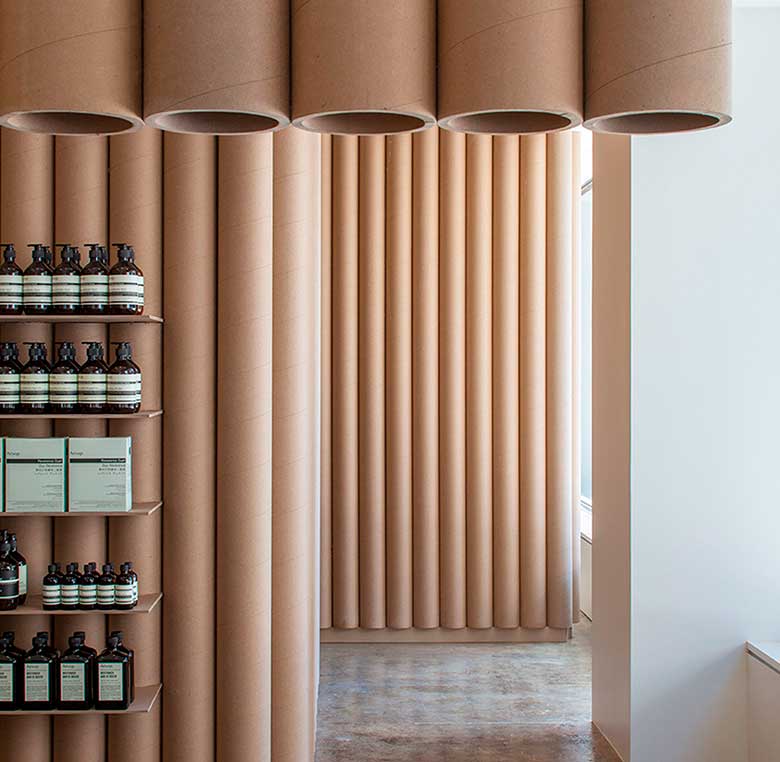
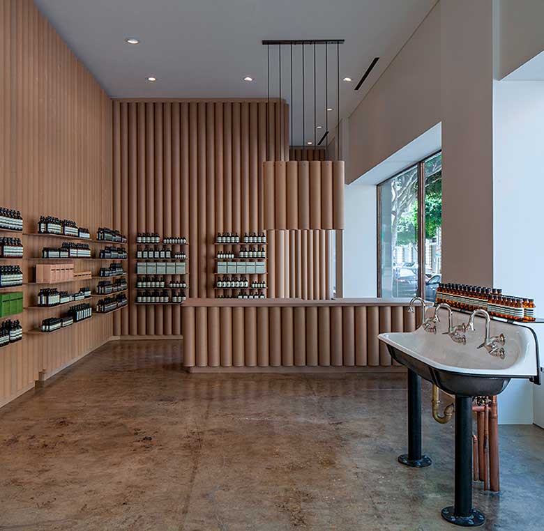
Aesop DTLA store interior, designed by Brooks + Scarpa Architects with cardboard tubes
In addition to conveying your brand values, you must provide the best possible shopping experience for your customers. This will set you apart from competitors.
Have you ever entered a store and left without finding what you were looking for because the products were poorly displayed, and there was barely room to walk? This results in a bad shopping experience for the customer and a lost sale for the retailer. What’s missing? Something essential: the furniture. If your product is good, the customer’s experience in your store should be even better. Achieving this is simple: you need functional, accessible, aesthetic, and attractive furniture.
Both the design and layout of retail furniture impact the shopping experience. Once a customer enters your store, the furniture layout guides and assists them in moving around and locating what they seek.
It’s also crucial to know what products will be displayed and where. This ensures each piece of furniture serves its purpose correctly.
“To ensure a great customer experience in your store, furniture is your best asset”
Additionally, factors like maintenance, durability, lighting, compliance with regulations, whether it will integrate digital devices, and if it will be static or mobile, must be considered. Remember, furniture can either enhance or detract from your product’s value. There are no grey areas; furniture can be your enemy or, with good design and placement, your greatest ally.
Decoration, ambiance, product placement, customer service, lighting, and even the store’s scent, combined with retail furniture, will seduce the buyer, enhancing their shopping experience and leading them to purchase your product.
Various stages in the manufacturing of retail furniture are crucial and meticulously managed:
1. Design
This key phase requires significant effort, involving numerous meetings with the client to understand their needs, goals, and limitations. Needs assessed include:
After understanding the client’s objectives, measurements are taken if specified, or a conceptual drawing is created. Designs are developed on paper or rendered digitally for client proposals, producing samples and plans until the perfect furniture piece is achieved. Upon approval, technical details are finalized for production.
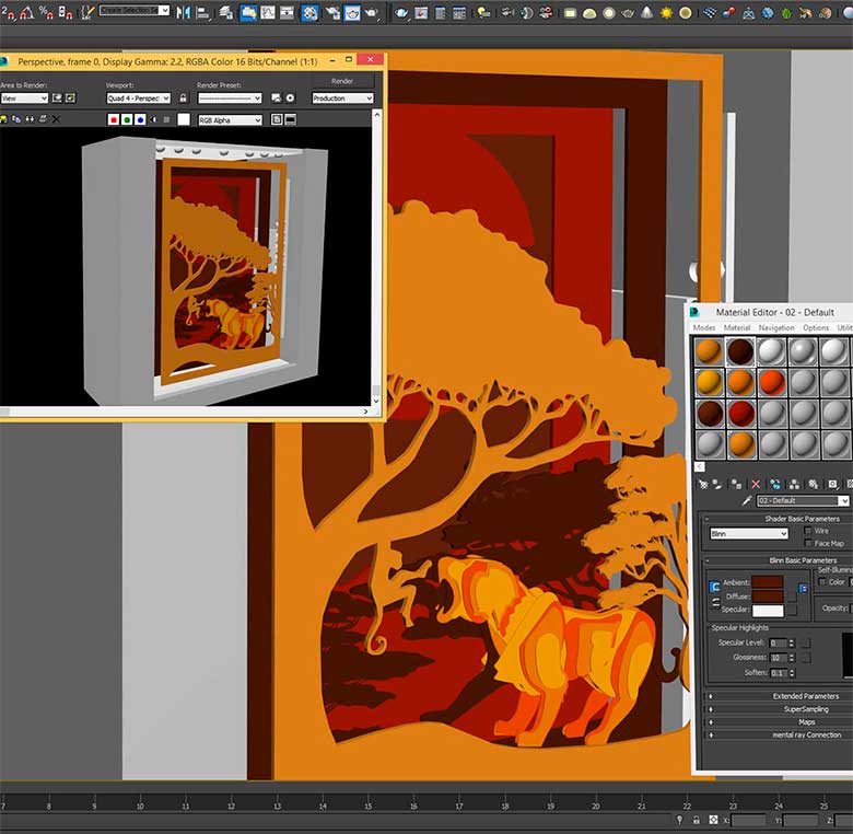
Decorations produced by INSTORE following the designer’s guidelines, handcrafted from 3D animal puzzles to the backdrops that frame the final result.
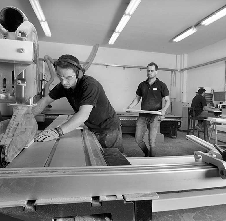
INSTORE’s own carpentry workshops, where the project is brought to life artisanally.
2. Manufacturing: In this phase, furniture and elements defined in the design stage are produced. The construction plan and render detail each aspect: dimensions, materials, finishes, and colours, ensuring unity in projects.
Integrated service providers ensure quick production and resolution of any issues or changes.
3. Logistics: storing products in warehouses until distribution.
4. Installation: The final step is installing the furniture at the point of sale. This delicate phase requires meticulous attention to client instructions for optimal results.
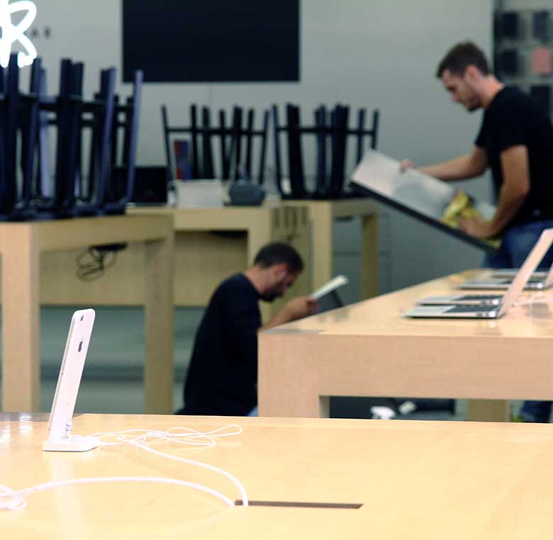
Installation of furniture and promotions with a guarantee on all projects managed by INSTORE.
Gondolas: Horizontal separators used for various displays, storage, promotions, and sales, forming aisles or islands in commercial spaces.
Gondola End Caps: Ends of gondolas used for promotions, with products rotating every 15 days.
Stand Furniture: Brand-specific furniture for promotions, tastings, demonstrations, typically temporary.
Tubs: Large open containers for product display.
Wall Shelving: Similar to gondolas but single-sided, placed against store walls.
Showcases: Generally used for high-value, small items like jewellery.
Screen Furniture: Incorporates screens for audiovisual communication with an attractive container.
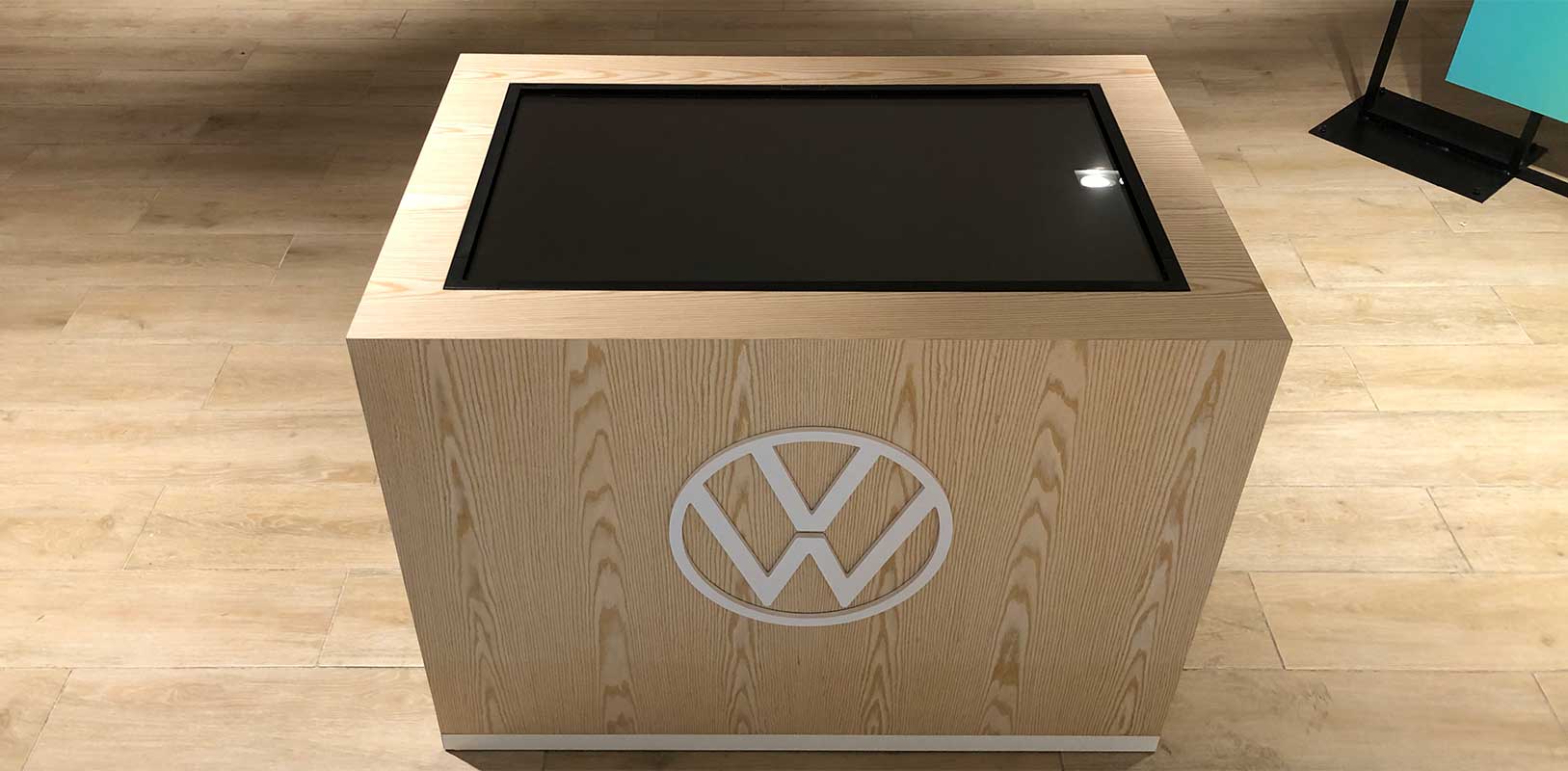
Production and installation of custom furniture for digital technology at the Volkswagen event by INSTORE
Containers: Exhibitors with ample merchandise, often metallic or wooden, presenting products disorderedly.
Bull Basket: Large, tall metal containers for displaying items.
Checkout Furniture: Dual-purpose for service and product access.
Check Out: Specific furniture for impulse buys at exits.
Displays: Adapted furniture for attractive product presentation, with various types.
There are different types of displays:
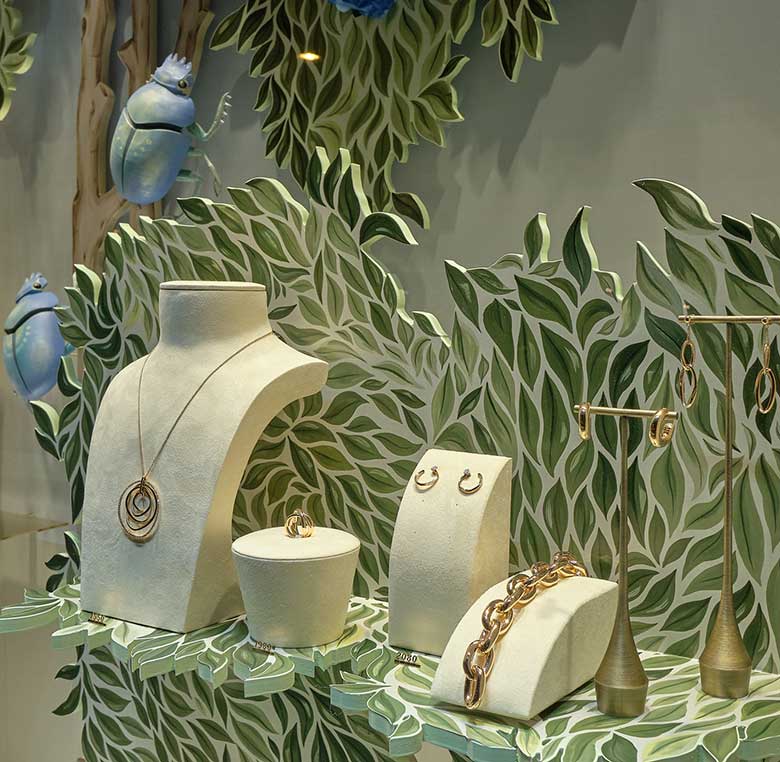
Vinyl-coated wooden displays with digital printing imitating trees for luxury jewellery store windows at RABAT in Madrid and Barcelona by INSTORE
Vision is fundamental, influencing the shopping experience significantly. Proper lighting highlights the exterior and interior, enhancing the shopping experience.
A dark, poorly lit store frustrates customers, while a well-lit store encourages purchasing.
What feelings does lighting convey?
Lighting goes far beyond simple visibility; it has a strategic functionality. Your sales will drastically increase if you have well-lit furniture that showcases products attractively. There is a wide range of lighting possibilities. But be careful, they must always align with the style of your store, the product, and your furniture.
Finding harmony and balance will be crucial to the success of your project. Which one suits you best?:
Halogen
Highlights details with warm light, although it loses intensity over time.
Metal Halide
The best for product lighting
This is a very bright light that respects the natural colour of objects without altering them. After being switched on, it requires a stabilisation period. Its good performance and optimal colour reproduction make it the ideal type of light for display furniture showcasing products.
Fluorescent
General lighting with low consumption and little output, suitable for spaces requiring long hours of illumination.
LED
The light of the present and future
The light with the most promising future due to its efficiency, low consumption, and high performance. Today, it is the type of light that allows for low consumption while maintaining high efficiency. Additionally, it emits very little residual heat and offers vast possibilities thanks to its extensive range. Although its price is higher, it is more cost-effective in the long run.
“LED lights are the present and future. An investment yielding significant benefits”
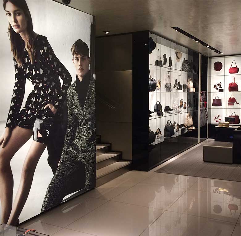
Furniture lighting in Armani boutiques to enhance their products by INSTORE
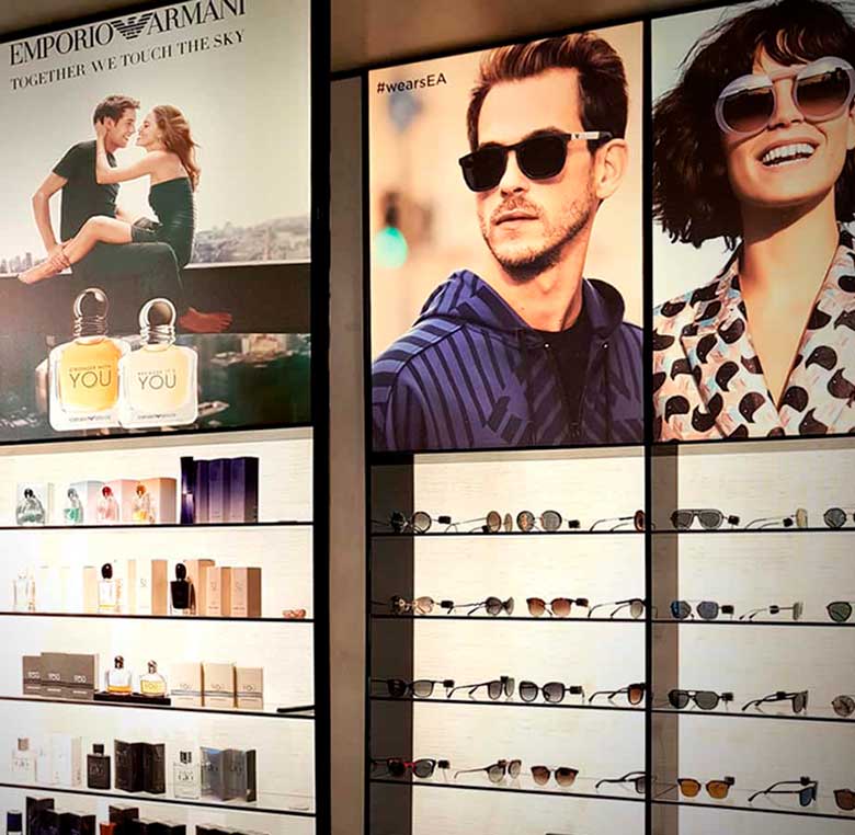
Decoration in Armani store with light boxes that also provide illumination by INSTORE
The different types of materials and their combinations in design offer endless possibilities. But be careful, don’t forget that small details make a big difference! Each material provides different benefits, and this should align with the message you want to convey. Do you want a warm, rustic atmosphere with wood, or do you prefer modern decor with acrylic?

Artisanal work by INSTORE in wood for Hermès window displays, layering different panels to create depth.
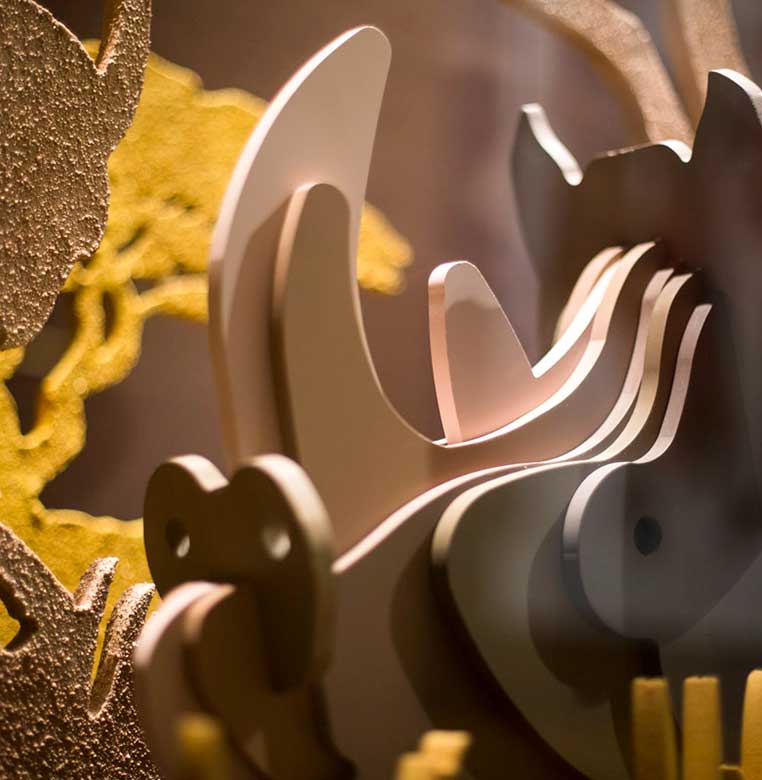
Window dressing with cut and printed acrylic for Chanel by INSTORE
The human mind needs visual order, and commercial furniture is responsible for providing that order in your shop. It allows the buyer to understand what products you sell at a glance and in which sections they are organised. Additionally, it should make visitors feel comfortable by offering a space that is welcoming and adapted to their needs.
Another important aspect to consider is product visibility. It has been proven that we buy more of what is at eye or hand level (some studies claim up to 35% more). In contrast, what is above or below eye level is much less noticeable.
Therefore, the different heights in the placement of shelves, display cases, and other commercial furniture will be a fundamental element when designing the space.
“Both furniture distribution and product placement are key elements that will increase your sales”
Furniture should be arranged in spaces in a way that allows the customer to move through the area easily and comfortably, avoiding obstacles or barriers that hinder the flow. To ensure that users enjoy their visit to your shop, wandering through every corner and observing each product leisurely, it is essential to create a proper arrangement of furniture in harmony with your brand image.
To start, you need to identify the main areas that divide your shop. These could include: the facade and window display, the access area, the product display area, the checkout area, and auxiliary spaces (changing rooms, restrooms, storage, etc.).
Next, recognise which of these areas are “cold” or “hot”. Hot areas are where the customer spends more time and which are of greater interest to them (entrance, counter, window display). In contrast, cold areas receive less attention (exit area).
It is crucial to clearly distinguish your “hot” areas to maximise their potential and reinforce the “cold” areas to create points of interest that attract the visitor.
The most common layouts are:
1. Straight Grid Layout:
This involves placing the furniture in a straight alignment relative to the customer flow. This flow is characterised by allowing customers great freedom to choose their own path through the store. Consequently, customers might opt for the shortest route, which is not ideal as some parts of the shop might be left unseen. However, there are also certain advantages: the space is maximised since the entire selling area is utilised. It facilitates shopping for customers, as after several visits, they become familiar with the exact placement of sections and products.
2. Herringbone Layout:
This involves positioning the furniture at an angle to the customer flow. This type of arrangement guides the customer’s path through the store and makes it easier to view multiple gondolas simultaneously, thereby encouraging impulse purchases. The disadvantage, compared to the previous layout, is the inefficient use of space.
3. Angular Layout:
This furniture arrangement is characterised by having a central aisle with secondary and tertiary aisles that are not perpendicular to the main one. It allows customers to access the central aisle from any point in the store, exposing them to a greater number of products. Similar to the herringbone layout, its disadvantage is the inefficient use of space.
4. Freeform Layout:
This involves placing the furniture without following any regular pattern, using differently shaped furniture to create specific environments. The advantage is that it can give the store a unique and distinctive style compared to competitors. It is the most creative layout, making it ideal for a leisurely and enjoyable shopping experience. The downside is that it requires non-standard furniture, which is consequently much more expensive and not reusable when it comes to rearrangement or renovations.
5. Closed Layout:
This layout divides the store into sectors or sections, giving each a different identity with various colours, styles, and environments. These sections are defined with walls, displays, or furniture that segment the store and prevent the total space from being seen at once. This approach incurs higher costs compared to an open layout.
6. Open Layout:
A store with an open, spacious environment featuring low furniture and a completely open space, surrounded only by exterior walls. The entire space can be seen from any point in the store, with no obstacles obstructing the view. There are no divisions, which may create confusion for the customer.
Following these key points, the importance of furniture in your commercial space is evident. There are numerous aspects to consider when choosing and designing your commercial furniture. If done consciously by professionals, with a prior study and in harmony with your message and brand image, it will cause your sales curve to rise dramatically. Your customers will be attracted to your shop, and once inside, they will find the peace and comfort that will encourage them to carefully observe each of your products and buy without hesitation.
Without a doubt, commercial furniture is your great ally, your winning horse.
You may also be interested
open
08:00 AM-18:00 PM Monday – Friday
08:00 AM-18:00 PM Monday – Friday