
In recent years, physical points of sale have undergone constant evolution due to changes in consumer behaviour. Currently, when designing a shop, the main objective is to create a unique shopping experience. Due to the high volume of competition and the excess of information that customers possess, you must differentiate yourself from the rest and make your establishment the most attractive.
Randomly displaying products as was done in the past no longer works. You need to focus on understanding your customers and offering them what they need. The key to creating an innovative shopping experience is attracting your customers with appealing visual communication.
Visual communication is an essential tool at your point of sale if you want to engage with your customers and convey your brand’s values. Moreover, through these visual elements, you can surprise and impact your buyers.
In essence, it is a tool to make yourself known. The role of emotions is fundamental to reaching people and generating loyalty. However, this point is difficult to achieve and is only obtained through direct and clear communication, creating tailored experiences. If you manage to make the customer identify with your brand and feel part of it, you will have successfully fulfilled the function of your point of sale.
But what does visual communication entail? Well, it is the transmission of ideas and information in forms that can be perceived entirely or partially through sight.
Visual communication typically appears in various forms and media, such as signs, typography, drawings, graphic design, illustration, industrial design, advertising, animation, architecture, fashion, colour, and electronic resources. Remember that a text accompanied by a visual message gains more power to inform or persuade someone.
For all these reasons, visual communication is crucial to attracting the consumer. This is where signs and lights play an essential role. These can never be missing in your shop, as they are the business card of your brand and differentiate you from the competition.
Every day, customers must decide between thousands of stimuli from all the options the market offers. Therefore, take the reins and make your message stand out from the rest.
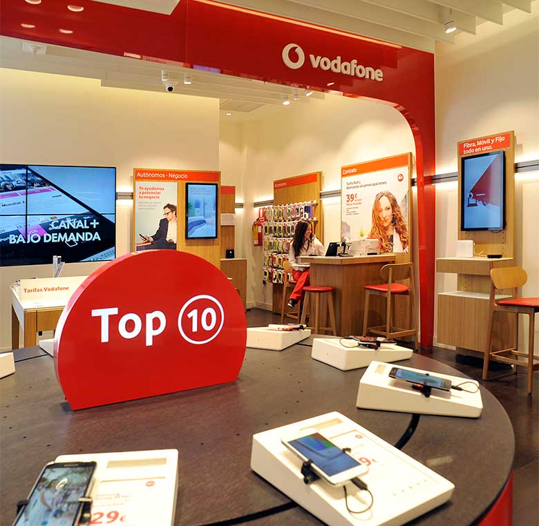
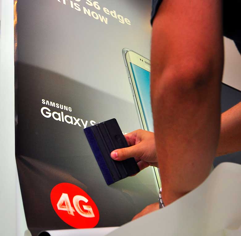
“Visual communication is necessary to achieve a positive customer experience at the point of sale, to elevate your corporate image, and to increase customer traffic in your physical store.”
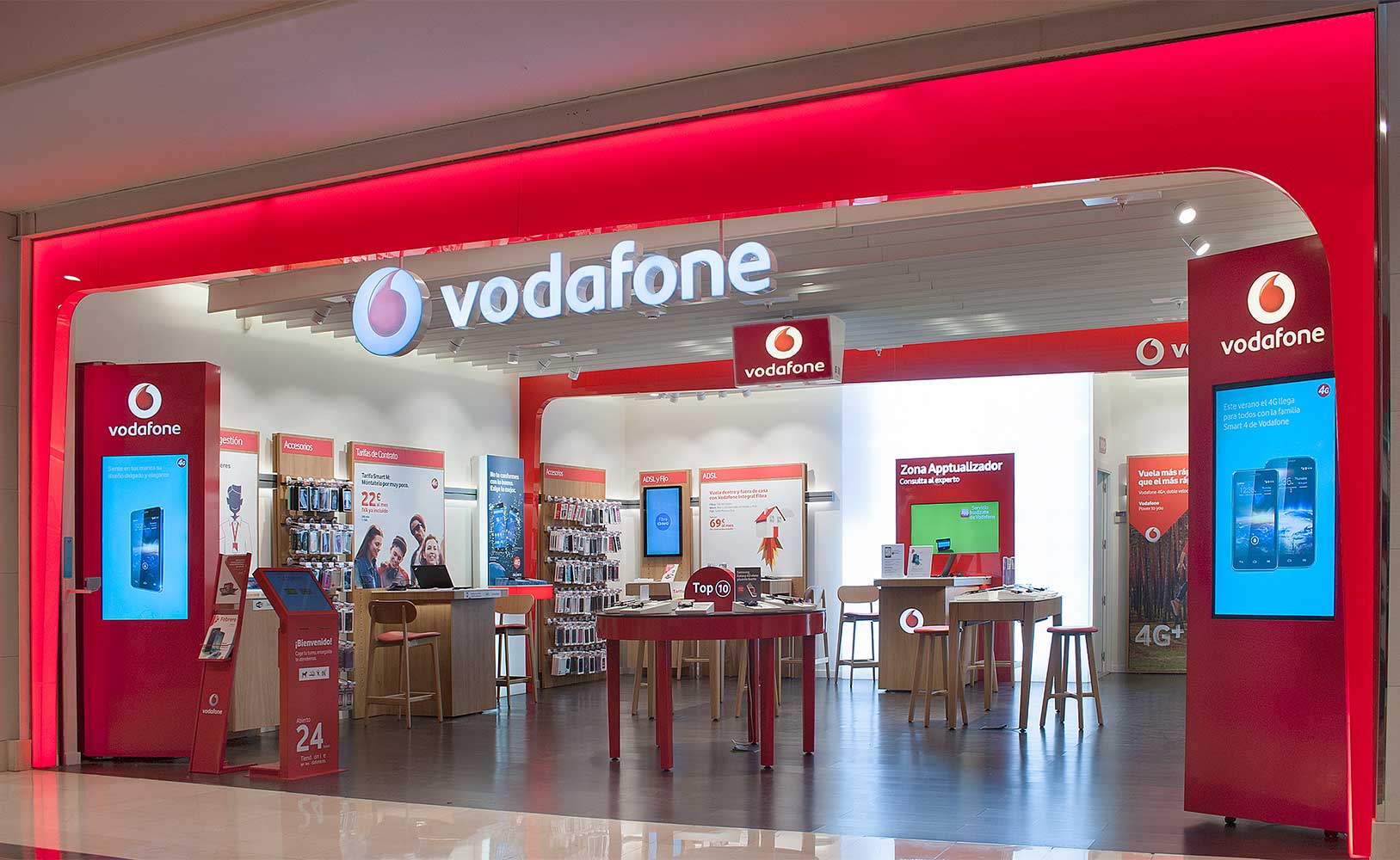
As mentioned, enhancing the visual image of your point of sale has become an essential objective, which is why signs and lights have become so necessary that you see them in all physical shops.
A sign consists of a symbol and/or text that represents the values of a product or service and identifies your business, making it recognisable and positioning it within your market niche.
In the retail world, generally, the sign contains the company’s name.
On the other hand, illuminated signs have the same function, but they have the advantage of being visible both day and night. These usually display your brand’s logo and/or a catchy slogan with a very direct and clear message.
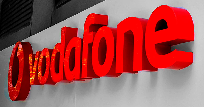
When deciding on the right sign, you will need to make several decisions. Let’s start by looking at the different types of signs you can find. There are two main groups:
Non-illuminated Signs: these signs are usually the most economical and are ideal for points of sale located in well-lit areas during all business hours. They can also work in businesses that open only during daylight hours. Here you can find:
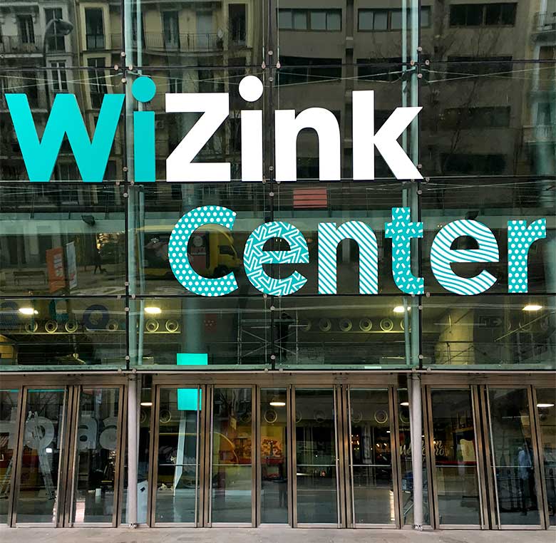
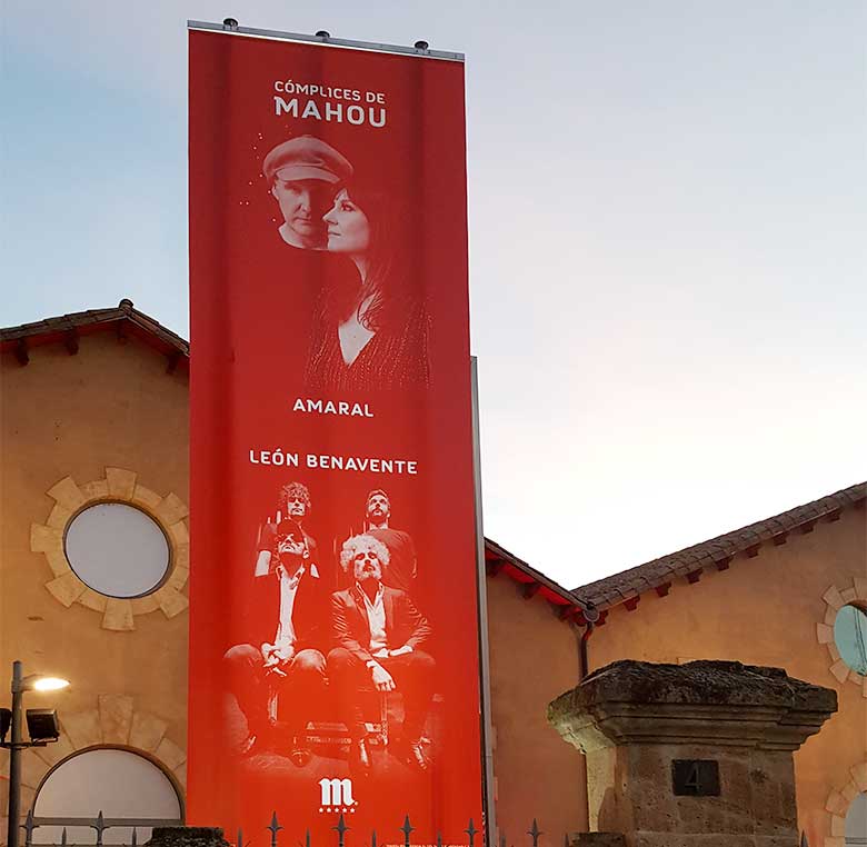
1. Single-sided non-illuminated sign: these are placed on the wall and are the most used, as they can be found in various shapes and colours. This type of sign allows your visual communication to be original, different from your competition, and not unnoticed by any passer-by.
2. Non-illuminated hanging sign: perfect for combining with illuminated signs, enhancing the brand’s visibility.
3. Double-sided textile hanging sign: ddeal for combining with illuminated signs, enhancing the brand’s visibility.
4. Vintage double-sided non-illuminated hanging sign: placed on the side of your facade, these signs have an old-fashioned touch that transports any passer-by directly to the past. One of the most original and striking signs.
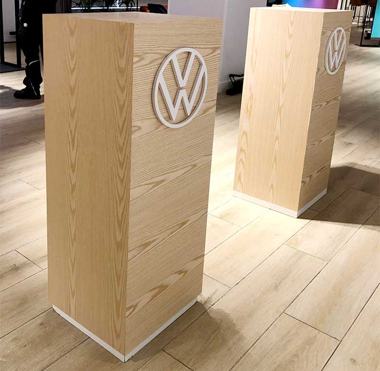
5. Double-sided non-illuminated totem: this type of sign is an excellent element for supporting the advertising of your point of sale. You can use it in campaigns and promotions to encourage product sales.
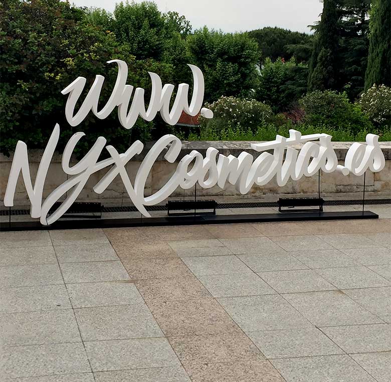
6. Non-illuminated 3D letters: these are 3D letters of a specific thickness. This type of signage allows you to offer a highly impactful message, mainly due to the volume and decoration they create. They can be used both indoors and outdoors, facilitating the creation of an appropriate corporate image.
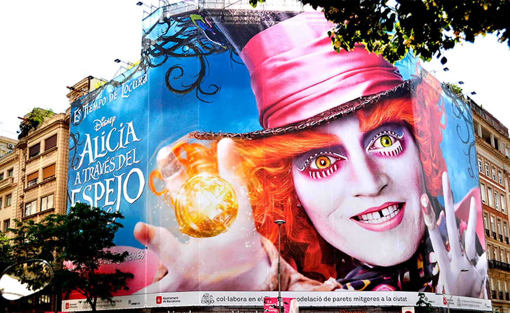
7. Non-illuminated digital print canvas on a frame: One of the most economical signs, which works well in indoor spaces like shopping centres. It is a very practical element that also serves to advertise events, to place temporarily in ephemeral spaces, or to communicate specific campaigns. It can have one or two sides, depending on its location.
Illuminated Signs:
These signs are the most well-known, as they are visible for more hours, but their drawback is that the business owner will have to pay an additional cost for electricity consumption. Most businesses choose this type of sign because the investment is worthwhile. If your point of sale is in a highly competitive area or you want to maximise your visibility, this is the type of sign you should choose. Here you can find:
1. Single-sided illuminated signs: These are usually placed on the wall and come in many formats, from geometric shapes to more organic forms. One of the most used, as it allows for various manufacturing options based on a wide range of materials and finishes.
2. Double-sided illuminated hanging sign: These signs are very effective on busy streets or intersections, as the sign is visible on both sides of the pavement, helping you stand out from the competition. The edges of this type of sign can be straight, round, or oval.
3. Double-sided illuminated vintage hanging sign: A vintage illuminated sign placed on the side of your business for a very original touch. These retro signs are a perfect way to attract your customers’ attention.
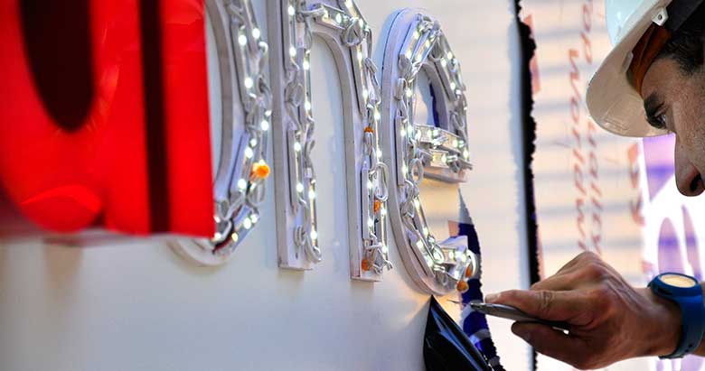
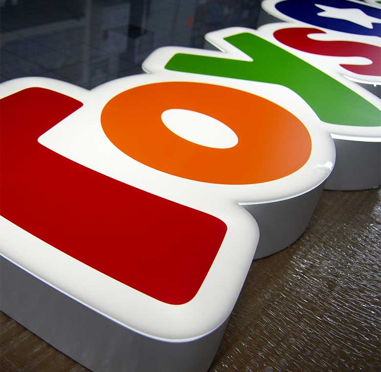
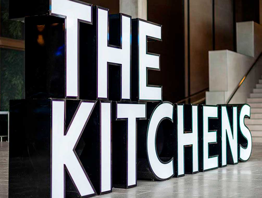
4. Illuminated 3D letters: These consist of independent letters of a specific thickness, giving the brand more body and strength. One of the most attractive options used by brands in the retail world for its elegance and wide variety of materials, colours, and finishes. The lighting of these signs can be direct or indirect, increasing their visibility and presence.


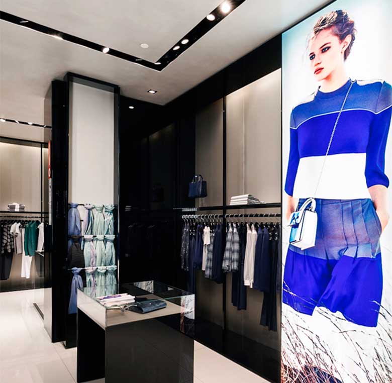
5. Backlit digital print canvas on a frame: These are canvases made of materials that allow light to pass through, ensuring bright and defined colours with a light source at the back. This makes your advertising message shine on its own, providing a great visual impact at a very competitive price. Ideal for shop windows and decoration in shops and stands, where your advertising will stand out more than ever, making it livelier and more elegant. Safe and durable, backlit canvas withstands tension well and is highly flexible, making it an ideal material to avoid impacts.
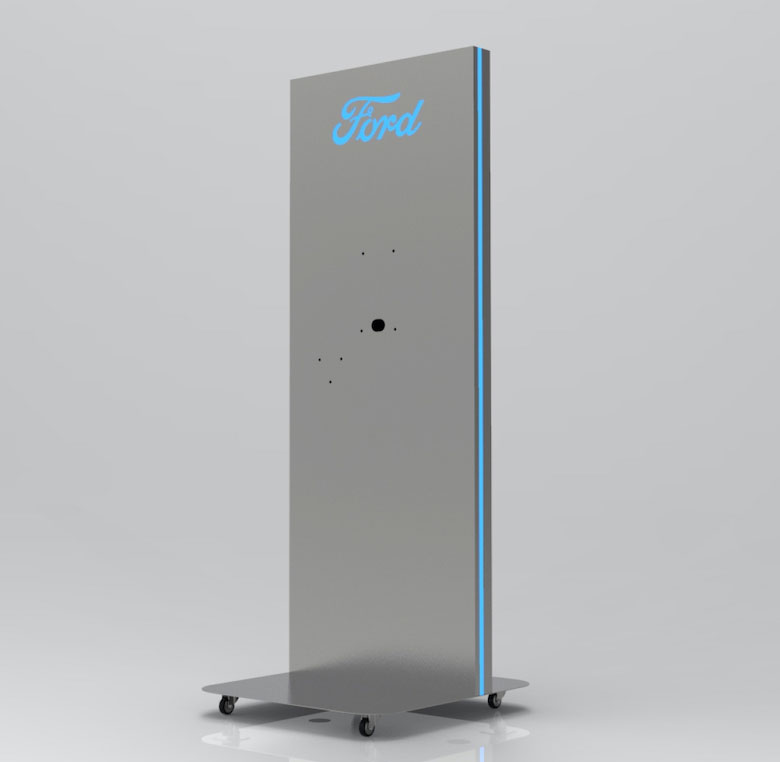
6. Double-sided illuminated totem: A promotional element that, thanks to its interior lighting, enhances promotion and generates a significant impact on your buyer. This sign will directly encourage your customers to purchase your products.
The main use of placing a sign at your point of sale is to attract customers and communicate the essence of your brand, making them feel the need to enter your store. Now, let’s go a bit further. What benefits will the presence of a sign bring to your shop?
“A sign is the quintessential element to make your point of sale visible to your customers from long distances, which is why the retail world does not hesitate to add it to their designs”
Customers will see you more easily: If you consider all the factors when designing a sign, the most important thing is not just that your customers see you easily but that they feel attracted by a call to action, encouraging them to choose your store.
They will remember your corporate image better: Signs are marketing tools that enhance the memory of your brand. This is very important for keeping your brand in the customer’s mind and increasing their interaction with it.
Stand out from the competition: Most establishments share a zone with the competition, and the customer has many options. Designing an attractive sign will encourage the customer to enter your physical shop before another competitor.
A decorative element: It is very important that the design is integrated into your shop’s decoration, maintaining the same style as the rest. A well-designed sign enhances the decor of a business.
Signs inside: To enhance your visual communication, you can use signs inside your point of sale, becoming a surprising element since it is uncommon.
Innovate in materials for your signs: If you follow trends and novelties when designing your sign, you will see which materials are more attention-grabbing, economical, or lighter. This will help you surprise the consumer and use the most suitable sign for your visual image.
Place them in different areas: Adding surprising elements to your design is attractive and original, and playing with the placement of a sign is too. Placing it in different locations will be attractive to the consumer.
Exterior signs are the most important since they are the first thing your customer will see of your shop. These signs must be designed with materials that withstand different weather conditions. However, when choosing materials for interior signs, we can be more flexible as they are exposed to less harmful conditions for their durability. The most commonly used materials for sign fabrication are:
Acrylic. This material has a high resistance to sunlight, is very manageable, and comes in a wide variety of colours and finishes. Additionally, one characteristic that sets it apart from other materials is its transparency and different opacities.
Stainless Steel. This material is not economical, but the result is very sophisticated. It can be perfectly combined with backlit materials and is currently in high demand. It is a durable and resistant material.
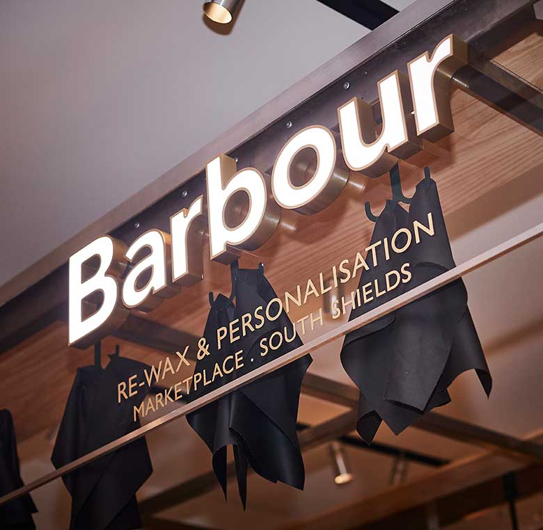
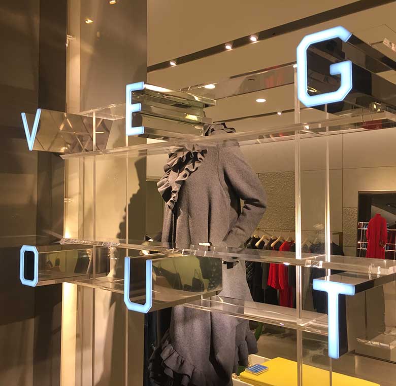
Steel sign in Stella McCartney Madrid boutique made by INSTORE.
PVC. The main feature of this material is its price, as it is very economical. Additionally, it has great resistance and many customisation possibilities, a significant advantage for your design. Moreover, it withstands weather conditions very well.

PVC. The main feature of this material is its price, as it is very economical. Additionally, it has great resistance and many customisation possibilities, a significant advantage for your design. Moreover, it withstands weather conditions very well.
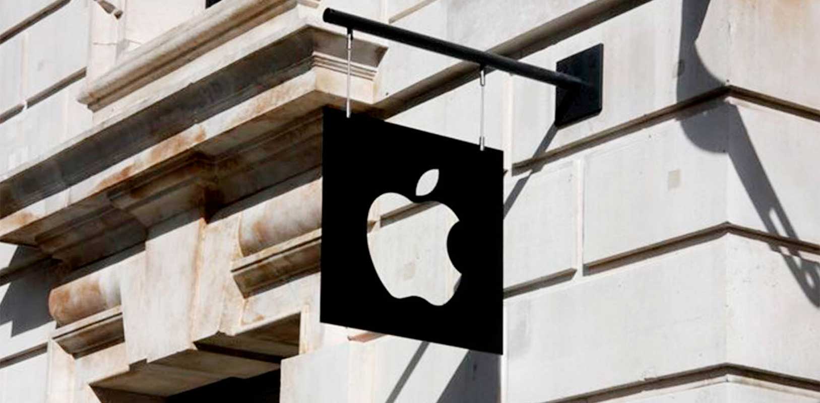
Constant innovation is a key feature of a successful business. Updating every detail of your point of sale will make your business attract and surprise more customers. Therefore, you should stay informed about the latest trends and innovations, ensuring no element of your establishment appears outdated. Here are the most popular signage trends seen over the past year that have undoubtedly been successful:
Having an original sign is essential to attract customers. By creating a common design, you will not surprise consumers or differentiate yourself from the competition. Therefore, playing with colours and shapes during the design process will help you create a sign that meets your objectives.
If your sign is non-illuminated, you should play with colours to make it stand out. It is common to look for a contrast between the background colour where the sign is located and the colour of the sign itself. If your sign is illuminated, you will have the option to choose striking colours that contrast with the background and attract customers. Combining both types of signs has also become a very appealing and original idea.
Using striking colours will always help you attract customers. Remember to design your sign with your corporate image in mind. Additionally, you can give it different shapes to surprise passers-by.

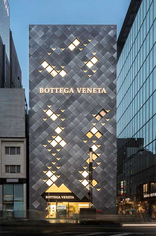
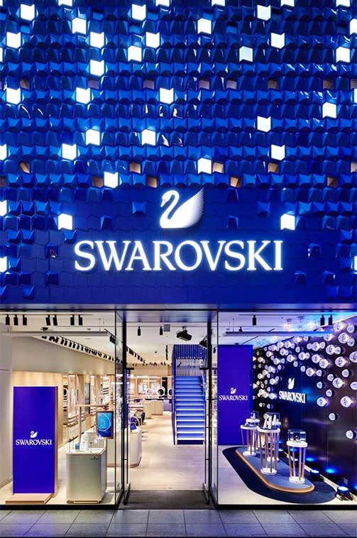
Flagship store in Ginza Tokyo with backlit sign and diamond effect facade lighting.
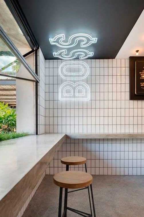
The classic positioning of signs is sometimes a bit boring. That’s why in the retail world, you can find designs that are not very original but are strategically placed to attract customers. Perhaps by making an economical and minimalist sign and positioning it differently, you can amaze passers-by with the idea and invite them to enter your point of sale, which is your main goal.
With all this information, you can see the importance of the visual communication of your establishment and the necessity of designing a good sign for your physical shop. When deciding, you must consider many factors: colours, shapes, location, size, and whether you want it to be illuminated. The most important thing is to have clear objectives and ensure that your sign’s design aligns with the rest of your shop and brand image. So get to work and invest in signs and lights to improve your business’s profitability.
You may also be interested
open
08:00 AM-18:00 PM Monday – Friday
08:00 AM-18:00 PM Monday – Friday