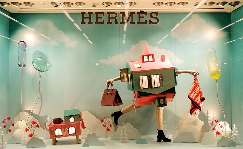
Consumers’ exposure to vast amounts of visual stimuli has made them immune to traditional advertising strategies. The challenge of capturing the attention of potential customers has increased. However, by understanding consumer behaviour, businesses can enhance the appeal of their commercial spaces through sensory stimuli; ultimately, we must reinvent ourselves.
The store window is a draw, an opportunity to introduce ourselves as a brand and showcase what we offer as a counterpoint to our competitors. Therefore, it is essential to know the keys to good store window design.
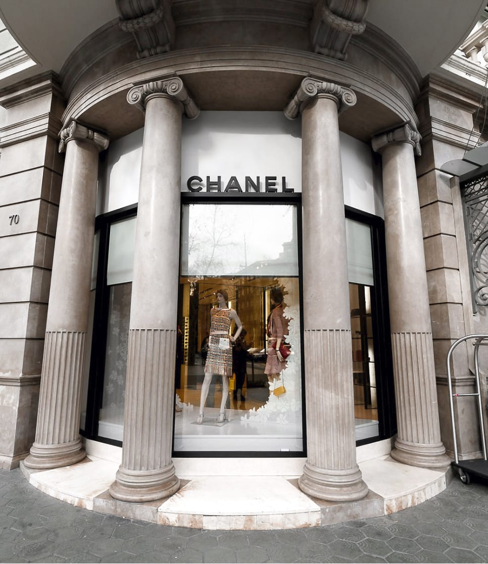
Store window display for Chanel Barcelona by INSTORE
Specifically, at eye level.
It’s no coincidence that the sign is placed at the top of the facade; since it has the least visibility, it is the last thing the passer-by notices, and that’s where the signage and informative signs are installed.
In contrast, products and decorative elements are placed at face height, giving them a greater visual impact. Identifying a point of interest will help us create an engaging composition around it.
An admirable set design is the infallible way to capture attention and make the most of visual merchandising. A proper display in the store window will make it appealing enough for potential buyers to stop, without being overly complex or cluttered. For this reason, the first impression is essential, and the success of this relies on the store window’s decoration.
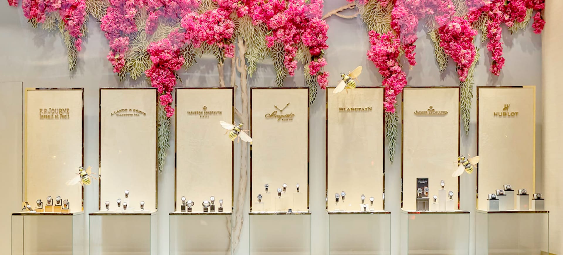
But what exactly is decoration? Is it merely what adorns our products? Not at all. Commercial interior design goes beyond displaying your products in a showcase; your items should integrate into the setting, blend with it, and still maintain their prominence. Store windows are creative and dynamic spaces that allow you to explore new ways of product display.
Something crucial when thinking about store window decoration is lighting. A display window with poor lighting will go unnoticed, no matter how original it is. Creating contrast between light and shadow allows us to highlight the outlines of the decor, add volume to our products, and intensify sensations. Our aim isn’t to illuminate the space but to create an atmosphere that matches the scene we’ve proposed.
Creativity involves reinventing oneself and finding an alternative solution to a problem already solved. Placing the product on a display unit seems to be one of those tasks with an obvious solution. But what if we reimagined the concept of product display? Hermès Spain did just that with the Savanna window display project, creating spectacular and creative store windows that left no one indifferent.
Adding movement and interactivity to your store window is an infallible technique for ensuring your business’s exterior design succeeds. Sensory experiences are more memorable than any other stimuli and prove to be an effective strategy for promoting your business.
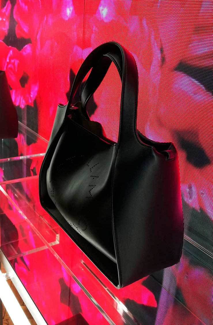
While technological store windows can be costly, there are affordable alternatives to consider. Digital signage and LED screens, for instance, hold great communicative value between the brand and the customer. Coupled with a well-developed marketing strategy, they enable your clients to enjoy interactive experiences that benefit both parties.
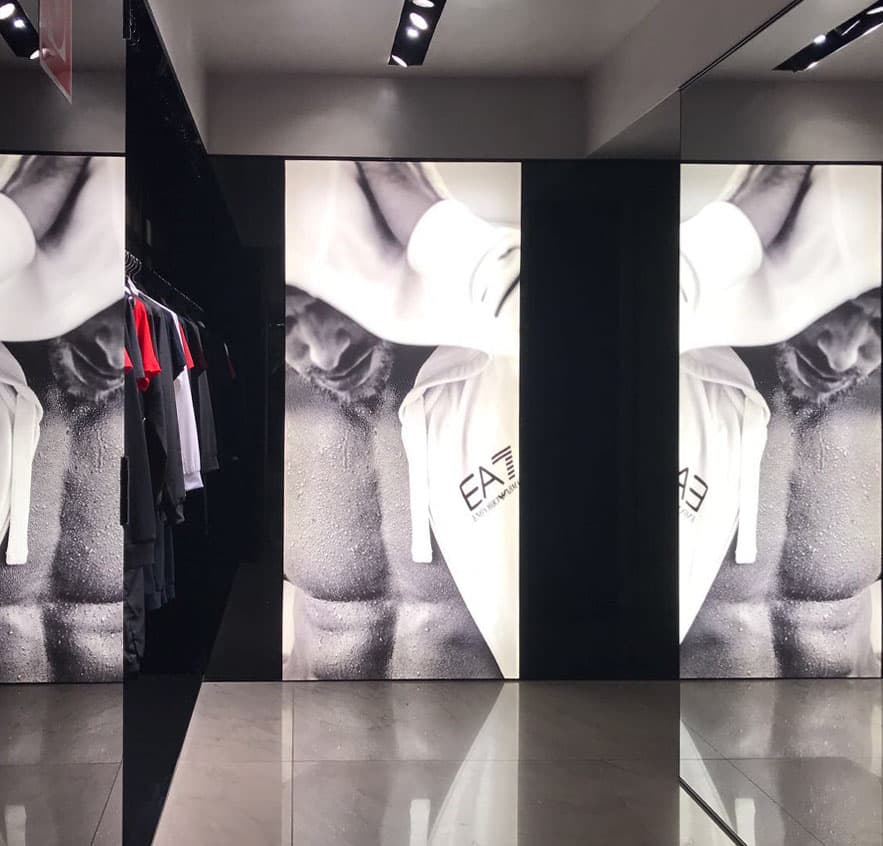
Major brands like Calvin Klein, Stella McCartney, and Armani use these in their points of sale, effectively showcasing their latest collections while creating store windows and interiors that align with their brand message.
You may also be interested
open
08:00 AM-18:00 PM Monday – Friday
08:00 AM-18:00 PM Monday – Friday