The importance of brand colours

The importance of brand colours
#
#
The importance of brand colours

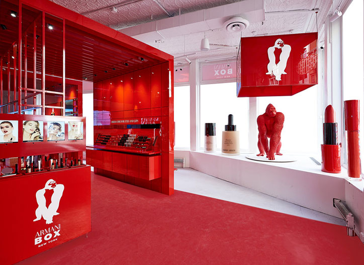
Colours play a very important role as they directly influence consumers’ emotions and represent brands.

4.6/5

Colours are more than aesthetics; each one can convey and evoke a unique sensation associated with a brand. All brands have a colour that represents them, and whenever we mention a brand, the colour is the first thing that comes to mind. To better understand the topic, let’s look at the meaning of colours and how major brands have used them effectively.

Why are brand colours important?

Brand colours are important because they reflect the essence of the company and, in the long run, become a reference that strengthens the brand. Visual stimuli capture the public’s attention, and colours play this role very well.

Initially, what customers remember most about the brand are the colours that integrate it, whether in the logo, establishment, uniforms, etc., and these precisely help to build greater intimacy.
Circle colors related to companies

What each colour means in marketing

Traditionally, colours have been classified as warm or cool according to the sensation of temperature they transmit and the states they produce in our brain. Warm colours are cheerful, intense, and related to summer months, the sun, and heat. Cool colours are associated with low temperatures, depth, and winter months. Understanding colour psychology is fundamental to choosing the best options to convey the brand message. Therefore, it is important to know what is behind each colour.
  • Blue: Conveys calmness, stability, and depth. It is often related to the sea and sky and is also associated with health, cleanliness, and seriousness.
  • Violet: Highly linked to elegance and royalty. Generally used by brands wanting to convey sophistication and luxury. It is also associated with spirituality, mystery, and magic.
  • Brown: Represents the simplicity of the earth and usually reflects strength and stability. It is a colour related to tradition and is used by classic, natural, or organic brands.
  • White: Directly associated with purity, light, and cleanliness. It conveys simplicity, trust, and minimalism. It is associated with the seriousness and transparency of brands. It is also used in high-tech products.
  • Black: The most used colour by brands, reflecting sophistication, seriousness, formality, elegance, and seduction. It also conveys mystery and can work very well when combined with other colours.
  • Grey: Evokes feelings of professionalism, stability, and credibility and is associated with technology.

Many brands make colour combinations. In these cases, two types of colour mixes should be considered: harmonious (using similar colours or different shades of the same colour) and complementary colour mixes (colours that appear opposite on the colour wheel), generating vibrant, striking, and energetic compositions. The most used colour in colour mixes is black.

Tips for choosing the best colour for your brand

To find the right brand image, you must clearly understand your brand values and the target audience. Based on this, select typefaces and colours that provide information about your business at first glance.

The following questions should be considered for the best colour choice:

  • What emotions do you want to evoke? Reflect on what emotions you want your brand to convey and use colours that align with them.
  • What tones are used in my industry and by the competition? Pay attention to the tones used by the competition to avoid choosing a colour that doesn’t look natural when associating your brand with that industry. Also, know how to differentiate yourself from the competition.
  • What is the personality of your brand? Identify the colours most suitable for conveying the personality you want for your brand.
  • Do the colours align with my message? To ensure consumers believe in your brand message, ensure the colours align with it.

Some examples

Starbucks

Starbucks’ logo evolution initially adopted brown as the brand colour, but over time it has changed to green, representing a fresh symbol with environmental awareness, transmitting a sense of security to customers.

Although its latest logo features green and white, we can also add black to its palette, used in the decoration of spaces shared with the public and in all its contents.

Starbucks colours

Instagram 

Instagram’s brand colours are a gradient from blue to yellow, passing through violet, magenta, red, and orange. The logo evolution shows an initial analogue camera with brown tones, which has evolved into a camera dominated by warm tones gradient.

Imstagram evolution colours

The predominance of these warm colours is no coincidence, as the brand seeks to convey warmth and energy through its brand colours. The variety and intensity of the tones also reflect the power of colour in the app.

Facebook 

Facebook has opted for blue, a colour that conveys calm and tranquility. It is the most natural and recognized colour by humans, as it is the colour of the sky and sea.

Blue increases trust. Royal blue represents innovation and professionalism, and like Facebook, major brands like Twitter, Skype, and WordPress, which focus on technology, use it.

Facebook evolution colours

McDonalds

Since its inception, yellow has always been present in this brand. Yellow is a cheerful colour that conveys positivity and clarity. It promotes communication and stimulates mental processes.

MacDonalds evolution colours

McDonald’s has perfectly combined red and yellow. This mix is necessary because its personality is cheerful and fun.

This past year, it presented a new logo with green due to new vegan menus, and how nature and organic products are directly related to this colour. Trends influence marketing strategies, and brands adapt to reach their audience. Tools like colour or scent representing your brand will help create a design line and a brand image that makes you recognizable and helps differentiate you from the competition.

You may also be interested

5 Examples of Companies with a Successful Corporate Image

5 Examples of Companies with a...

Corporate identity is the set of actions and reflections that a brand carries out to create…
Does your corporate image match the image you project for your brand?

Does your corporate image match the...

If your brand doesn't exist in people's minds, you don't exist either. But believe me, nonexistence…
The importance of graphic communication for events

The importance of graphic communication for...

Hoy en día la comunicación gráfica ocupa nuestra vida, la podemos encontrar en muchas situaciones para…

Subscribe to our Blog

Subscribe to stay in constant contact with us and receive the most interesting articles in the sector

  • Hidden
  • Hidden
  • Hidden
  • Hidden
  • Hidden
  • Hidden
  • Hidden
  • Hidden
  • Hidden
  • Hidden
  • Hidden
  • Hidden
  • Hidden
  • Hidden
  • Hidden
  • Hidden
  • Hidden
  • Hidden
  • Hidden
  • Hidden
  • Hidden
  • Hidden
  • Hidden
  • Hidden
  • Hidden