In these times of rapid change and evolution, window dressing and visual merchandising have gained undeniable importance. We live in the age of consumerism, with more companies emerging daily and increasing competition. Brand image has become crucial. Companies must make greater efforts to stand out, appeal to customers, and draw them to their establishments. It is not enough to have an amazing product; we must also care for our brand image. This involves creating strategies, setting objectives, and designing based on specific ideas and intentions.
"Window dressing and visual merchandising aim to make the product's display sell itself"
To better understand the different terms we encounter, we researched them and found an interesting post on the topic.
It explains how window dressing involves using all possible decorative and persuasive elements harmoniously to make a shop’s window displays generate interest among passers-by and, consequently, increase foot traffic inside the store. Meanwhile, visual merchandising goes several steps further by enhancing the shopping experience through the creation of an attractive, sensory, and emotional environment, maximising the physical space.
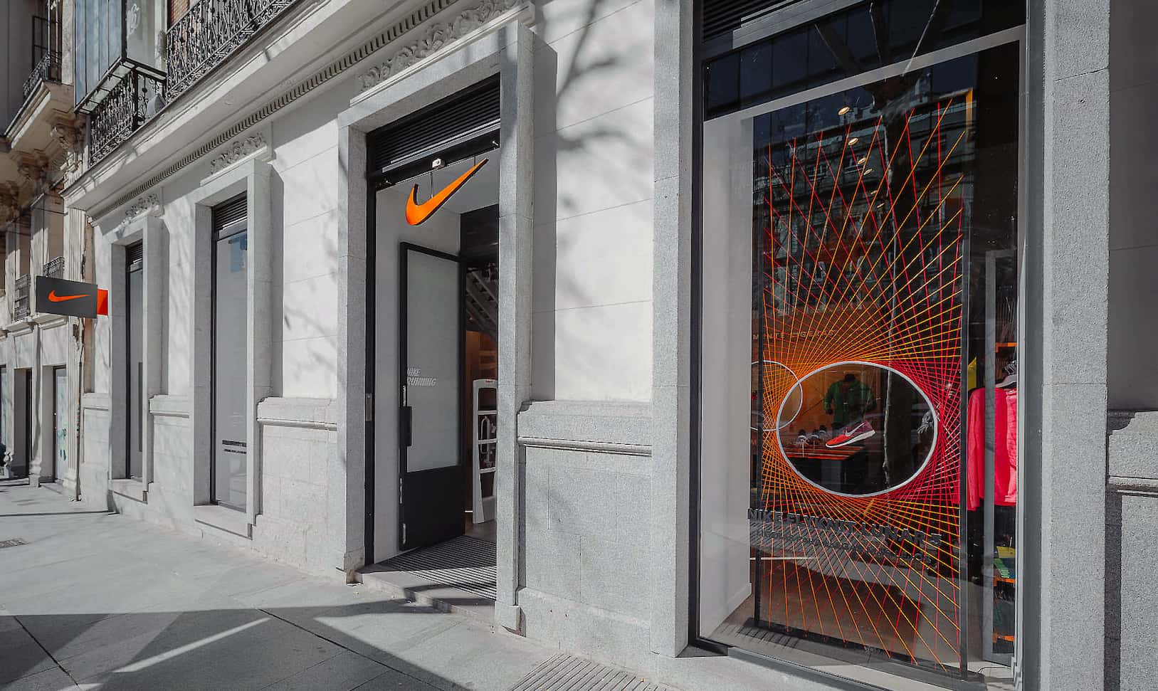
Decoración con hilo de seda en los escaparates e interior de tienda Nike by INSTORE.
"To be irreplaceable, one must always be different." - Coco Chanel
Imagine entering a clothing store and seeing each space with a different style, mismatched elements, and uncomfortable lighting—this would be a poor experience, wouldn’t it? It’s essential to think of the final ensemble, ensuring the visual composition inspires harmony. Just as various departments of a company—PR, marketing, photographers, interior designers—coordinate to launch a campaign, those responsible for visual merchandising and window dressing must work together and coordinate to achieve a unified design.
The key to success lies in the design concept. Carefully study the story you want to tell your customers. Create a simple yet powerful message that anyone can understand upon seeing your store. It’s not about decorating the store interior and exterior to be beautiful; you must convey a clear and exciting concept. Think of the most surprising window displays you’ve seen. They likely follow a specific theme with a clear narrative.
A clear example is the window displays of Hermès Paris. With each season change, the marketing department collaborates with a renowned international artist to create bespoke window dressing projects for Hermès boutiques worldwide. These projects are tailored and always share a common theme: presenting Hermès products as integral parts of the display, merging art with Hermès items.
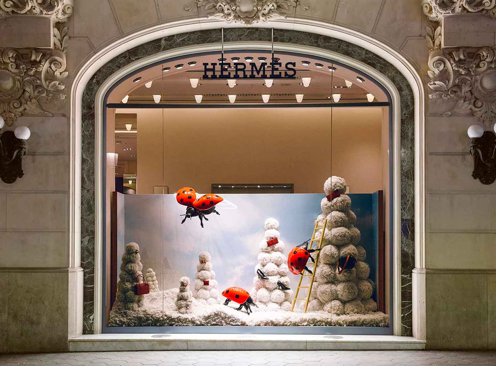
Xmas16 window dressing project Hermès Spain by INSTORE
This image clearly illustrates our point. It shows one of the designs by artist Kiki Van Eijk for Hermès Spain’s Christmas windows in 2016. Within the “Essence of Nature” project, the artist told a story where insects shared the spotlight with Hermès products. Both the brand and the designer conveyed a message, giving strength to a product and showcasing it so uniquely that Hermès customers and passers-by couldn’t help but admire it.
But the story doesn’t end there. The challenge is to attract your customer, make them enter the store, and continue the narrative started outside. If you’ve attracted the potential customer and the final product convinces them, you’ll make a sale. It’s not enough to have good lighting, beautiful furniture, and decorative elements. Your store must convey your values and move the customer to buy your product.
An indispensable tool in visual merchandising is the decoration of a space. Decoration is a discipline that studies the best way to select and combine decorative elements. This discipline is crucial because effective decoration can transform a commercial space completely, even without major renovations (something sought by companies with lower budgets or those unable to renovate due to structural constraints).
Decoration can make smaller commercial spaces appear larger by manipulating spatial volume.
Once we understand our commercial space’s layout, we can choose colours for our decorative elements, walls, etc. At this stage, we must consider the space’s needs. If we want to enlarge the space, we use light colours, mirrors, or unobstructive furniture.
Conversely, if our space is too large and we want a cosier atmosphere, we use patterns, darker colours, and larger furniture.
Our customers will notice every detail, so our decoration must be meticulous. Small decorative elements are as important as larger ones and can add touches of colour, originality, and warmth.

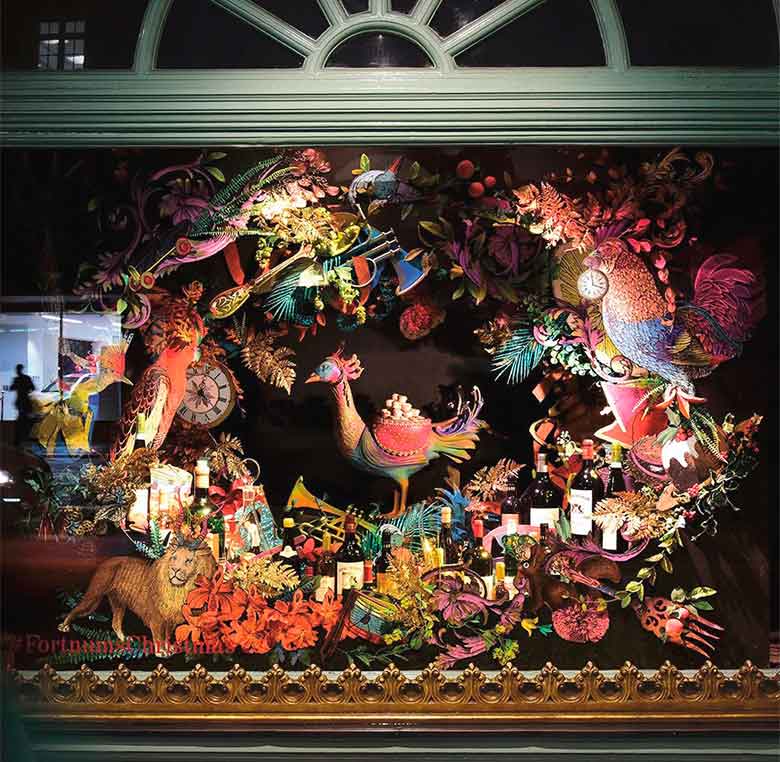
Design by illustrator Kristjana S Williams for the London store Fortnum and Mason in the Christmas campaign.
In addition to selecting and combining decorative elements, we must pay attention to their placement. The same applies to the products displayed in our commercial space or window. Careful product placement is crucial; if products are inaccessible or overwhelming in quantity, it can cause problems. This post by Foment Formació provides further insight.
We must ensure that products are easily accessible to customers. I recently read an Instagram post about direct purchase action in e-commerce, which translates perfectly to physical commercial spaces. Imagine entering a store and having to ask to see a product or learn its features—the customer gets bored, loses interest, and leaves.
Product placement varies depending on your intention. For example, in a luxury brand’s commercial space, we might find fewer displayed items, each presented like museum pieces. This approach aims to convey that the product is art, unique and delicately crafted. The same applies to the window display, showcasing a few items uniquely and artistically.
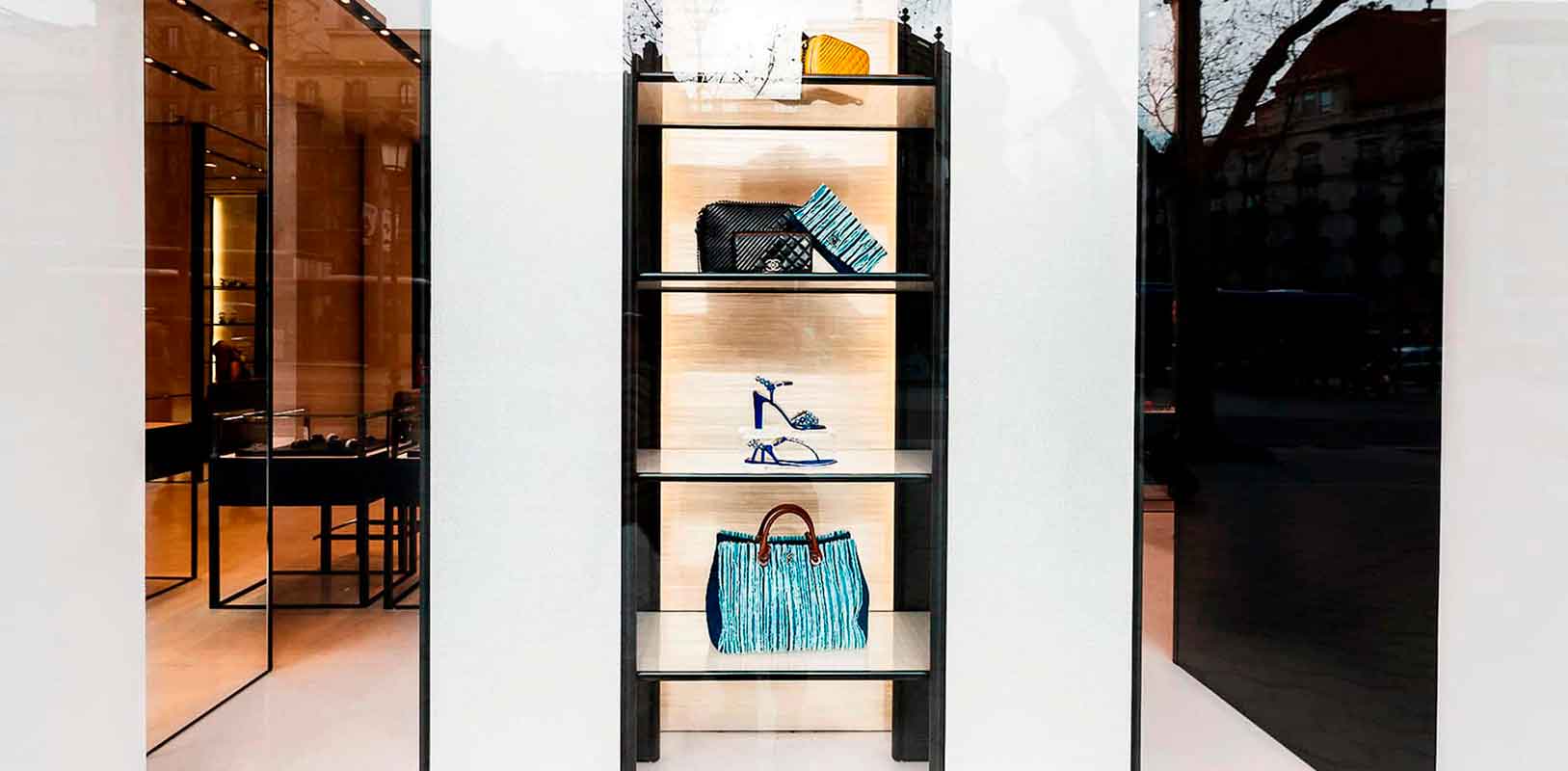
Chanel window dressing project by INSTORE
However, in an Inditex chain store, we find a completely different scenario with many displayed items. They aren’t delicately placed but arranged intuitively to facilitate customer purchases. Often, products that customers might buy together (e.g., a complete outfit) are placed nearby, making it easier for customers to purchase multiple items.
Products are usually separated by categories. Similarly, their windows display many products clearly and simply, encouraging the purchase of multiple items by creating complete outfits. This approach aims to create the need for multiple purchases without conveying a sense of uniqueness or specialness.
Lighting plays a crucial role in highlighting specific areas or products by illuminating them more than others or using different coloured lights.
In window displays, the study of lighting is extremely important, including the type of lights and their colours. Factors to consider include avoiding lights that emit too much heat if the window display design includes heat-sensitive elements.
Lighting and display design can influence each other, and we must identify and resolve potential issues before they become problematic.
It’s essential not to dazzle the customer, as discomfort is not our goal. For instance, if we aim to create a warm atmosphere, we choose warm lights; for a cooler effect, we select cooler tones. Lighting is a clear ally in creating the desired ambiance.
A current and original trend is using colourful neon lights with various shapes for signage in interior and window display designs.


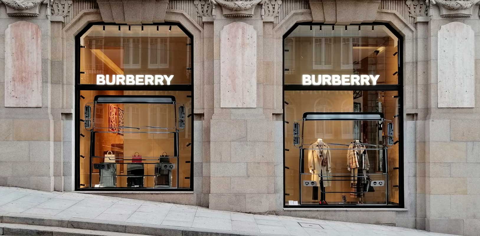
‘Voyage Magique’ is the theme for this Burberry window display.
Product placement, distribution, and effective visual communication signage are key. First, ensure that products are attractively arranged for customers.
Orderliness makes shopping more pleasant, as customers can quickly locate the product they seek. Products can be grouped by colour, use, or category.
Furniture distribution also plays a vital role, distinguishing between hot and cold zones to enhance and adjust them according to your narrative.
In addition to attractive product displays, signage is fundamental for helping customers navigate and providing information about specific products.
There are three types of retail signage:
All these types are useful and essential for increasing store accessibility and, consequently, boosting sales.
TNT showcase made with plastic pixels by Breakfast
Recently, we have seen technology integrated into interior and window display design. Creating movement in window displays with mechanisms is very eye-catching for spectators. It adds originality, a crucial characteristic in design creation.
Screens and digital signs are common and economical resources, attracting viewers while informing them and creating direct brand-customer communication. Examples of Hermès and Nike using these tools in their stores can be seen in older project posts.
As we can see, there are numerous tools and elements to create an unbeatable interior and window display design that attracts customers, conveys brand values, and generates optimal sensations and experiences.
Pay attention to every detail and witness the magic.
You may also be interested
open
08:00 AM-18:00 PM Monday – Friday
08:00 AM-18:00 PM Monday – Friday