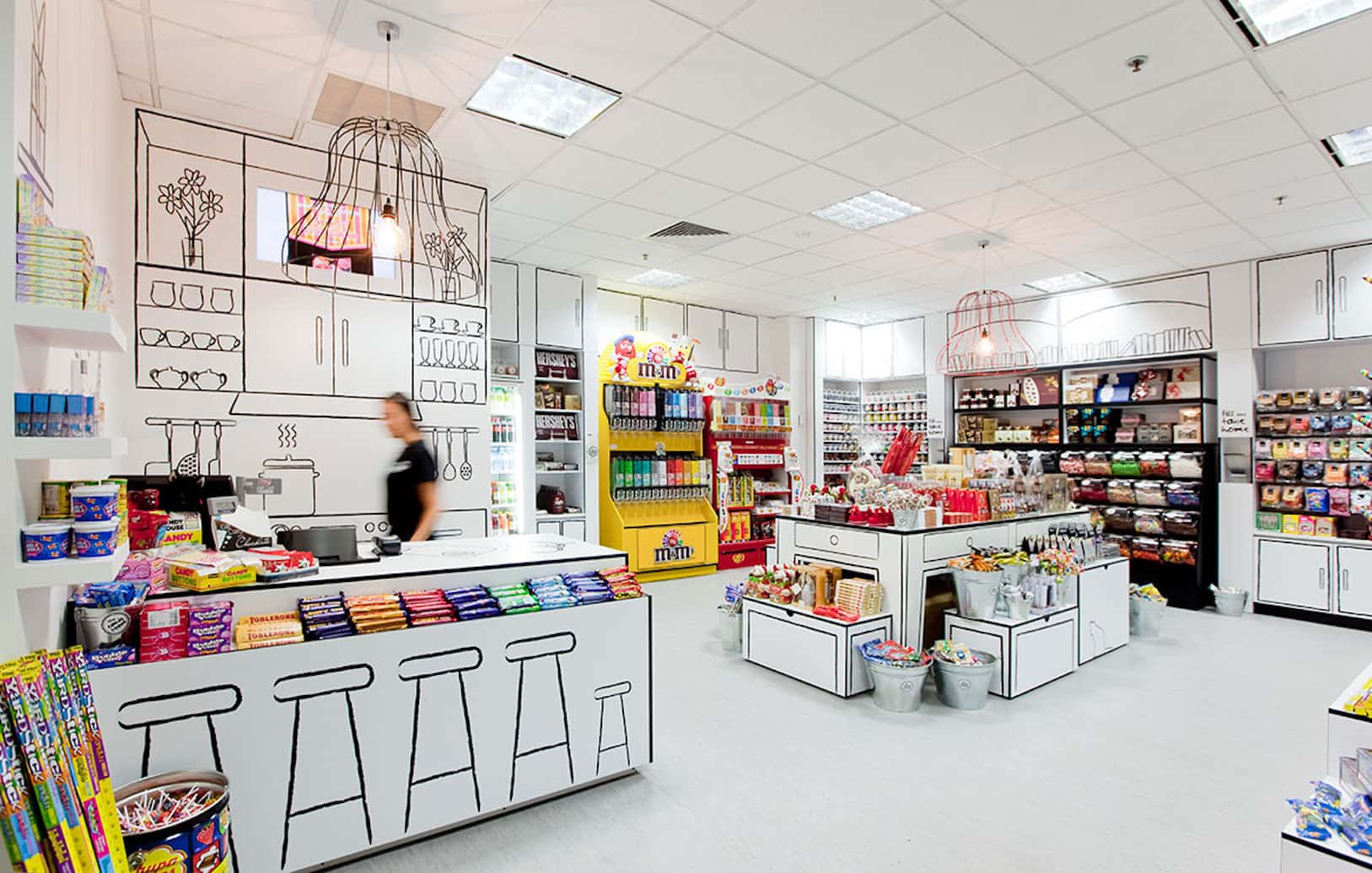
Visual Merchandising, a concept widely used today, originated with the first shop windows. Due to the rise of social media, we fill our vocabulary with Anglicisms whose meanings often elude us. If you own a business, it is crucial that this is not the case for you.
In this post, we will look at product placement strategies that will ensure an increase in your sales. Do you know what lies behind a good commercial strategy? Can you confidently say that you have never made these mistakes when displaying your products?
Creating desire in the consumer is our objective when attracting potential customers. We must know our target audience and project their dreams and desired lifestyle in our store. This also applies to digital media; when we browse Instagram, we look for profiles that respond not to what we have, but to what we want.
This excerpt from the interior design blog Decofilia precisely explains this phenomenon. When we come into contact with a stimulus, our brain tries to grasp how we feel about it and the emotions it evokes in us.
To captivate the buyer, we must display our merchandise alongside decorative elements that convey a lifestyle experience they long to achieve. This way, our customers will project their desires onto our product, purchasing it to relive that experience we have provided in our store.


The practice of exhibiting merchandise dates back many centuries, when the aim was to show the customer the abundance of available goods. However, we do not want our business to be perceived as a bazaar. Are you one of those who displays their products as if it were a market stall?
The emergence of the concept of Visual Merchandising revolutionised product display techniques at the point of sale. Businesses began applying market research and consumer behaviour studies and hiring renowned artists like Salvador Dalí and Andy Warhol to create impactful shop windows that served as commercial appeals.
This evolution culminates with the emergence of minimalism, led by designers like Mies Van der Rohe, to whom the prestigious quote “Less is more” is attributed.
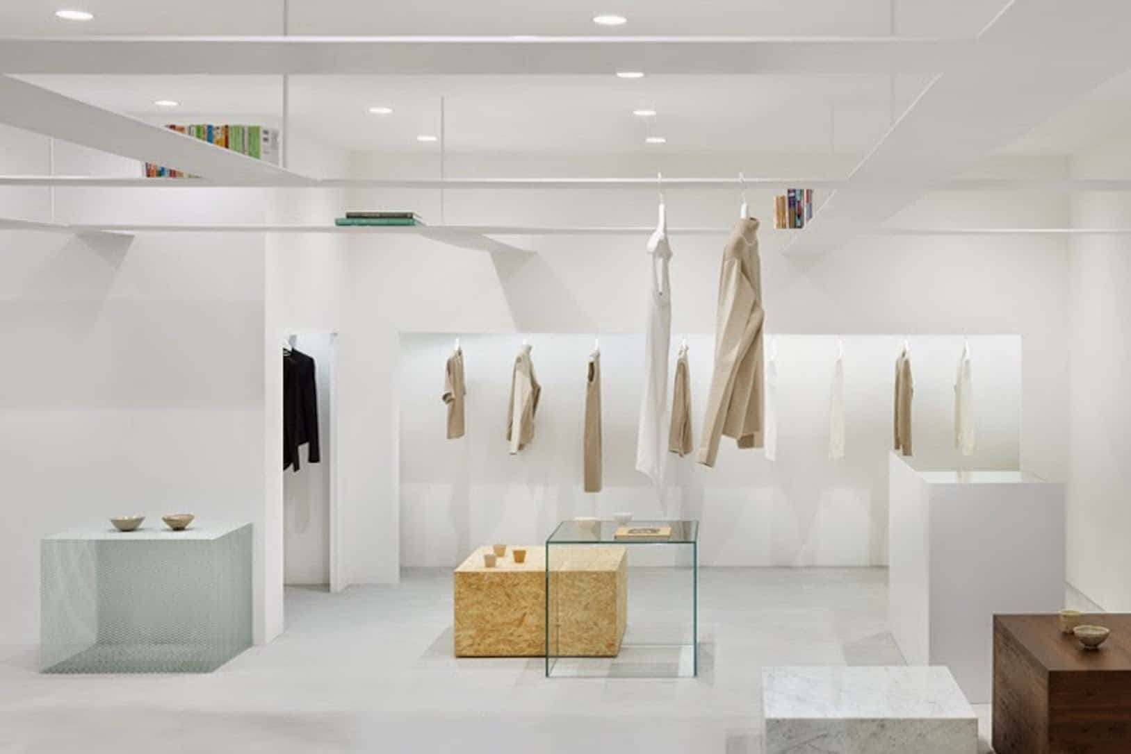
History gives us an important lesson regarding product presentation and display. An overwhelming amount of information and choices will plunge the customer into chaos and doubt. A strategy that undeniably works in many business models seeking impulsive buying is, however, the same that can lead your star product to go unnoticed and the buyer to leave.
Proper Visual Merchandising will help your customer easily locate your product, providing the comfort and confidence they need to return to your business in the future.
Commercial interior design extends from the store’s façade, where the shop windows are located, to the product arrangement in the furniture, the space’s lighting, and the customer journey. Do you recognise the most effective product display strategies in your business?
Plan the design of your store. Zoning and delimiting display areas will allow you to project furniture appropriate to the product you wish to exhibit and identify locations that offer a higher sales rate.
Optimise the customer journey. Properly placing products and planning circulation in your store translates into greater exposure to your sales strategy, increasing the likelihood of preventing the buyer from leaving your business.
Highlight your products and create environments. Illuminating the space is not the only function of lighting. Arrange the light sources to attract your customers’ attention, generate emotions, and create a welcoming atmosphere.
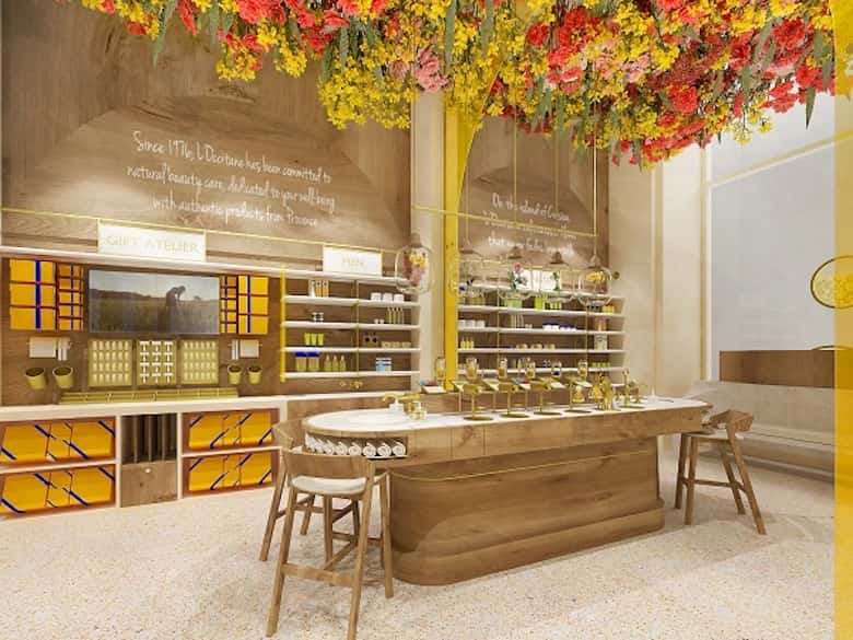
Enhance sensory experiences. The biggest advantage of a physical point of sale is the ability to appeal to the five senses. Include scents, use music, and never forbid your customer from using their hands. Sensory marketing creates stimulating and immersive spaces like L’Occitane’s Flagship in Toronto.
Rely on experts. The false belief in saving money on professionals is the leading cause of financial losses in your business. Remember: anything that allows you to increase your store’s appeal and boost sales is not an expense but an investment.
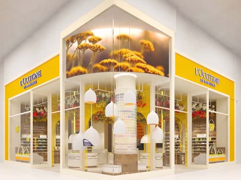
The image of our business has become the cornerstone for a substantial influx of customers. We live in a time when commercial competition goes beyond the merchandise we offer. Arranging the product at the point of sale based on the strategies provided by Visual Merchandising ensures that we enhance our product and increase sales.
You may also be interested
open
08:00 AM-18:00 PM Monday – Friday
08:00 AM-18:00 PM Monday – Friday