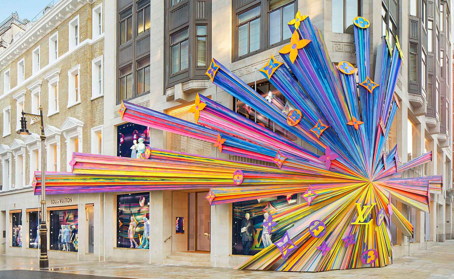
We live in a culture of haste, striving to do more in less time. We want to accomplish everything without missing a beat, even when it comes to our leisure and free time.
Consumption has often become something that happens here and now, and we must keep this in mind when designing our retail strategies.
Customers are always in a hurry, and it only takes them 30 seconds to decide whether or not to enter your shop. When it comes to the impression a customer has of your business, it matters—a lot. Therefore, investing in the design and decoration of facades is crucial for effectively conveying the DNA of your business.
The facade is the exterior, visible, physical part of the business. It is the embodiment of what customers will encounter when they enter the premises—your calling card, a seduction tool that invites people into your point of sale. It must be striking and create a genuine need.
“Never forget that your brand is in the facade, and it is a place full of possibilities.”
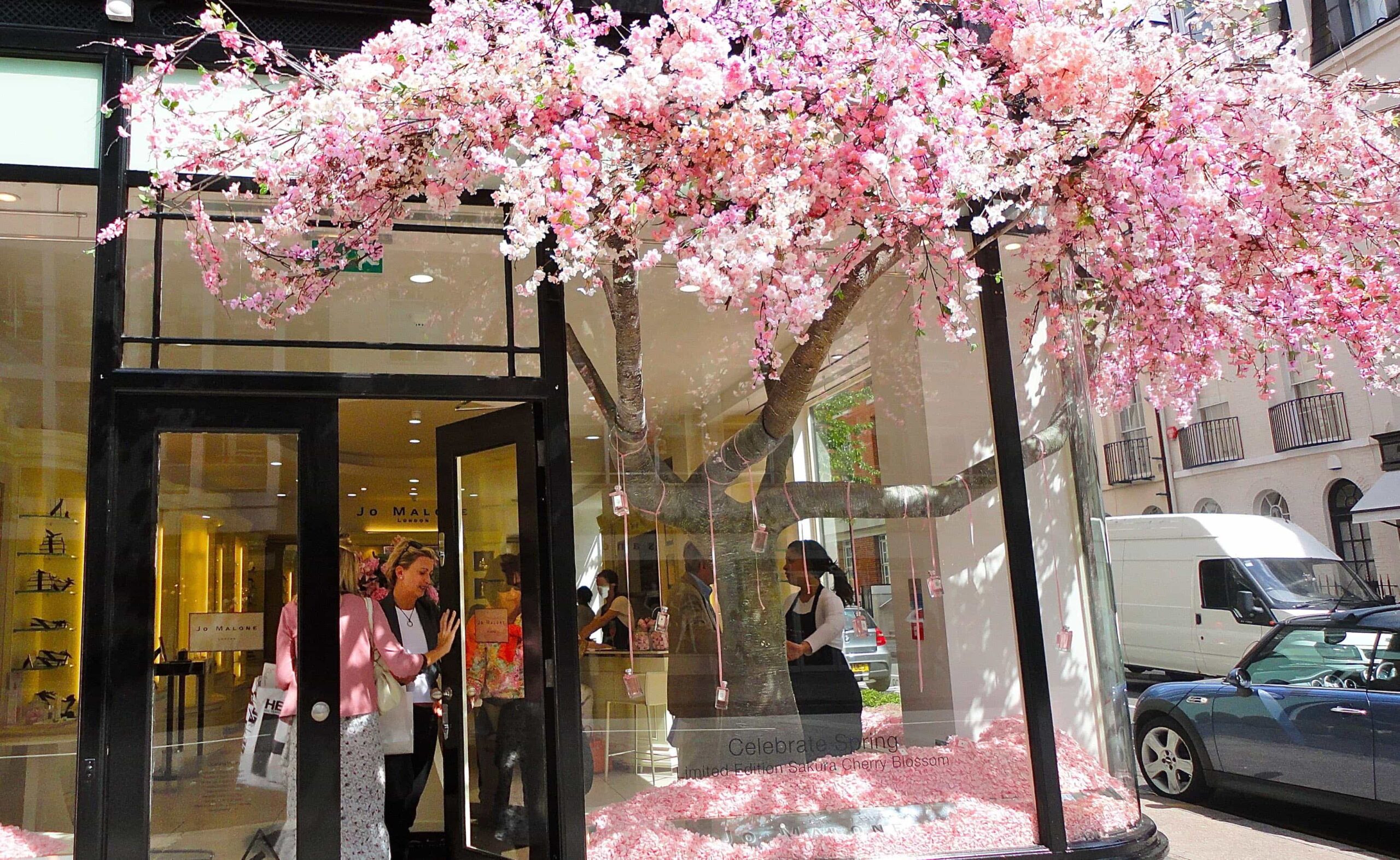
The exterior of your shop conveys a brand idea aimed at a specific type of customer, who should feel identified and confident that entering that shop at that moment will provide them with what they need.
For a facade decoration design to be successful, it must communicate brand values and reflect your personality and style. It is an indispensable identifying and communicative element.
There is no one right way to design a facade, but there is something you must never forget: to differentiate yourself from your competition. To achieve this, you need to conduct prior strategic planning, identify the unique value of the company, think about what makes your business unique and special, and why customers should choose you.
If you have more than one point of sale, it’s essential to create a similar design for the different locations, adapted to their environment and objectives, but respecting your company’s corporate image. The design of exteriors for commercial premises should follow the same line to ensure harmony and similarity. This tool will set you apart from the competition and allow you to position your brand.
Being clear about your image and values—essentially, what you are and what you want to convey—is key. If your ideas are confusing, the message will be too. This is fundamental and forms the basis for creating any strategy.
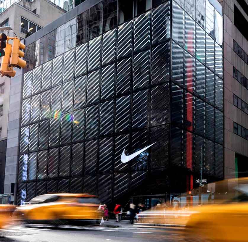
Nike store, New York.
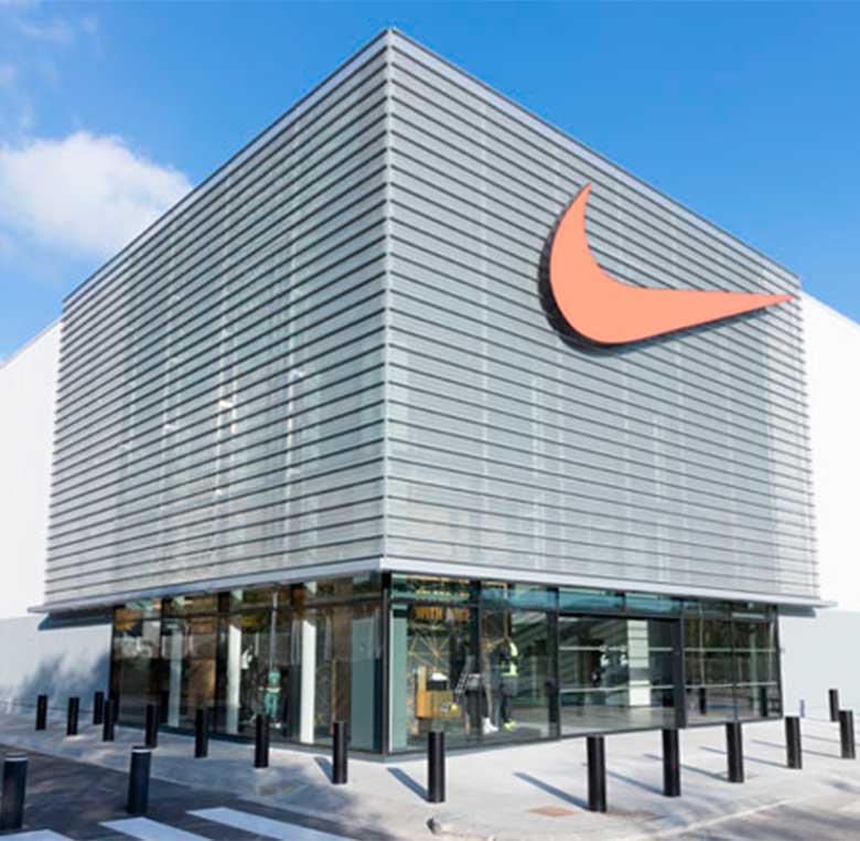
Nike store, Barcelona.
As you can see in these two examples, both shops belong to the same brand, Nike. If you compare both facades, you will find many differences and, at the same time, many similarities. Both follow the same design line, featuring the same colours—white, black, and orange. Identifying brand elements, such as the logo and the use of transparent materials to view the store’s interior, are also present. Each design is integrated into its environment, as each location requires different demands, and they achieve their objectives: to stand out and attract customers by conveying the message.
Considering all of the above, to create the facade decoration of commercial premises, we need to know what elements are involved. We often encounter permanent elements—these are usually present and essential for the business—and temporary or ephemeral elements, which are resources that decorate or help us communicate brand news to our customers.
Focusing on the first group, permanent elements, we look at cladding and colour, exterior lighting of the shop, and facade signs.
When choosing objectives for your shop, it is essential to find out if any laws prevent changes to the facade. It is common to find aesthetic regulations to maintain the essence of historic buildings. This doesn’t have to be a hindrance, but it’s a factor that can limit the design process and should be considered.
When designing facade cladding, you must know if your establishment is outdoors or indoors if you want it to be a durable material or if you plan to renew it after a few years, and also what colour and style you will choose for the facade design.
The most commonly used materials are stone, wood, ceramic, slate, 3D element cladding, and brick. If you want a more durable material, stone, slate, ceramic, and brick are recommended, as they require little maintenance and withstand weather changes. However, wood, though not as durable, is cosier and more versatile, allowing for unique designs. On the other hand, cladding with 3D elements requires more maintenance due to its fragility but can create stunning exteriors.
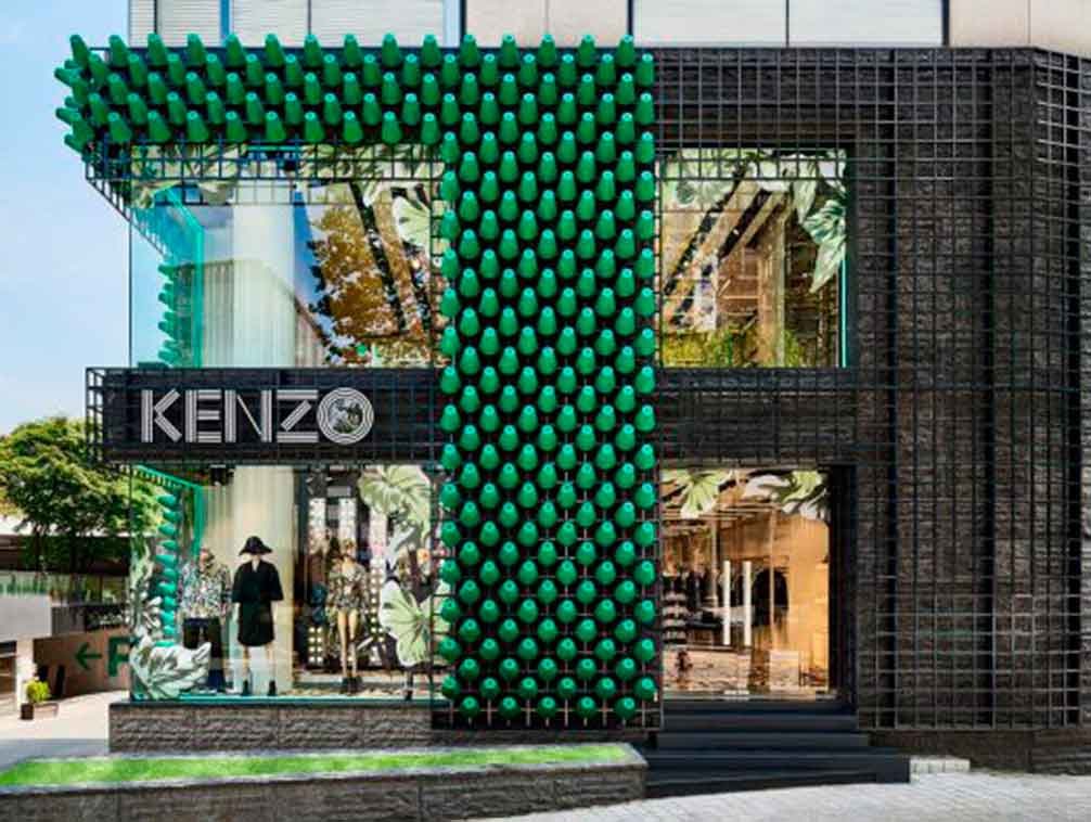
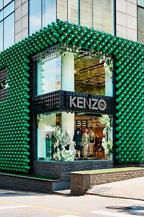
Colour is another design element; choosing one colour over another is not random. It depends on what you want to convey. The psychology of colour is a theory that explains what different colours communicate to people and what they make them feel. With a colour study, you can discover which colours can convey your message.
For example, in an aesthetic treatment centre, a palette of warm tones is often used, with white being prominent to convey light, tranquillity, cleanliness, purity, etc. It’s very insightful to look at these examples to understand more about what colours convey, ensuring you choose the correct colour for your facade.
As for the style of your decoration facade, you can choose from countless different styles, ensuring it aligns with your brand and corporate image and positively impacts the environment. Using a style different from the rest can make you stand out; here, you can see different styles of commercial facades to inspire you.
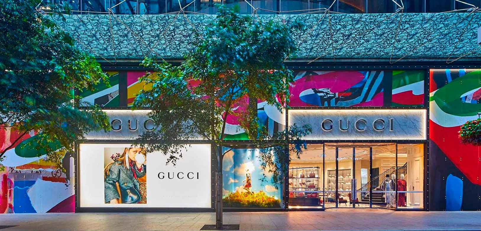
Gucci Flagship, Sidney.
Once these aspects are defined, we move on to another permanent element: the sign on decoration the facade. Typically, the sign will contain your logo or brand name. This element is both an identifier and a decoration, as it allows people to identify you easily from both long and short distances.
It’s most common to find illuminated signs or non-illuminated signs but with a colour that stands out against the surface it’s placed on. You can learn more about the types of signs that exist here. It’s essential to ensure the sign’s visibility from a distance. It is usually placed on the facade at approximately 2 meters high, although this distance depends on the space available.
Then there is the external lighting of the shop, where you must consider the tone of the light and the different types of lights that may be present. There is ambient lighting, which illuminates the entire space with a soft light, creating a particular atmosphere. General lighting illuminates the entire space so that no additional lights are needed to see the environment clearly, and accent or focal lighting is more intense and focuses on illuminating a specific object or area. Your choice will depend on your needs, but it’s important to follow various recommendations. For instance, use accent lighting to highlight more important elements or to separate different areas to ensure the lighting enhances your design.
Next, we have the second group, ephemeral elements. These are resources used in designing the exterior of the point of sale that are easy to install and remove, allowing for continuous store updates. In summary, they are graphic elements of different types: signage, vinyl, and 3D letters.
Using vinyl opens up endless possibilities; they can be promotional (for special occasions, sales, and promotions) or decorative (for aesthetic purposes). You can use them to inform customers about news or any relevant information and also to add 3D letters. There are many types, including polymeric vinyl, typically used for exteriors and the most resistant; monomeric vinyl, which is durable but recommended for short-term projects both outdoors and indoors; and cast vinyl, which has greater quality and durability and is usually applied to irregular or rough surfaces.
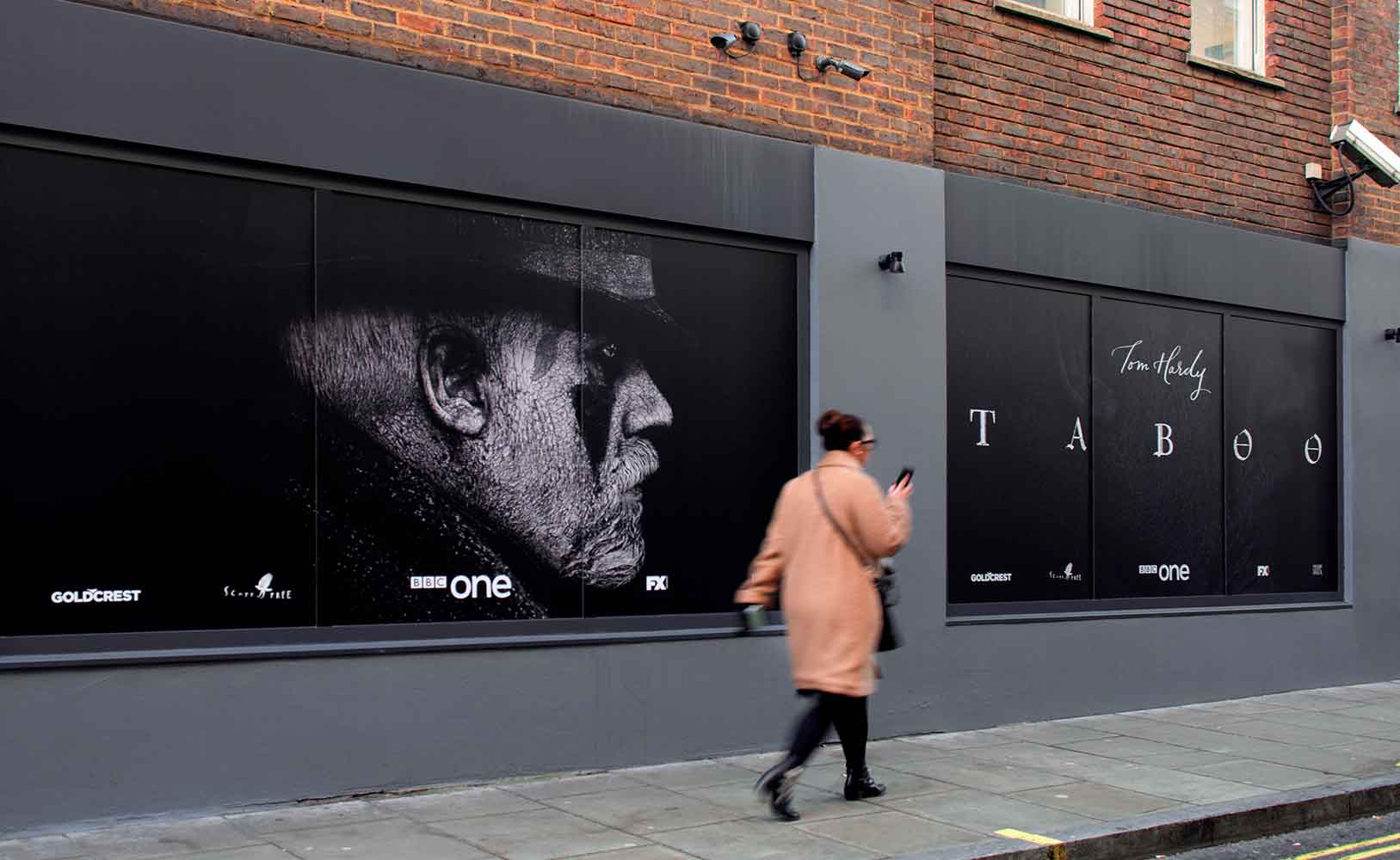
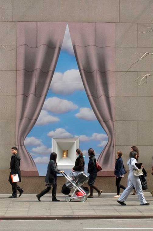
3D letters are a widely used advertising resource as they can be manufactured at a low cost and are very attractive. They can be made from cheaper materials like vinyl to materials like metal or wood. Illumination can also be added, depending on the importance you wish to give it.
Signage is an excellent informative and advertising resource. The PLV (point-of-sale advertising) marketing strategy involves combining different materials and visual and/or auditory resources to promote various products or services. Using signage to promote a new product, news, or an offer is a widespread technique.
Lastly, and not least importantly—quite the contrary—we’ll talk about the shop window, just a few hints to consider when designing your facade.
The shop window falls between these two groups explained earlier; it’s a permanent and ephemeral element. If your commercial facade has space for a shop window, the store’s view for your audience will vary greatly.
When designing the ideal shop window for your business, carefully consider what you want to showcase and how to do it. It’s crucial to know your product, understand what you want to sell, and create your own image that sets you apart from the rest.
“A compelling shop window is the best tool for attracting new customers”
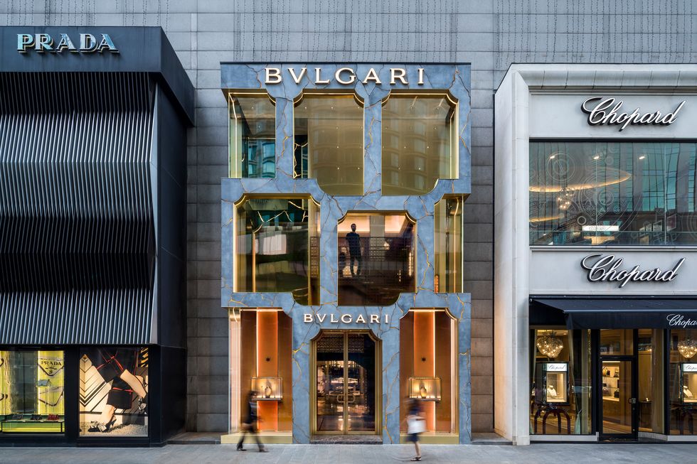
Bulgari store window in Kuala Lumpur
After reviewing these facade essentials, the importance of it becomes clear for boosting your sales and attracting customers from the moment they see your establishment from afar. It helps you stand out and position your brand… The facade is an essential tool; you decide what you want to convey with it.
You may also be interested
open
08:00 AM-18:00 PM Monday – Friday
08:00 AM-18:00 PM Monday – Friday