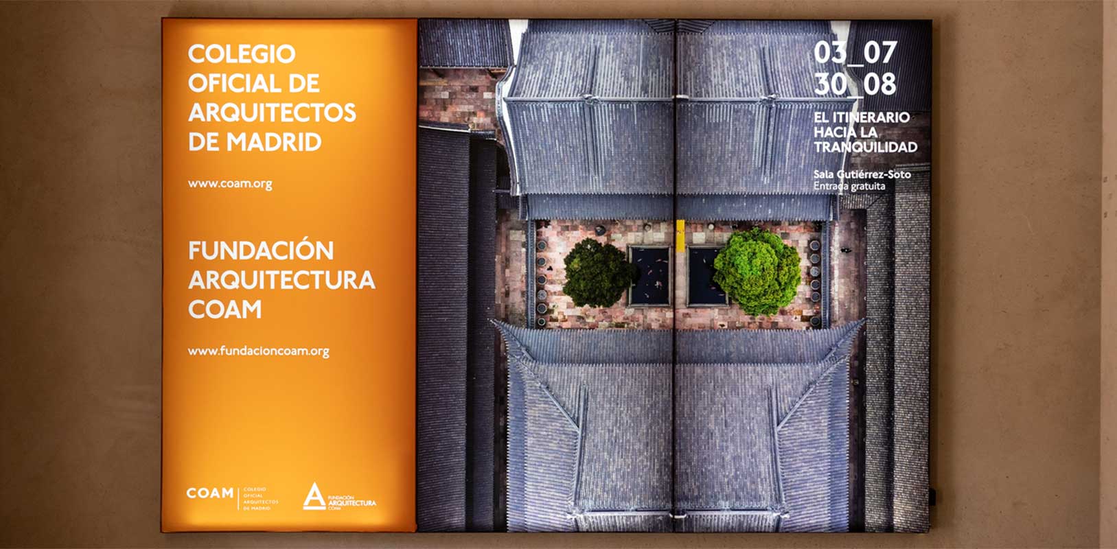
Using signage, wayfinding, and signboards has become a fundamental action in any establishment. It would surely be surprising to go to a place where, for example, they do not indicate the entrance and exit. These elements have become obvious to the customer, and you must meet their needs to create good communication with the recipient and avoid confusion. It is very important to know the domain where you will place these elements beforehand, as each space and its uses have different requirements.
"Signage, wayfinding, and signboards need a balance between functionality and aesthetics."
There are many differences in terms of aesthetics and functionality. Typically, if it is a commercial space, the design will focus more on being visually appealing, unlike an educational place, where functionality and safety are prioritized. But what should you know before choosing and designing the signage, wayfinding, and signboards for your space? Let us tell you.
Signage is the set of regulated signs with applied standards, which in most cases are mandatory, such as signage indicating emergency exits. Signage is unique, has regulated designs, and cannot be adapted to the space of interest.
To design the signage for a space, a standardized and approved technical code is used. There is a universal language for design and placement, which must be the same regardless of the location.
The main function of signage is to regulate the flow of people or vehicles and indicate elements. These visual guides are created so that anyone in any situation can understand the transmitted information. These elements have unique typographies, colors, and sizes, making them understandable to everyone.
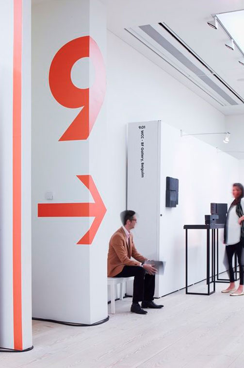
Signage inside an office in Belgium.
Signage is always used in public places, with clear benefits: creating visual guides so that any user can navigate the space easily without confusion. Its benefits are essential for any establishment, which is why you can find them in many places such as:
These can be found in different formats:
Not all signs convey the same message; there are different types of signage. These are the most important:
Internal use signage: Essential security elements for any establishment, required by law and common sense.
Traffic signage: Exterior signage focused on responsible vehicle management.
Safety signage: A combination of geometric shapes, colors, and symbols with meanings related to safety, designed to communicate simply, quickly, and universally.
In the field of safety signage, precision is crucial, and standardized design guidelines must be followed. Some common types of safety signage in any establishment include:
The colors and shapes of these signs play a fundamental role, allowing users to identify and understand them quickly, wherever they are.
Wayfinding combines communication and graphic design, used in various fields to facilitate users’ access to services and inform them in a direct, simple, attractive, and personal way.
It is commonly used in:
Wayfinding must meet several essential aspects to fulfill its objectives, aiming for designs that are both functional and aesthetically pleasing. Corporate wayfinding is a discipline within this, used by companies to form and complete their brand image, bringing numerous benefits to retail points, educational spaces, workplaces, etc.
The creative process of wayfinding is crucial and labor-intensive, requiring preliminary studies to determine the functional and aesthetic objectives and which designs best fit the space. The designer must be able to synthesize, correctly analyze the reality and space, and pay attention to color codes and the brand’s corporate colors to maintain consistency.
Depending on the objective, wayfinding can be classified as:
Orientation. Situates users within the environment. Example: Maps or location plans.
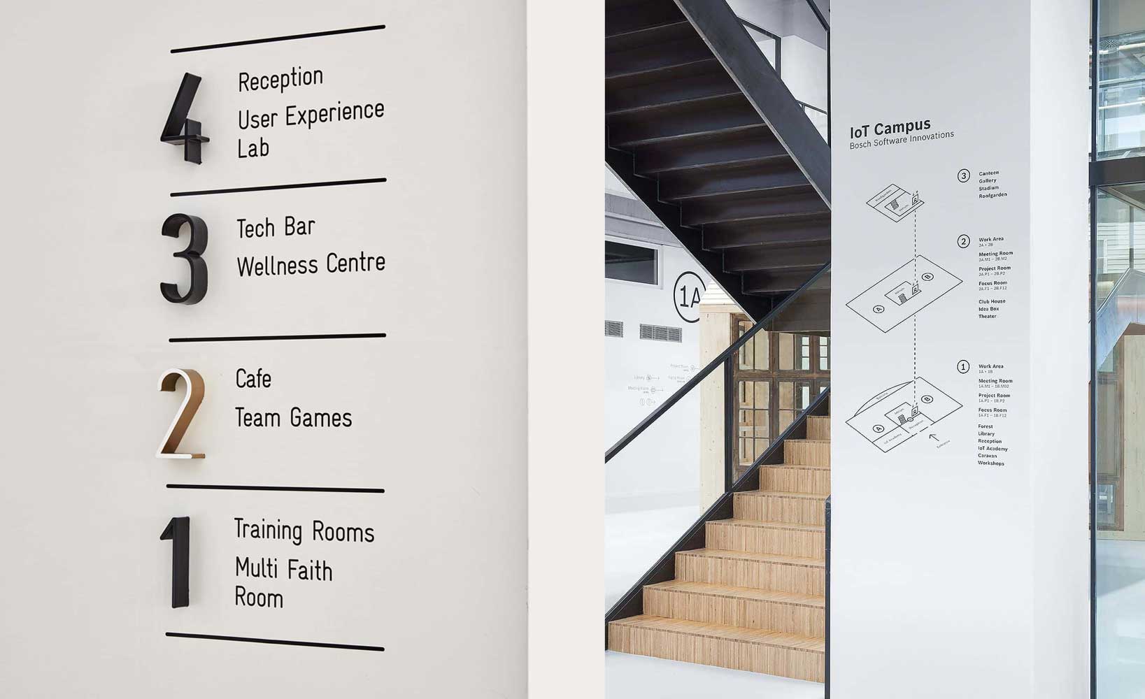
Informative map indicating office floors.
Informative. Provides information to the recipient, found in various zones. Example: Opening hours.
Identifying. Informs the user about the area they are in, used in open spaces. Example: Women’s section in a clothing store.
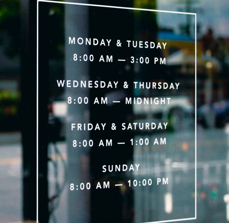
Restaurant opening hours.
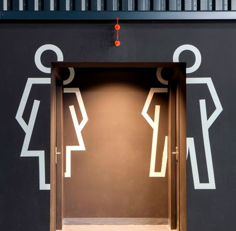
Restroom signage at the ice hockey stadium in France.
Directional. Informs users about circulation within the environment. Example: Arrows indicating paths or no-entry signs.
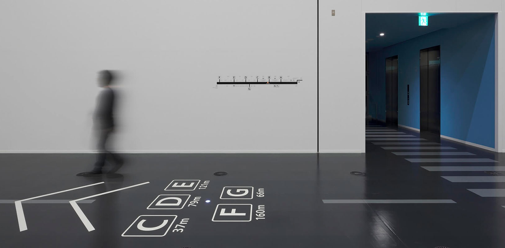
Direction signs at training center in Japan
Regulatory. Protects users from danger, classified into preventive, restrictive, and prohibitive. Unlike safety signage, regulatory signage does not require homologation. Example: Authorized personnel only.
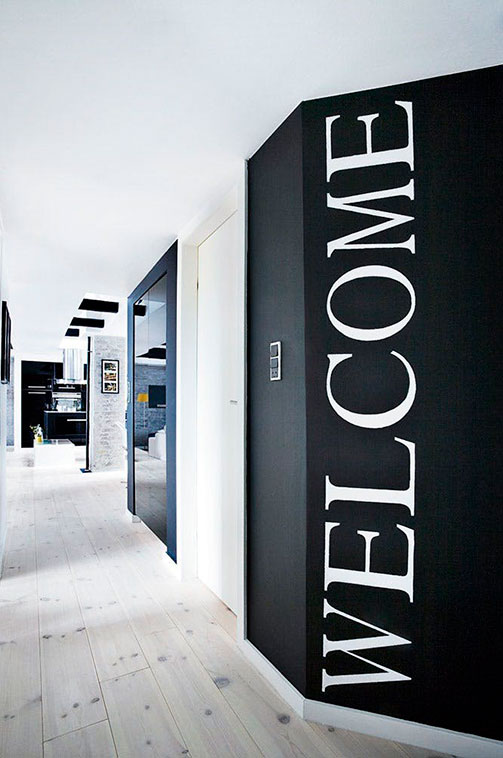
Welcome hall vinyl on wall.
Ornamental. Quickly identified by users, usually blended into the environment. Example: Welcome signs.
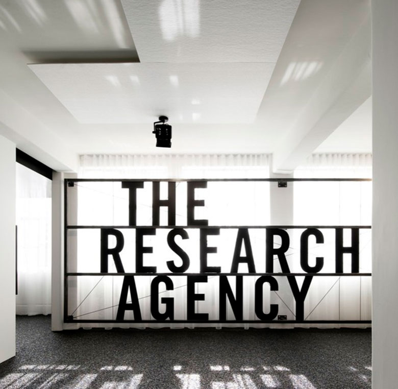
Corporeal interior communication agency.
Wayfinding placement is essential, and there are specific classifications depending on the location:
Parallel attached: Mostly attached to another element, usually a wall.
Free-standing: Anchored to the ground with one or two posts.
Band free-standing: Supported by two walls, columns, or posts perpendicularly.
Flag-type attached: Perpendicular to a wall or column.
Hanging: Hanging from the ceiling.
Identity totem: 3D signage, usually the brand’s name or logo.
Informative totem or directory sign: 3D signage for directories only.
Scissor-type temporary: Temporary signage, named for its foldable shape.
Permanent signs: Installed for a long period, usually screwed, glued, printed, or planted.
Mobile signs: Usually temporary, found in vehicles, panels, or tables.
The extensive variety of design and placement options makes wayfinding enriching for any space, providing both functionality and visual appeal.
"The goal of wayfinding is clear: to make things easier for the customer, improving their in-store experience."
A good example of well-designed and installed wayfinding is the project on the “integral signage of the COAM Madrid building.” The Madrid Architects’ Association headquarters updated its signage, and Instore developed the project, creating, producing, and installing all necessary elements for comprehensive COAM signage, including directories, informative plaques for columns, and totems.
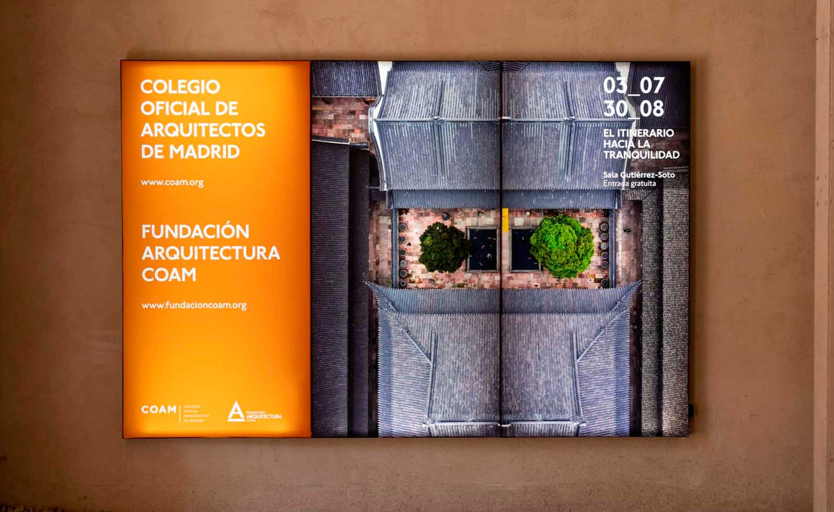
The Headquarters of the College of Architects of Madrid decided to update the signage of its building and INSTORE developed the project.
All designs followed a modern aesthetic line with a clear industrial style, respecting the Association’s image and the building’s interior design.
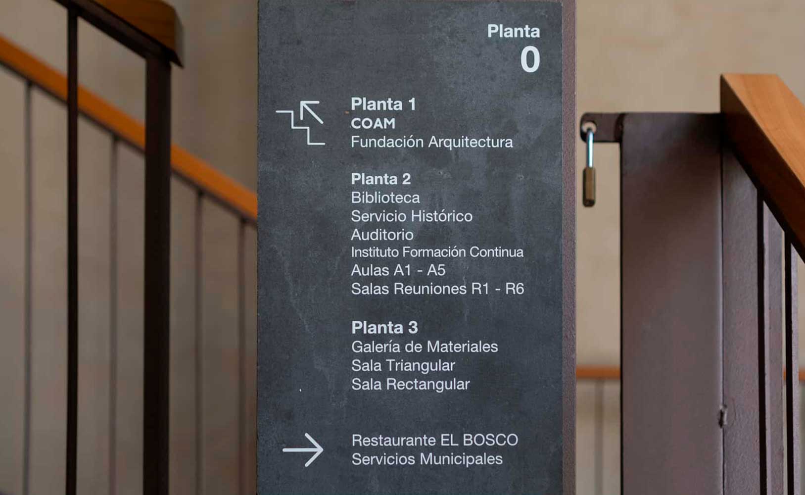
Signage for the Headquarters of the College of Architects of Madrid: directories, information plaques for columns and totems.
A signboard is a printed medium larger than A3 size, used to convey a specific message. It has a dual function: disseminating information about an object, product, or service, and capturing the customer’s attention.
"Improving communication and establishing a good relationship with your customer will be reflected in increased sales."
When creating a signboard, the aim is to inform clearly and simply, with an eye-catching design that attracts the viewer. An impactful, novel, and attractive design is key to success. A signboard should contain:
There is a wide variety of signboards based on purpose, size, design, and material. Important types of signboards include:
Advertising posters
Used to communicate advertising campaigns, promotions, and offers. Found in high-visibility areas with heavy foot traffic.

Advertising poster for the APN law and order series.

Music Port Fest poster.
Informative posters
Inform about specific activities like courses, conferences, events, shows, often consisting of text and color contrasts. Sometimes combined with images and short texts.
Educational posters
Create awareness or ensure cleanliness, hygiene, safety, or order. Prioritizing images over text, they should be schematic and direct.
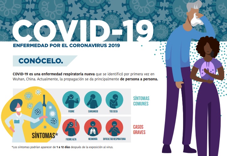
Infographic covid19.
Illuminated posters
Seen in low-light areas, consisting of a casing with internal lighting (LED or neon) and a translucent outer panel. Common in pharmacies and bus shelters.

Illuminated pharmacy signage
Commercial posters. Influence product sales with real images motivating consumption. Found in various retail supports.
Political posters. Used in election campaigns to promote candidates or political messages.
Cultural and entertainment posters. Inform about cultural or artistic activities and entertainment.
Social posters. Raise awareness on specific topics.
Tourist posters. Encourage tourism, providing information about areas, routes, and monuments.
Institutional posters. Found in buildings, universities, etc., generally informative.



Cultural, advertising and social posters.
Common sizes for signboards include:
A pioneering company in using signboards is IKEA, utilizing advertising posters creatively aligned with brand values to highlight promotions in high-traffic store areas, ensuring clear and simple messages that incite purchases.

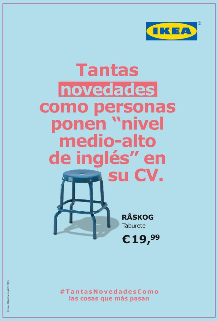
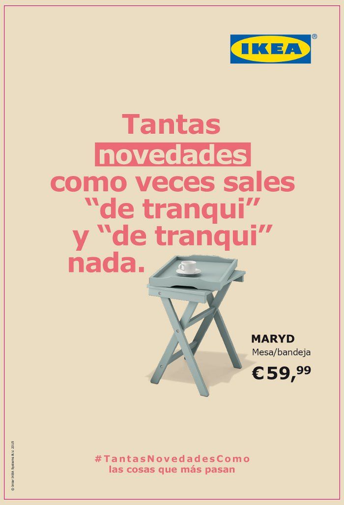
Posters designed for the Ikea advertising campaign.
Typically, when manufacturing signage, wayfinding, and signboards for an establishment, durable materials are chosen to ensure they last for a medium to long period. However, if the signage is intended for an event or promotion, more economical materials may be used, as long-term durability is not necessary.
Therefore, the most commonly used materials are:
The choice of material will also depend on the importance you wish to give to these elements and where you will place them. Naturally, the design style will be the basis for selecting one material over another. An aspect you cannot overlook is whether it will be located indoors or outdoors, as this characteristic will be very relevant when making this choice. This can cause significant problems since each material withstands climatic changes differently.
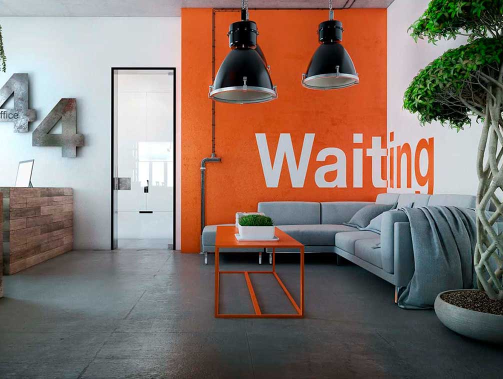
Signage on a painted wall inside an office.
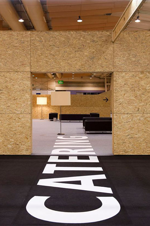
Interior marked on the ground at the Nato Summit Lisbon event.
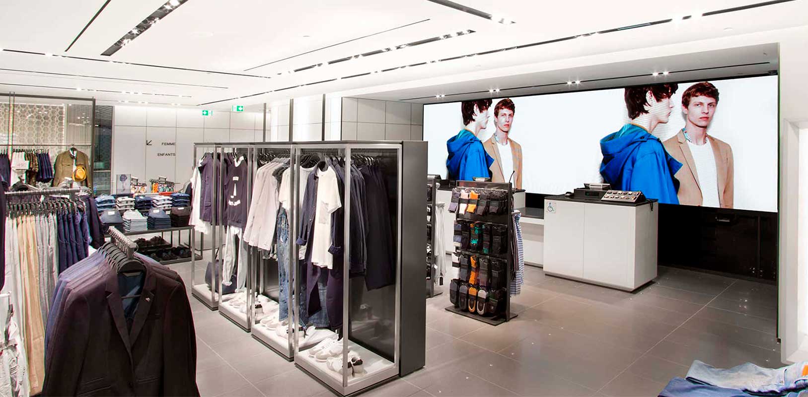
Digital screen inside Zara store.
Good signage, wayfinding, and signboards must be created through a process where all elements are equally important and work in harmony. They bring many benefits to your business by making information visible and reinforcing communication with your customer. Neglecting these elements in your establishment is a complete mistake. The success of your business is in your hands, and one way to achieve it is by taking advantage of the numerous benefits that signage, wayfinding, and signboards will bring.
You may also be interested
open
08:00 AM-18:00 PM Monday – Friday
08:00 AM-18:00 PM Monday – Friday