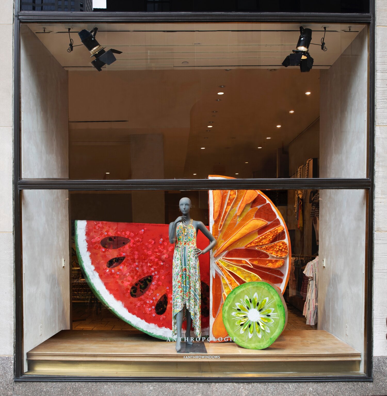
In summer, window displays and storefronts are filled with vibrant colours, fresh designs, and elements that evoke the summer season.
In this post, you’ll discover three essential tips for summer window displays.
Don’t miss them—they can give you many clues on how to prepare your store to attract customers and elevate your brand image.
Don’t limit yourself to just the window display—extend the design to the entire storefront. A striking and attractive facade will catch the attention of passers-by, increasing your store’s visibility and attracting new customers.
This floral facade created for Jo Malone’s immersive exhibition ‘Wild Grass’ at Shanghai Samet Building is a great example of maximising your building’s facade, generating curiosity and creating desire for the brand.
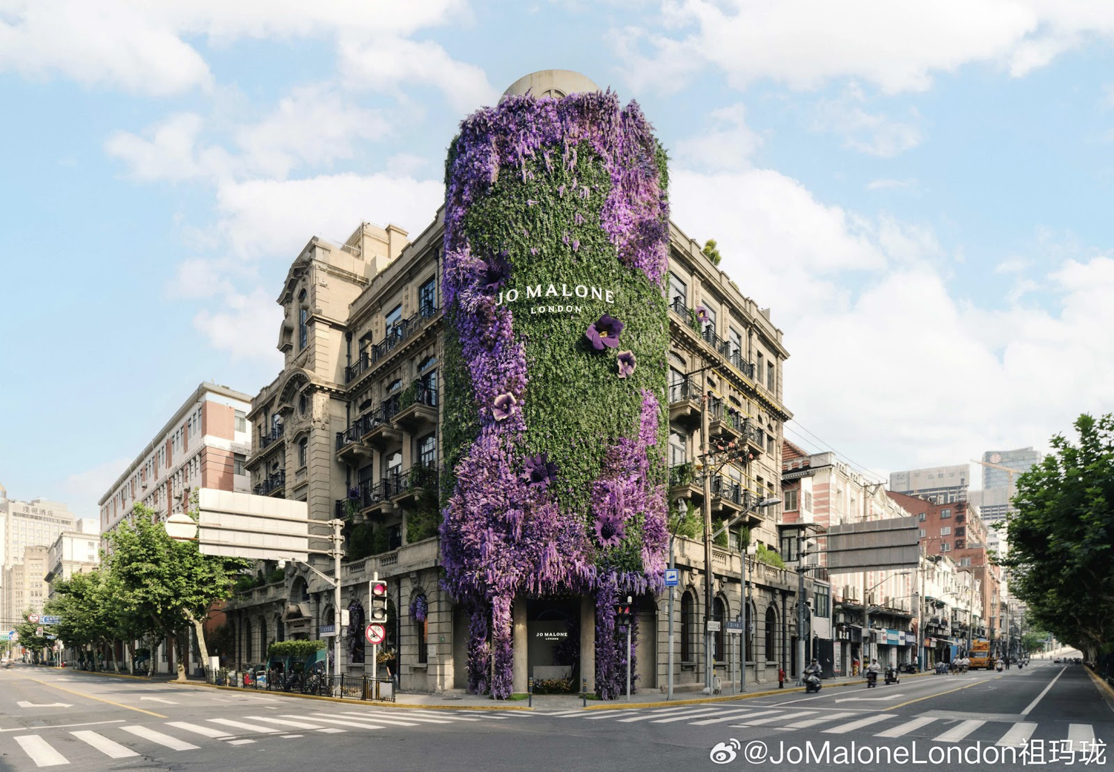
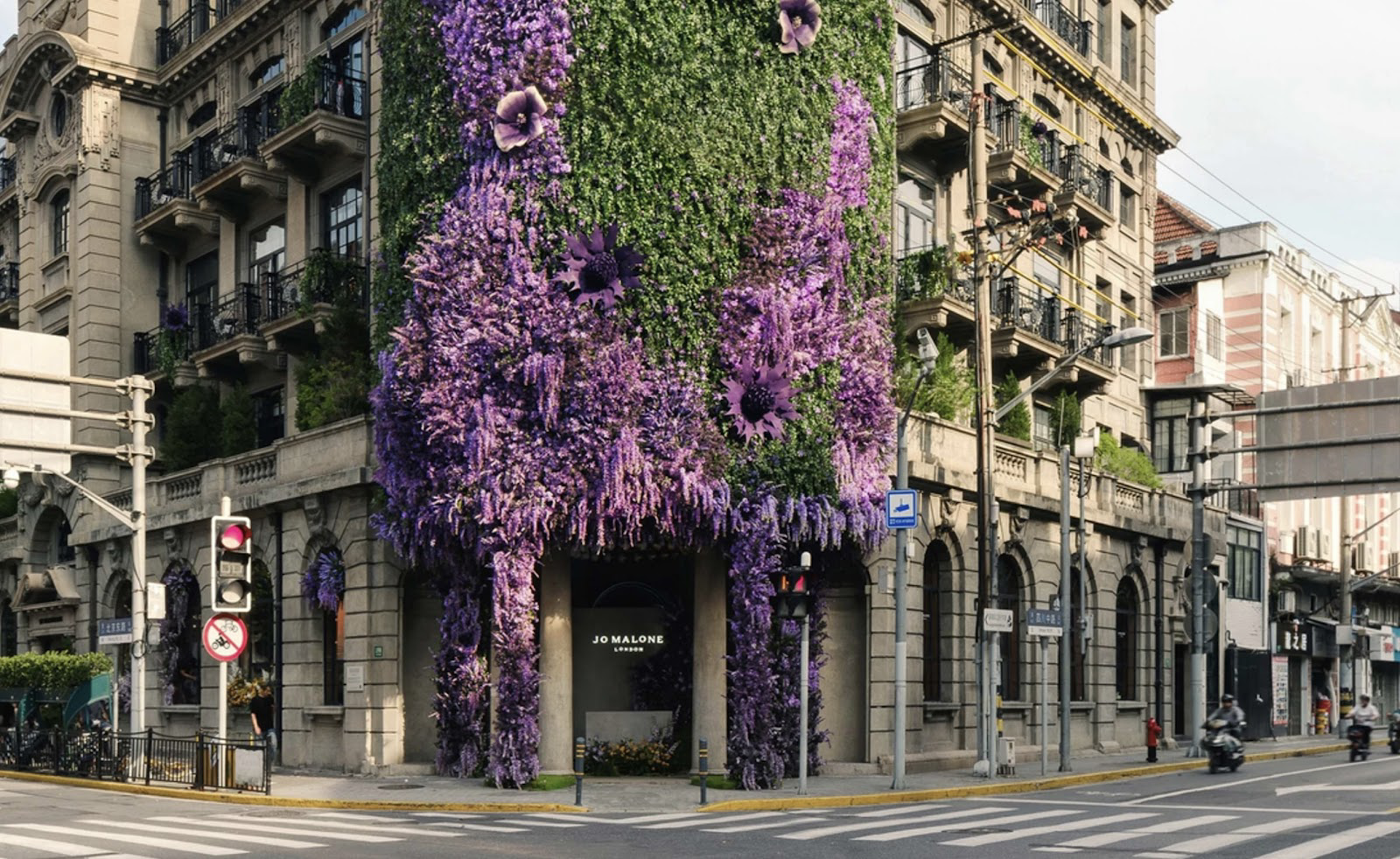
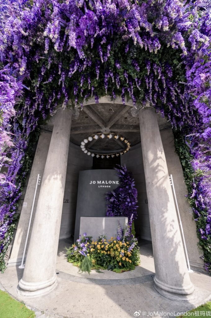
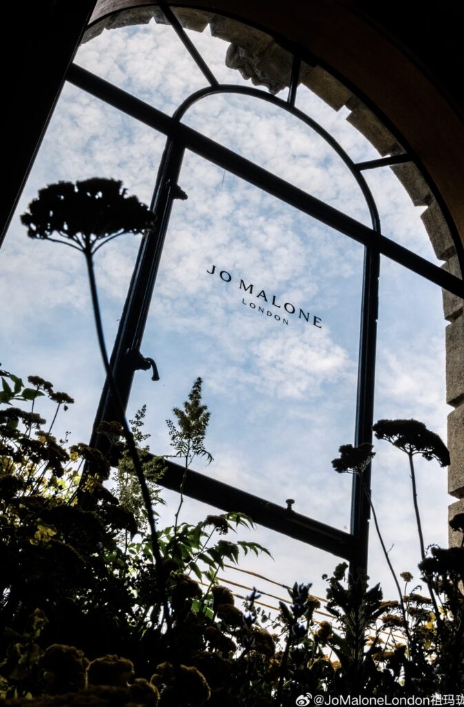
Your store’s facade acts as constant visual marketing. Passers-by will see your store even when it’s closed, increasing brand exposure and creating a lasting impression. Use this to differentiate yourself from the competition.
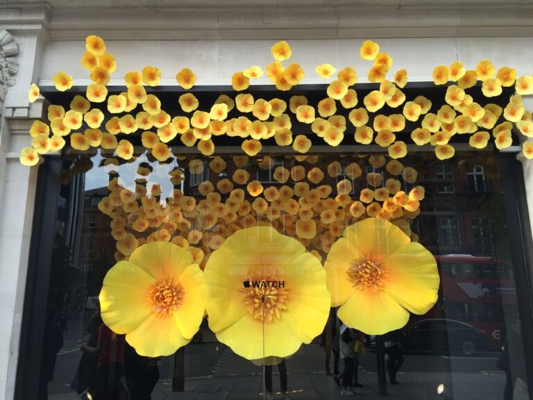
The prestigious brand Apple also uses this approach in its stores.
The image shown above is from the windows of their store in central London. It is a seemingly simple design, but very powerful as it starts inside and, in a very original way, continues outside the store. The contrast of colours is so striking that it leaves no one indifferent.
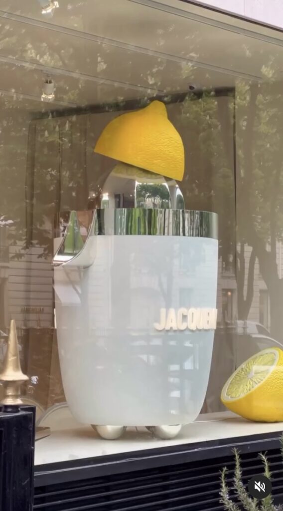
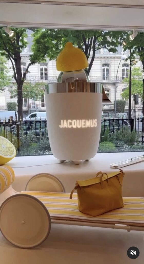
A strategy that never fails is playing with the dimensions of the elements that make up the window display design.
The luxury brand Jacquemus is an expert at playing with dimensions in its designs. One of its latest window displays for the summer ’23 campaign was exhibited in their boutique in Paris.
And considering that fruit in all its forms is a big draw in summer window displays, the brand Anthropologie and its visual artist Nina Li join the game of dimensions by creating this elegant, summery, and original window display located in their Rockefeller Center boutique in New York.
Undoubtedly, the different textures and colours present the brand’s summer collection spectacularly.
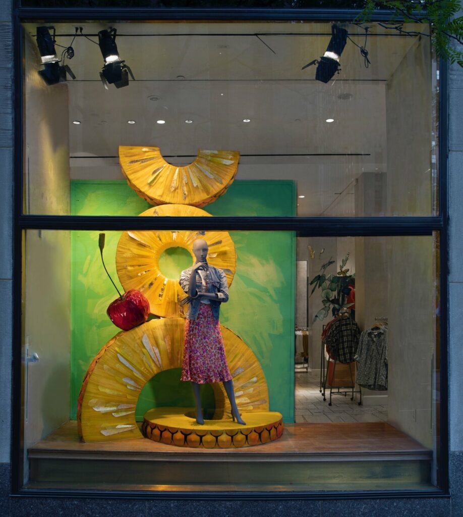
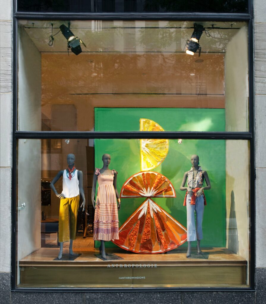
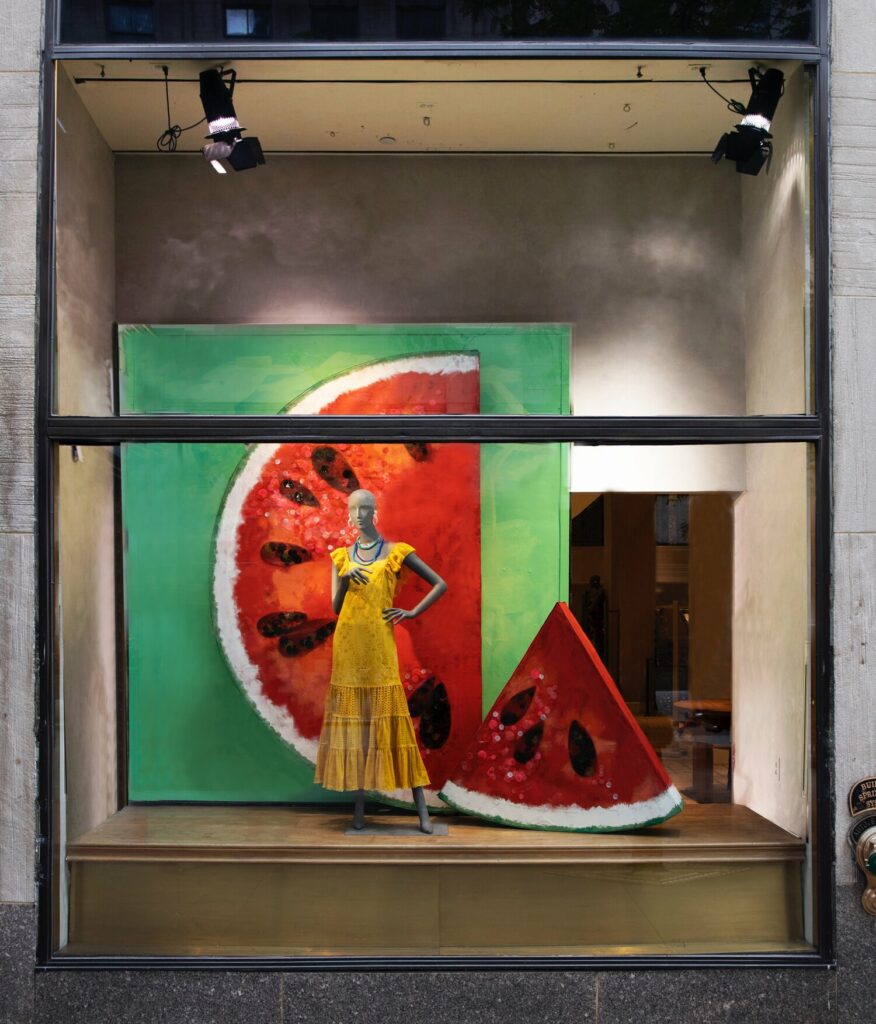
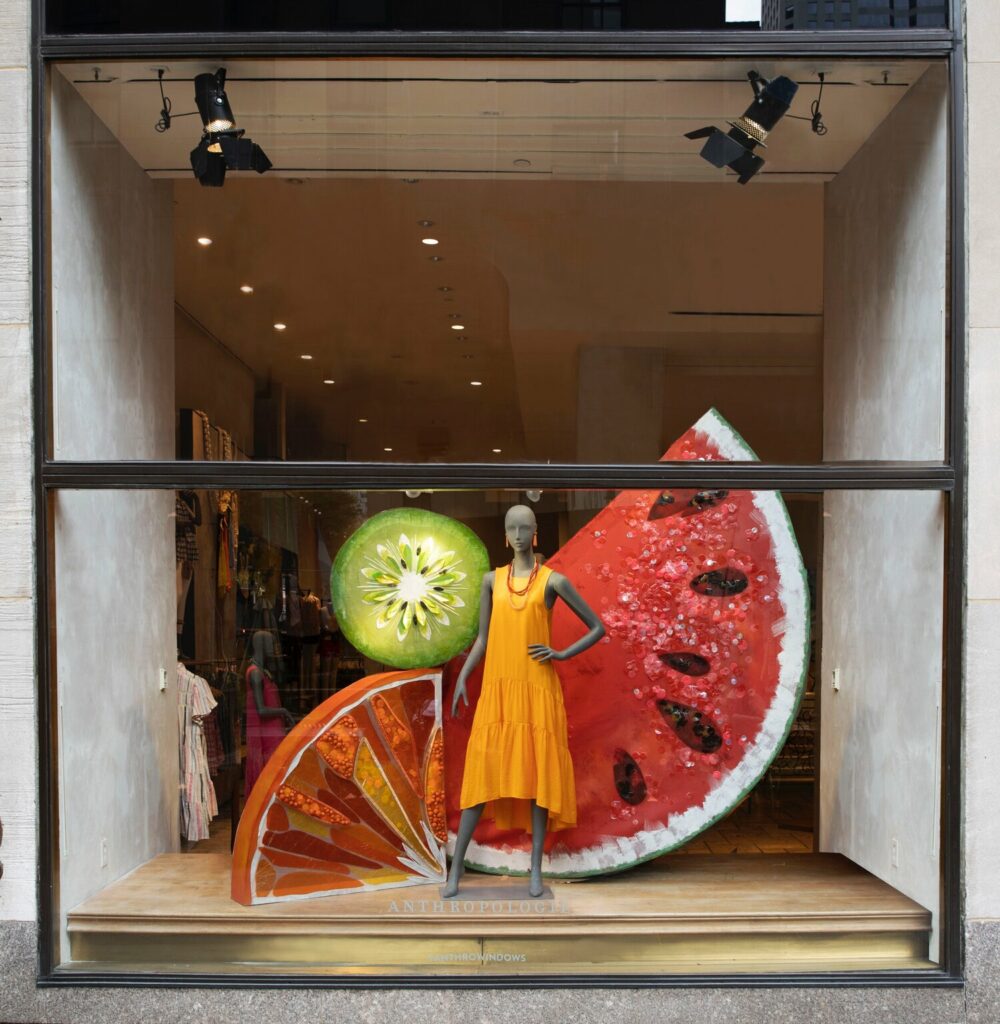
Summer window displays are a great opportunity to create stories and emotionally connect with customers. This is why elements that transport customers to their desired holidays are so important. You show them what they want while associating it with your brand, ensuring you remain in their memory.
You might wonder, what elements are most effective and how to introduce them?
You can find more elaborate window displays than others, but most have a common dominant colour, which is usually green in all its shades. Additionally, floral or animal elements are commonly found in these themed designs.
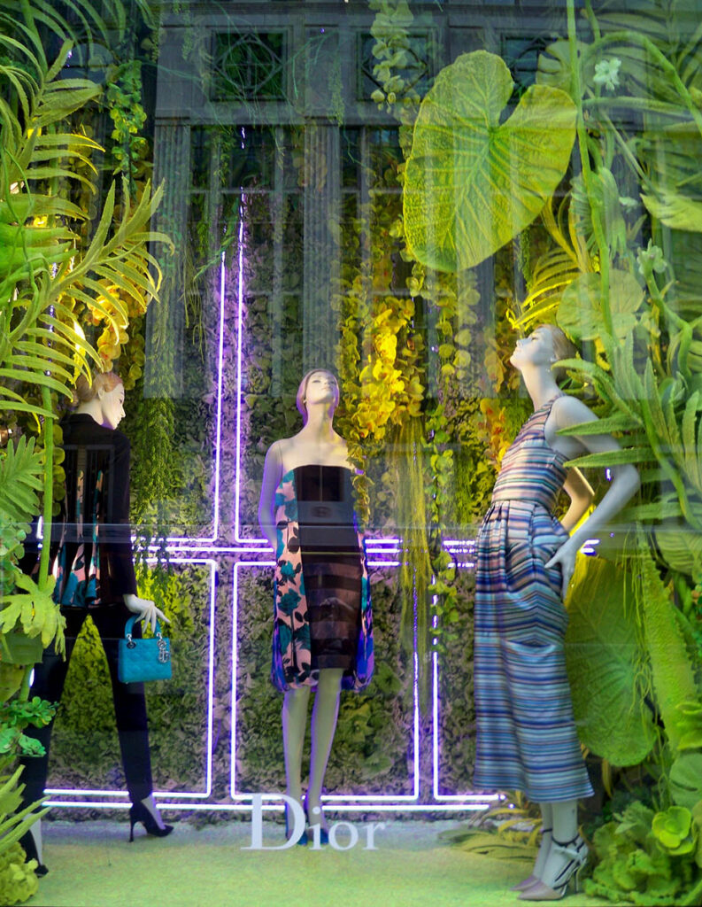
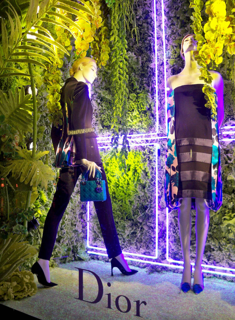
This Dior window display on 5th Avenue in New York is an example of the Garden theme. It is striking and original while remaining elegant without betraying the brand image.
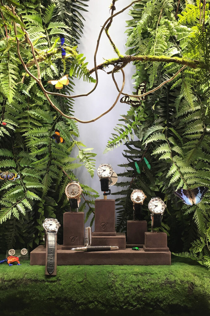
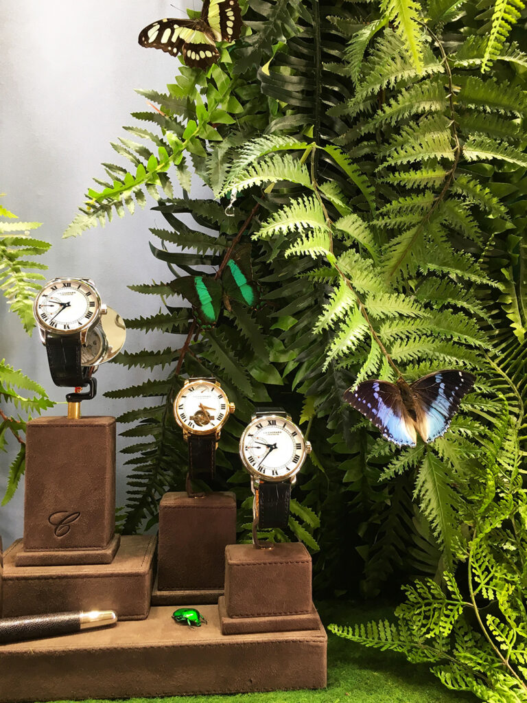
In a smaller space, the jewellery brand Francesca Signori executed Jungle-themed designs in its boutique on Madison Avenue, New York. These installations focus on the details.
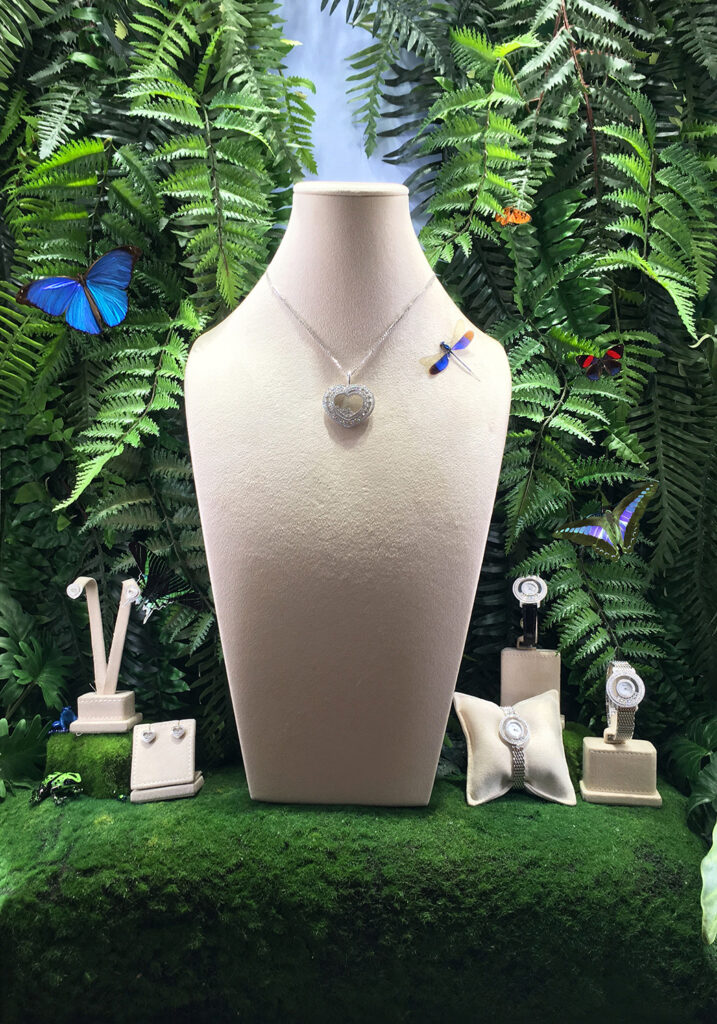
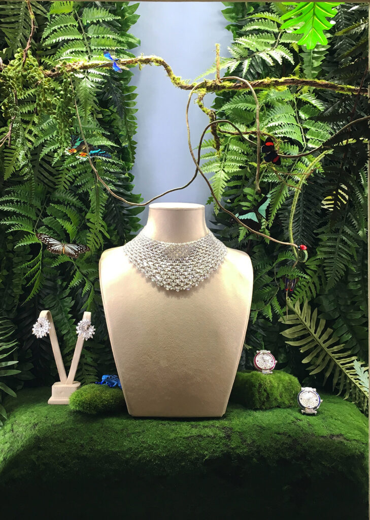
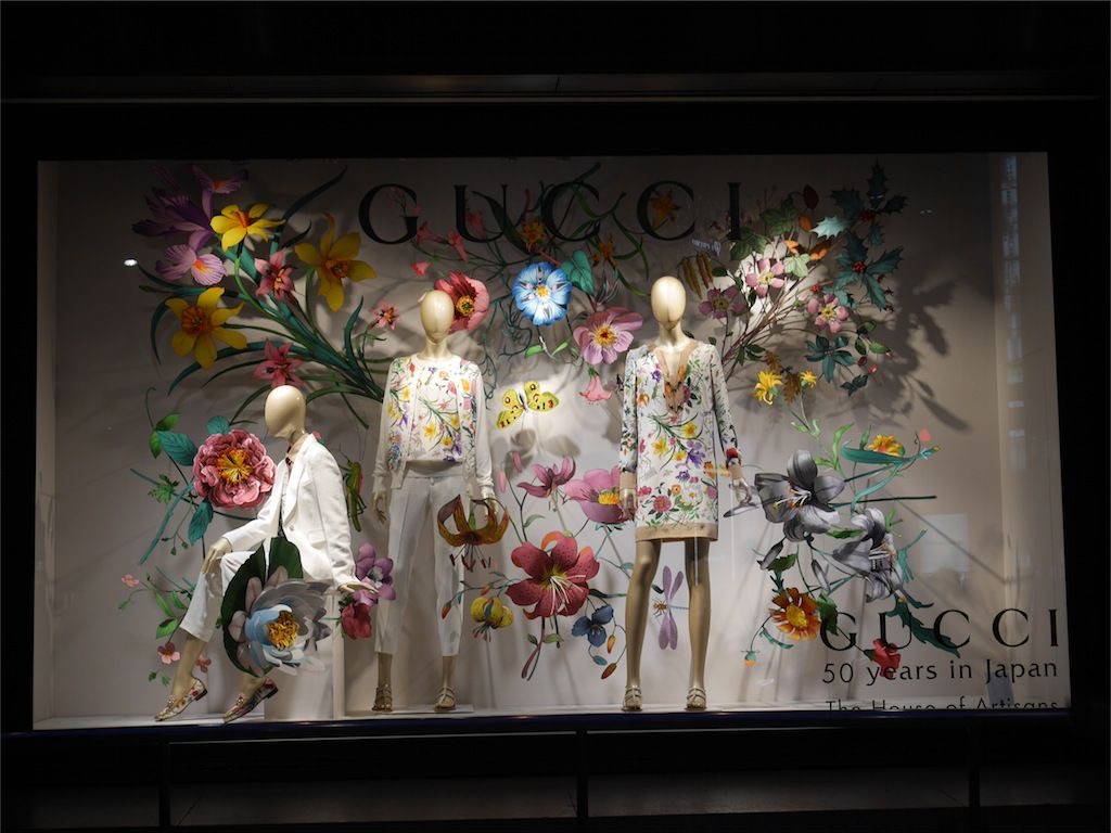
The brand Gucci, a pioneer in Garden-themed designs, created this window display in its Japan boutiques for the itinerant flagship Gucci House of Artisans.
A design that fuses the prints of the garments with the floral design of the window display.
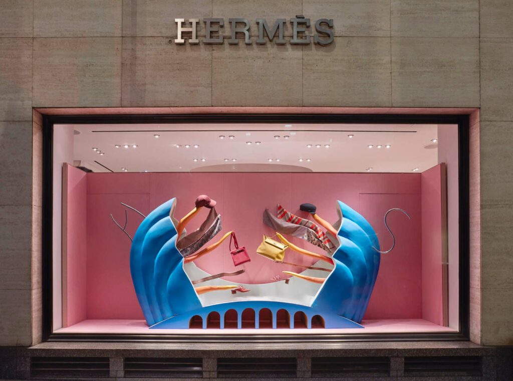
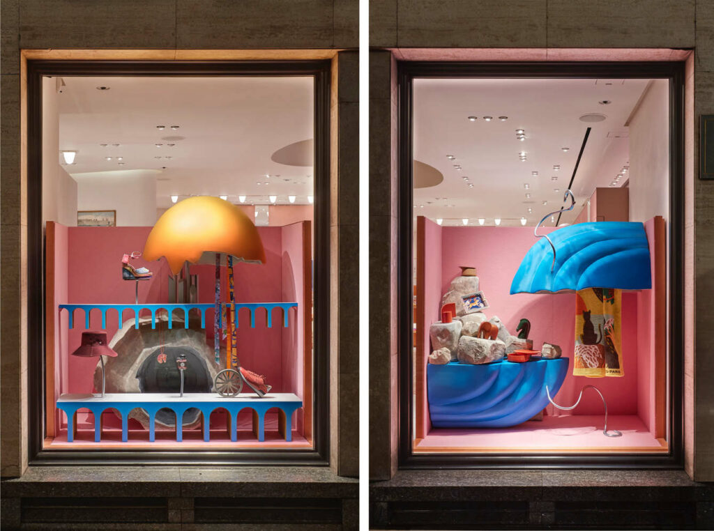
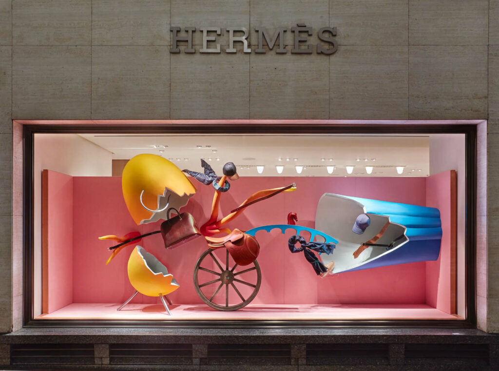
The brand Hermes is always a great design reference. This window display created by Fotis Evans for their boutique on New Bond Street, London, is a great example of perfect design execution. Figures that seem to be in motion and products that are the protagonists of the surreal scenes by the London-based Greek artist.
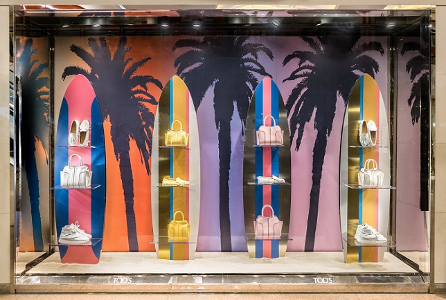
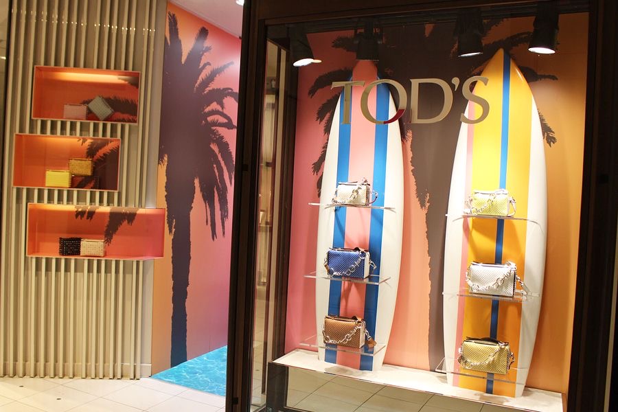
The window displays created for the “TOD’S BEACH” campaign by the brand TOD’S show us summer in their own way, referencing surfing in their Tokyo boutique.
And staying true to its style and image, the brand Jacquemus created this window display for its pop-up at Galeries Lafayette, Paris. A very creative design that screams Jacquemus in every detail.
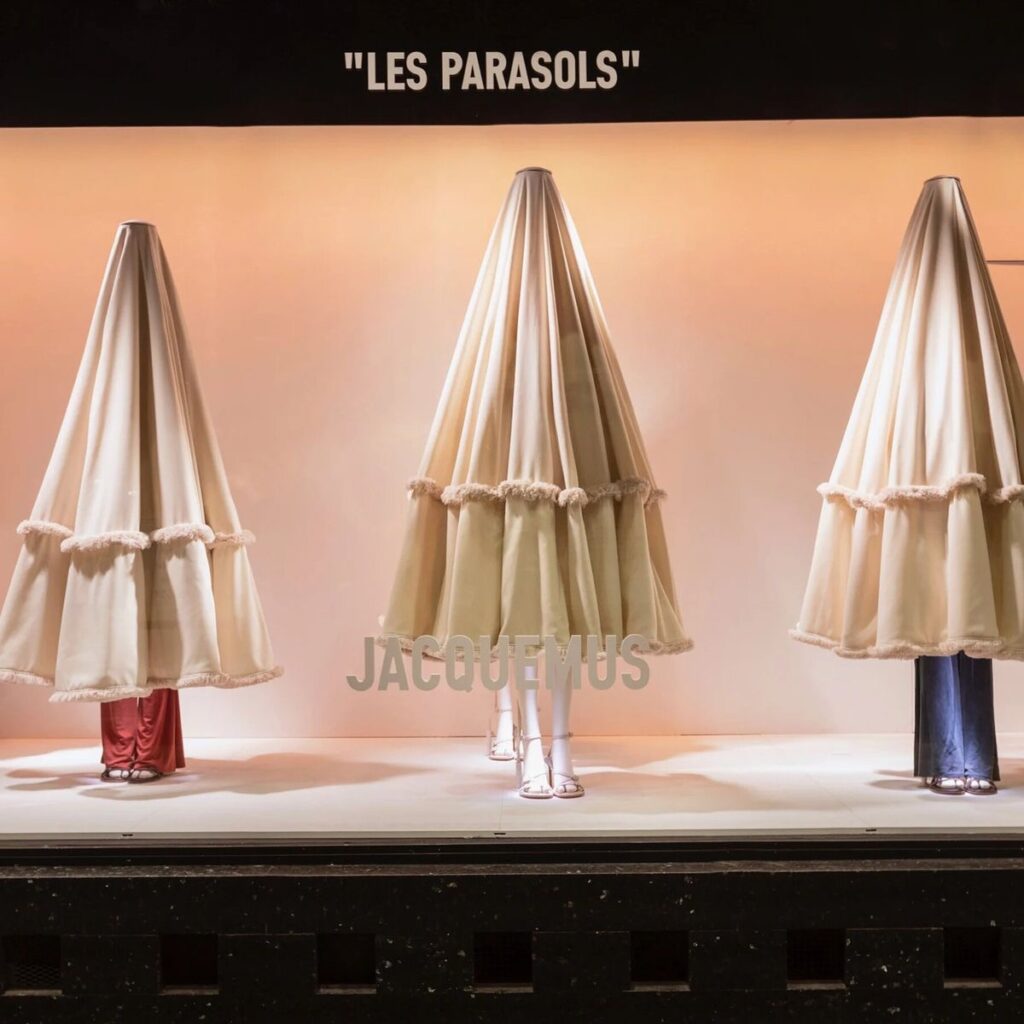
A great strategy to attract customers is to create the sensations they need to feel. In the summer season, customers want to escape routine and get away from the city, fleeing to a holiday place that transmits tranquillity.
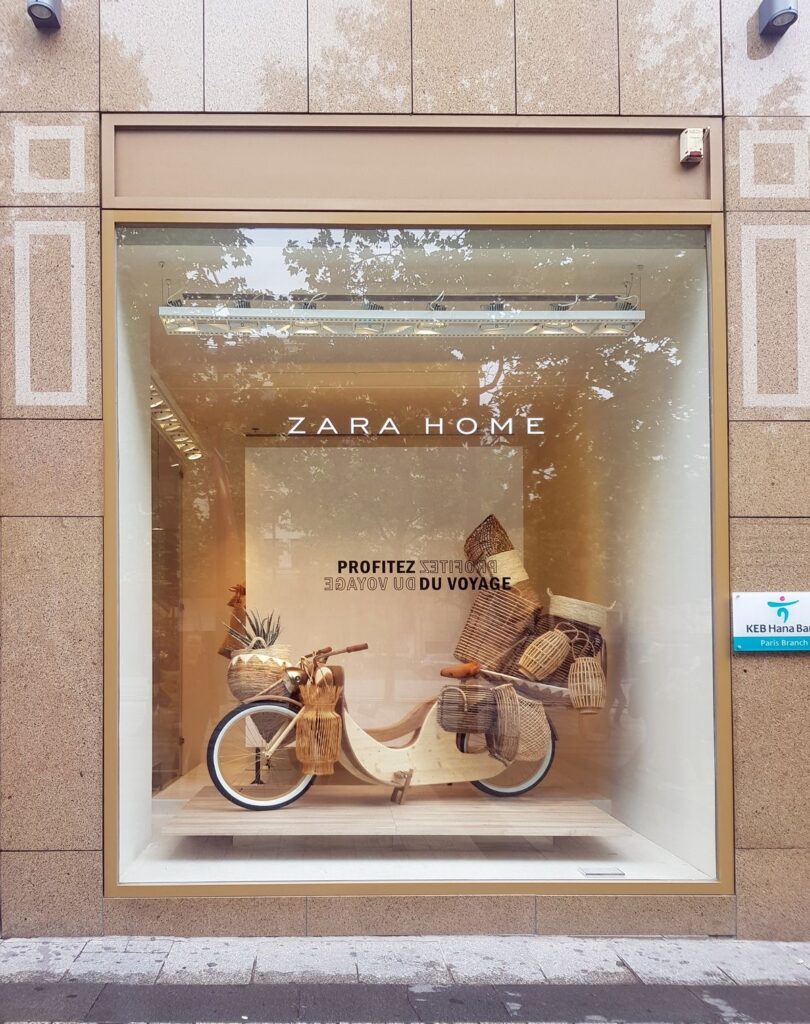
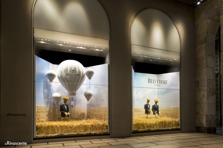
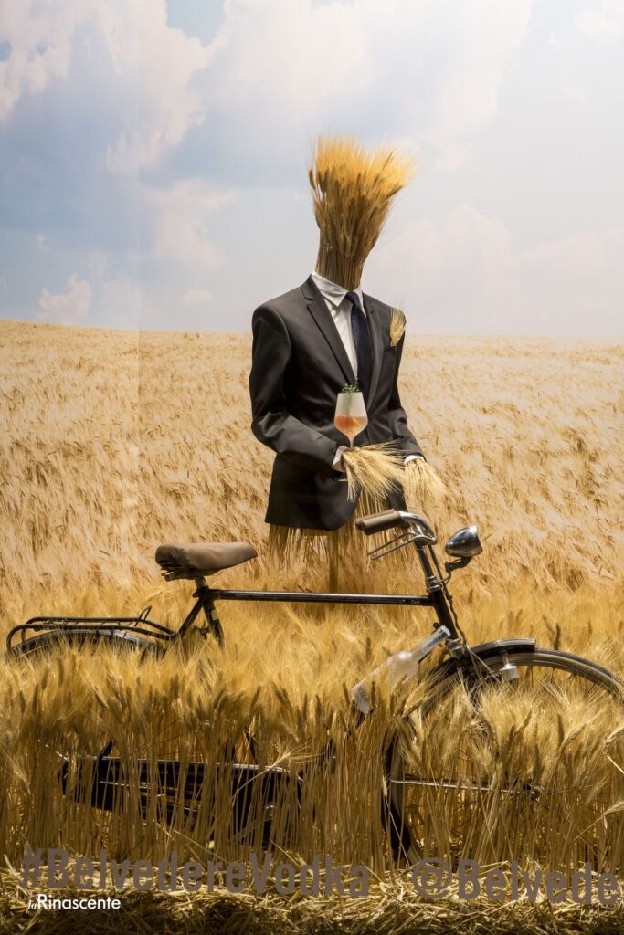
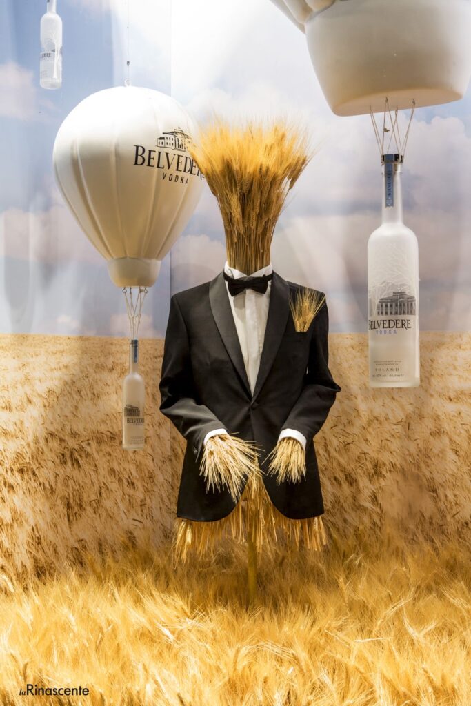
This is why brands resort to this theme: wheat fields and the Mediterranean style.
Zara Home used this resource in one of its stores in Paris. Neutral colours and wicker textures on a motorcycle that invites us to travel.
Belvedere Vodka x Rinascente joined forces to create this incredible campaign displayed in Milan. As we can see, the design is exclusively based on wheat fields, a summery image that transports you.
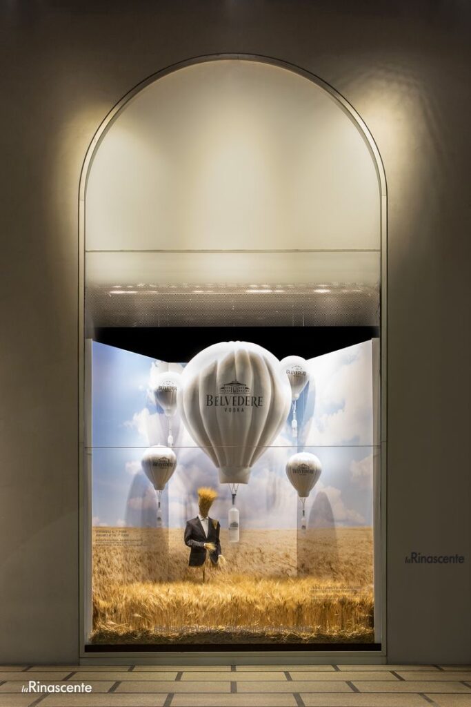
Brands take advantage of seasonality, campaigns adapted to each time of year to get closer to customers.
Create unparalleled designs that capture customer attention, elevate your brand image, and differentiate yourself from the rest.
You may also be interested
open
08:00 AM-18:00 PM Monday – Friday
08:00 AM-18:00 PM Monday – Friday